A Grand Prairie Kitchen Renovation with Farmhouse Charm


It’s always fun for our designers to look back on a completed project and remember how the space was the first time we saw it. In review of this kitchen remodel in Grand Prairie, our Senior Designer mentioned that “there were a lot of small problems within this space, but they were easy to solve.” Issues like lack of storage or counter space, poor layout, insufficient lighting, and dated aesthetic were among the list of things the clients brought up in our first meeting with them. They had a general idea in mind of how they wanted the new kitchen to look but were unsure of the specifics needed to get there. After talking through the detailed pain points the clients had with their existing kitchen, our designers got to work creating visual concepts for the renovated space.


One of the primary layout changes you can see in the floor plans is the removal of the peninsula bar area. While this space was good for seating, it made the kitchen feel closed off. It was important to the clients that the new kitchen was more open and provided a nice flow for entertaining, so it made sense to take out the peninsula. This change also allowed for the refrigerator to be relocated to the outside corner of the kitchen, providing easy access for guests, and preventing unnecessary traffic through the cook area. This relocation of the fridge created more space around the sink, which would no longer be crowded by the refrigerator door.

Another notable change is the removal of the corner pantry. Doing so allowed for much more counter space and a streamlined feel to the renovated kitchen. As for the storage space, a cabinet pantry was incorporated in the new design so the clients wouldn’t miss the pantry.


The above rendering allowed the clients to visually understand the structural changes that were to be made. Sometimes, especially if you have lived in a home for many years, it can be challenging to imagine it looking different than it always has. Our detailed 3-D renderings always provide a fantastic visual and communication tool for our clients to see the space before committing to the construction.


It’s amazing how much larger the renovated kitchen feels with the peninsula gone and the refrigerator in its new location. The flush built-in cabinets above the fridge provide additional storage and pair nicely with the new cabinet pantry to the right. We love how customized and uniform this wall turned out!


Stacked drawers were installed in place of the original lower cabinets. This is often a design option we suggest to clients looking to improve storage space and overall functionality of their kitchen – the drawers take advantage of usable space and are also much easier to access than the back of a deep cabinet. Our clients certainly appreciate the easy-access utensil drawers and upper cabinet spice rack within reach while they are using their new cooktop.


A beautiful wood vent hood adds a customized feel and a touch of farmhouse charm the clients were hoping for. The natural wood color pairs so beautifully with the sage green backsplash tile!


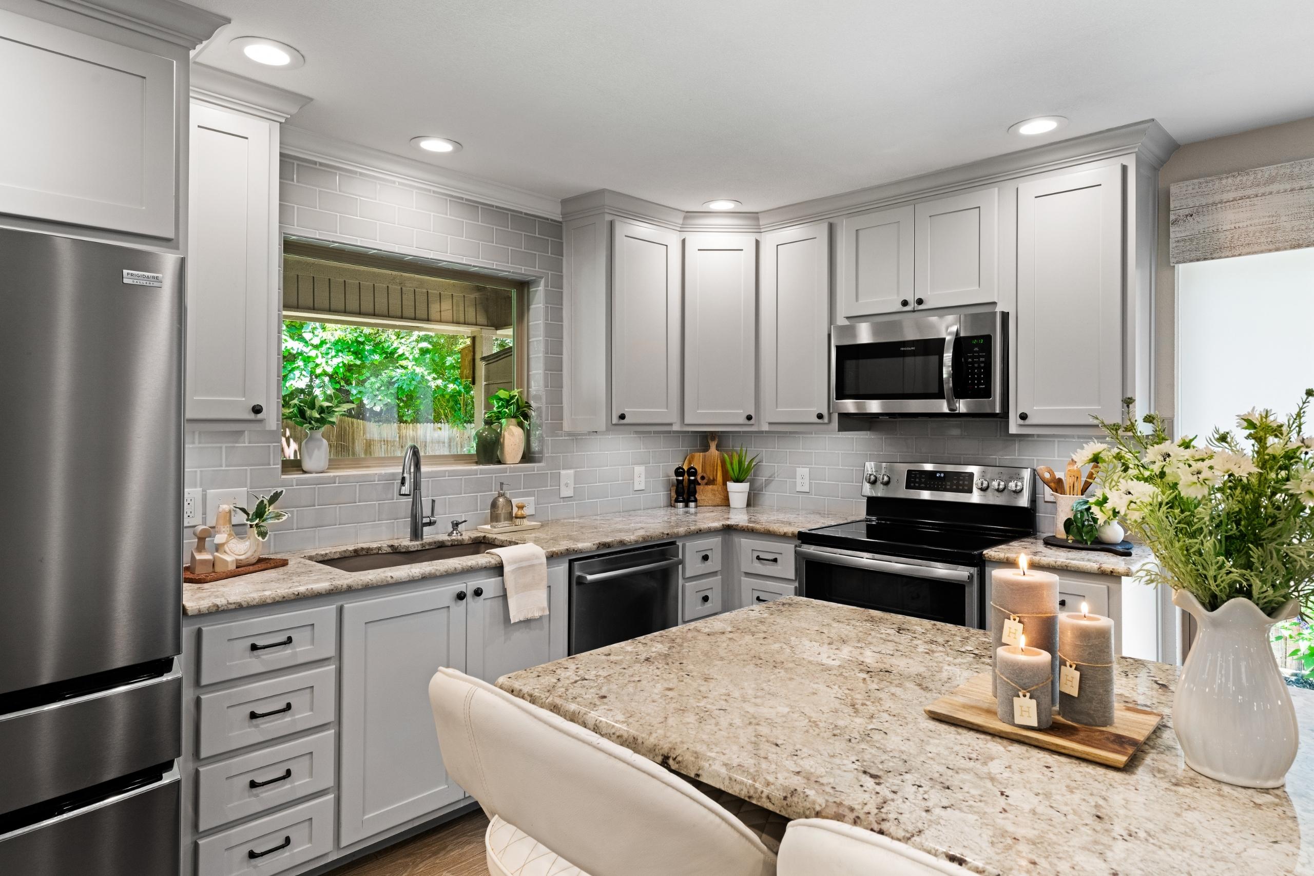
Another design feature that makes this kitchen appear larger is the extension of the upper cabinets to the ceiling. The original cabinets had dead space above them (as many older kitchen cabinets do!) Incorporating elegant crown moulding detail at the top draws the eyes upward and makes the ceilings feel higher. Painting the cabinets white also brightens the room, as the dark brown color of the original cabinets darkened it.


This view shows how open the room is to the neighboring dining room after the structural and layout changes have been made. The clients no longer have to feel separated from guests sitting at the table while they are in the kitchen preparing food or drinks. A flowing, entertainment-friendly space was one of the big items on their wish list, and we were happy to be able to deliver it.


You can see in the above ‘before’ shot that the corner pantry took up a ton of space! The inside storage area felt crowded and the door swung outward into the kitchen, interfering with the cook space and dishwasher. The HVAC supply duct that was above the pantry made the ceiling lower inside, adding to the cramped feeling. Our team was able to relocate the duct into the ceiling, and in place of the old pantry is now a streamlined corner with added counter space, upper cabinets, and stacked drawers below the counter.


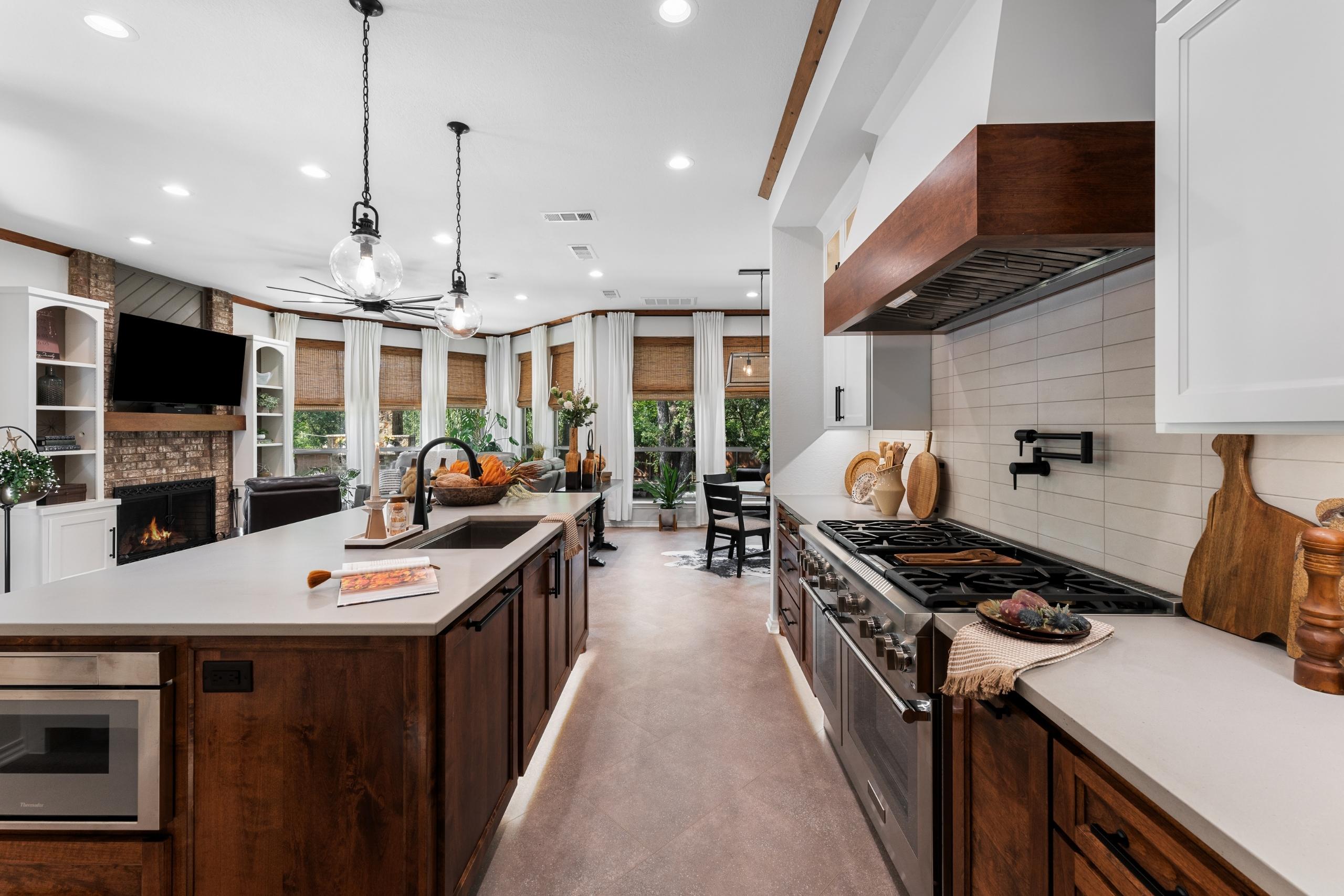
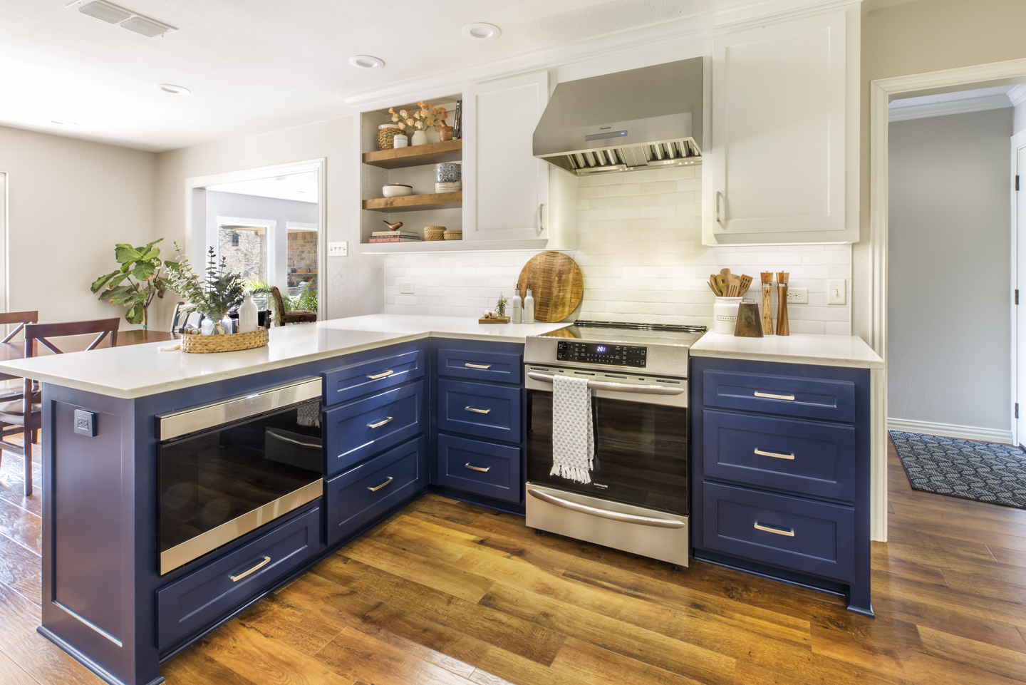
Looking at the new kitchen straight-on, it’s hard to believe it’s the same space! The white painted cabinets, Colonial White Granite countertops, glass subway tile backsplash, wood plank tile flooring, dark oiled bronze hardware, and strategically placed LED can lights have fully transformed the room.


The right corner of the kitchen where the refrigerator once was now holds rustic open shelves, a concealed trash pull-out, and a sleek microwave drawer. Having this modern-style microwave below the countertop provides a uniform look, easier access, and less clutter sitting on the counter.


The close-up details of this kitchen really showcase the level of skill and craftsmanship required to get it done right. The Medford Team is always proud when a completed project exhibits top-level quality, all the way down to the smallest details!


Comparing the ‘before’ and ‘after’ shots of this corner shows how the refrigerator crowded the area and made the kitchen feel small and dark. Fast-forward to now, and the new kitchen feels bright, welcoming, and full of usable storage space!


Above is the original inspiration photo our clients shared with us when first considering a kitchen remodel. In comparing the inspiration to the finished remodel, it’s safe to say our clients are beyond thrilled with the finished project!


We’d like to recognize everyone who contributed to this kitchen remodel and helped bring our client’s dreams to life:


Structural Design: Mike Medford, Sr.

Aesthetic Design: Stephanie Milford

Drafting and Renderings: Brandy Anderson

Production Management:  Michael Medford, Jr.

Project Management:  Dave Broadfield

Trim Carpentry:  Dave Broadfield, Neil Norris, Greg Haws, Scott Vernon

Cabinets and Shelving:  Bailey Cabinets

Plumbing: Express Plumbing

Electrical: Marc Miller Electric

Drywall: Alex Green Drywall

Paint: Phillip Painting Company

HVAC: Southern Air

Tile & Counters Fabrication: HRG Granite

Glass: Kindred Glass

Countertops & Tile: Hilton’s Flooring & Tile

Staging: Ali Doskocil

Final Photography: Impressia– Todd Ramsey


We’d also like to share the design selection items used to create this beautiful space:


If your kitchen could use a renovation, whether to update a dated aesthetic or improve functionality (or both!) our team would be happy to help! Contact us today for more information on our kitchen design and remodeling process.


Warm Regards,


The Medford Team


Latest Post