Remodeling an odd or unusual space is one of the many things that makes our job fun and interesting. It’s actually surprising just how many homes include a kitchen or bathroom with a unique floor plan. Sometimes it works in our favor and other times it creates a frustrating challenge. Maintaining the specified budget while also optimizing storage space and improving functionality can be a difficult task, requiring both knowledge and creativity. Add in the client’s “must-haves” when it comes to features and aesthetics, and we’ve got quite the conundrum! More often than not, however, our talented designers are able to come up with the perfect solution to these issues. Such was the case for our recent master bathroom remodel in Keller, Texas.
The client’s beautiful home was built in 2002 – newer than many of the homes we renovate. Still, being nearly 20 years old, it definitely needed some updating. The master bathroom was among the first rooms on the client’s list for a complete overhaul.
The floor plan was unique to say the least, with a large jetted tub in the very center and an L-shaped, 2-entry shower directly behind it. A larger “hers” vanity was on the left side of the bathroom entry, while a much smaller “his” vanity was on the right. Having the second vanity where it was created a bottleneck of entrances between the shower, toilet room, and closet. Not only did this layout feel crowded, but it also lacked the storage space the clients needed. It’s mind-boggling that large bathrooms like this always seem to lack storage space due to a poorly designed floor plan!
Our designer’s solution for this bathroom involved replacing the over-sized jetted tub with a slimmer free-standing one. The L-shaped shower was closed off to only one entry, allowing the “his” vanity to be moved to the area previously occupied by the second shower door. This move also freed up space for a large linen cabinet to be built against the wall to the right of the bathroom entrance. The floor plan really didn’t change, but some minor structural modifications made all the difference in this space!
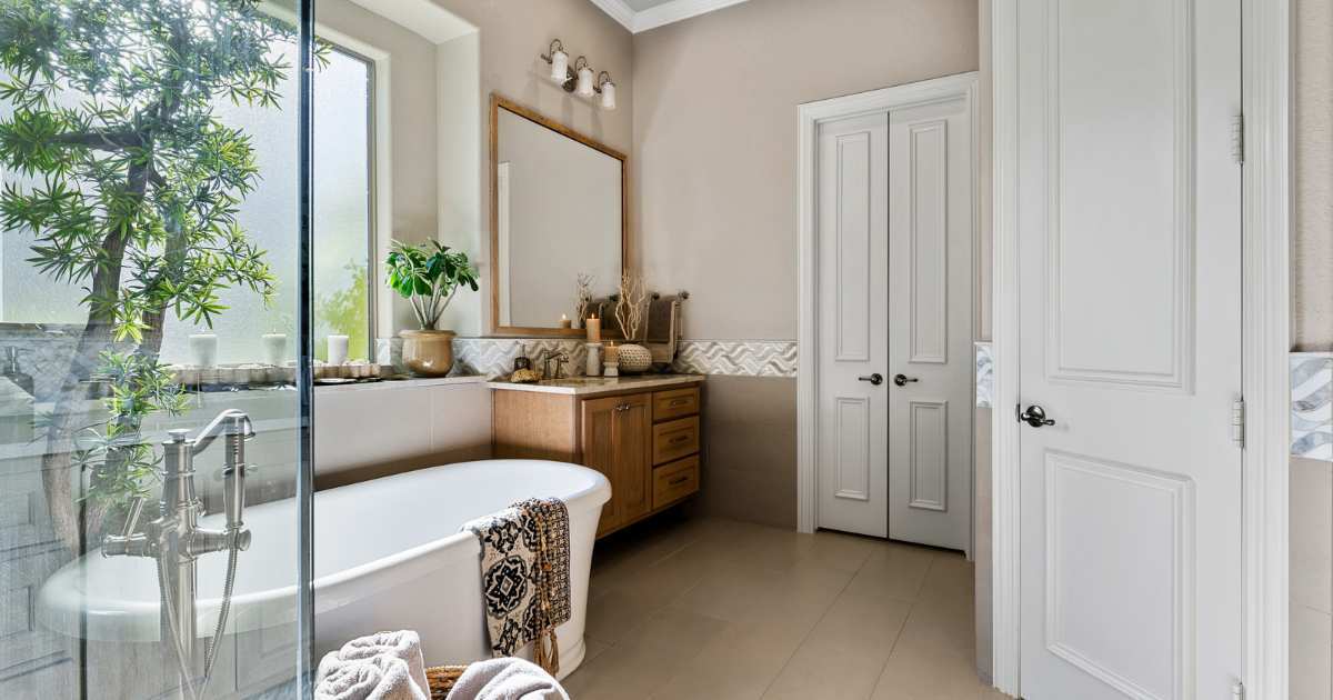
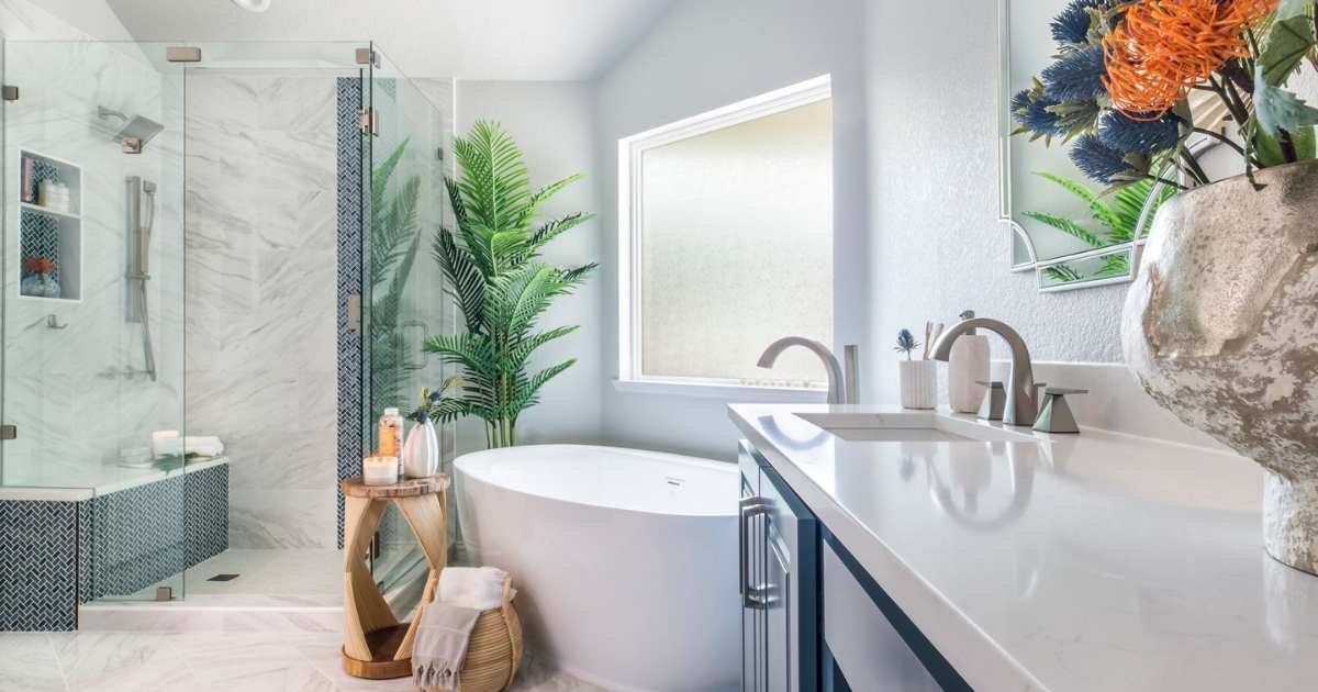
Upon entering the remodeled bathroom, the sleek free-standing bathtub is a stunning central focal point. The tiled accent wall behind the tub serves as a beautiful backdrop, extending to the ceiling and holding a serene piece of artwork and a deck-mounted, chrome-finished tub faucet. An elegant 30” chandelier hangs above the tub, drawing the eyes upward and adding soft additional lighting. Incorporating lighter, neutral tones makes the renovated room feel much larger and brighter than the previous dark corner created by the original shower and bulky tub surround.
To the left of the entry is the “hers” vanity. The original vanity was large and included a sit-down area on the far end – a common feature for bathrooms constructed during the early 2000’s. As the trend seems to be, the client never used this space and even had boxes stacked in the opening below. The false-front drawers on the original vanity also wasted valuable storage space and made it difficult to reach items in the back of the cabinets below. The angled corner beside the doorway clipped the edge of the end cabinet, taking away that much more storage space!
Our team was able to square up the design of the new vanity by replacing the sit-down area with a stack of drawers and narrowing the center cabinet doors. This created much more room for storage as well as a symmetrical, streamlined aesthetic.
You’ll also notice in the before photo, the client had a hairdryer sitting on the countertop with the cord hanging off into the floor. A neat upgrade we offer for all of our bathroom remodels is to install electrical outlets inside the drawers and cabinets, so things like hairdryers, curling irons, and electric toothbrushes can be used and stored without creating clutter on the countertop. Our clients always love that little hidden feature, and of course, the result of a spick-and-span bathroom!
Across from Her vanity is the luxurious walk-in shower. It’s interesting that the shower looks and feels so much larger than it did before, while it is actually the same square footage; having only one entry really makes it feel more spacious, versus the original set up, which felt like a long walkway between the entrances. Stepping into the new shower, you can see the beautiful pebble-tile flooring, custom shampoo niches, a robe hook, a footrest, and convenient towel racks on each side of the entry.
This impressive shower includes 3 different shower heads – a standard showerhead, a handheld, and a rain shower head – each with their own valves for easy customization. The beautiful chrome finishes compliment the glitzy porcelain accent tile for just the right amount of visual interest.
Just beyond the new bathtub is the large custom linen cabinet where the second vanity once stood. This was the perfect place to install built-in cabinetry, as it fit perfectly within the existing nook without extending into the walkway or requiring additional structural changes. Aesthetically, this bank of cabinets looks as though it has always been a part of this bathroom!
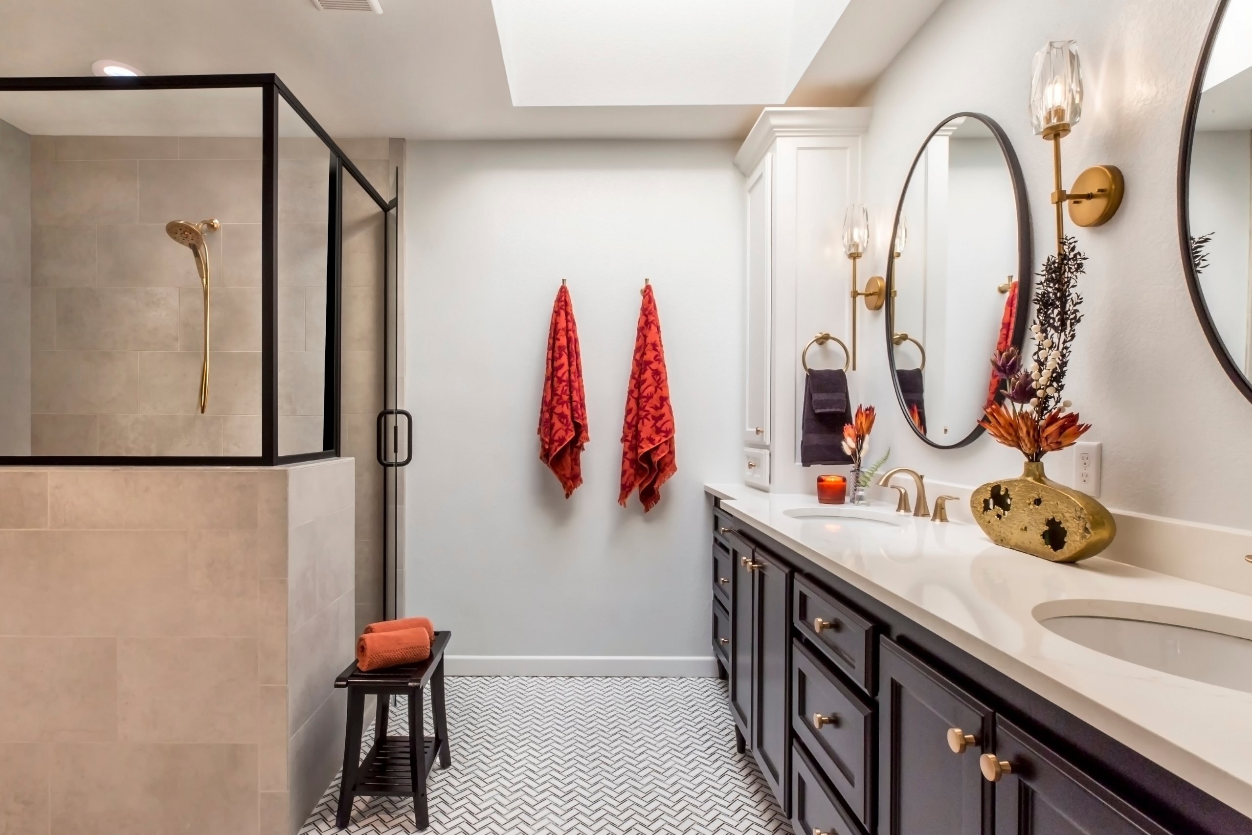
Another aesthetic decision that was made was to replace the full-sized wall mirror over the vanity with a framed mirror and mounted sconces. The frame was custom made to match the vanity cabinets for a high-end look, while the embedded sconces match the chandelier over the tub. Consistency in the details is what really ties the whole room together for a truly put-together look.
This photo shows the new location of the second vanity just behind the shower and tub. It was designed to match the larger vanity, with the same layout of drawers, Clear Alder stain, undermount sink, White Ice 3cm Granite countertop, and a framed mirror with matching sconces.
The best part about moving this vanity to this location is that it is out of the walkway, creating a more open floor plan and the illusion of a larger room. Our client can now get ready in the mornings and use his sink without being directly in the walkway to the closet or toilet room.
Another detail that makes the room feel larger is the diagonal lay and narrow grout lines of the large 12×24” Porcelain flooring tiles. Strategically placed LED can lights compliment the decorative lighting and brighten the updated bathroom. Our talented Interior Designer, Stephanie, helped the clients select Sherwin Williams’ Colonnade Gray paint for the walls to tie in with the flooring, tile, cabinets, and countertops. The end result is a beautiful, spa-like master bathroom that our clients can enjoy for years to come.
Making the best design decisions for this project was a challenge, due to the unique layout and the lack of storage space. Our clients could not be more satisfied with the solutions that were presented. The new bathroom is beautiful, functional, and has substantial storage space!
We’d like to recognize and thank everyone on our team that helped with this project:
Structural Design: Mike Medford, Sr.
Aesthetic Design: Stephanie Milford
Drafting and Renderings: Brandy Anderson
Production Management: Michael Medford, Jr.
Project Manager: Dave Broadfield
Trim Carpentry: Dave Broadfield, Neil Norris, Greg Norris, Scott Vernon
Custom Cabinets: Bailey Cabinets
Electrical: Marc Miller Electric
Plumbing: Express Master Plumbing
Plumbing Fixtures: Moore Supply
Drywall: Alex Green Drywall
Framing Carpentry: Greg Norris, Scott Vernon
Paint: Phillip Painting Company
Flooring: Hilton’s Flooring
Tile: HRG Granite
Glass: Kindred Glass
Final Photography: Impressia– Todd Ramsey
We’d also like to include the details of the design selection items used in this project:
If you have a unique or unusual room in your home that needs to be remodeled or reconfigured, our creative designers would be happy to help!
Contact us today to get started!
Warm Regards,
The Medford Design-Build Team