Our recent clients in Arlington, Texas, came to us with plans to renovate their dated 1978 kitchen for a more modern, personalized aesthetic. They had given much thought to the project and were certain a full-gut was the way to go. After some discussion with our team, the clients were excited to have our Designers draw up plans and renderings to provide a clear visual of the transformation.
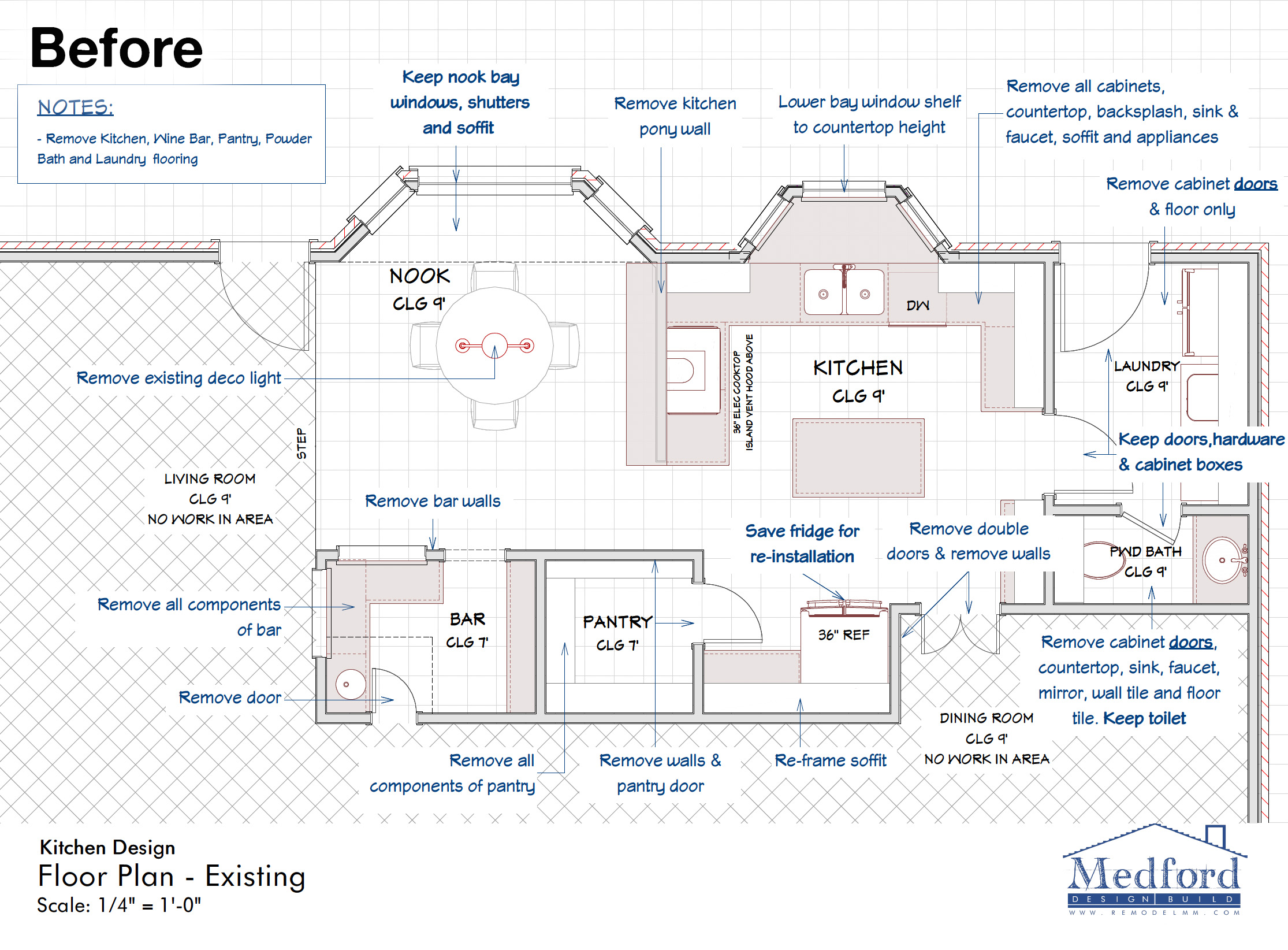
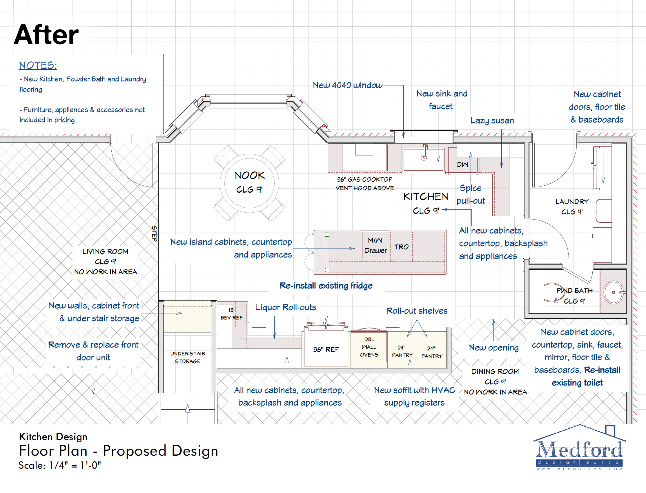
The floor plans were especially helpful in communicating the structural changes in regard to an existing walk-in pantry and bar area that were to be removed. Initially, the clients intended to leave these areas there, but doing so would require them to be updated with new cabinets, paint, and countertops to match the new kitchen. After going through a few different layout options, the decision was made to fully demolish these areas, allowing for additional counter and storage space in the kitchen and a much needed under-stair storage closet in place of the bar.
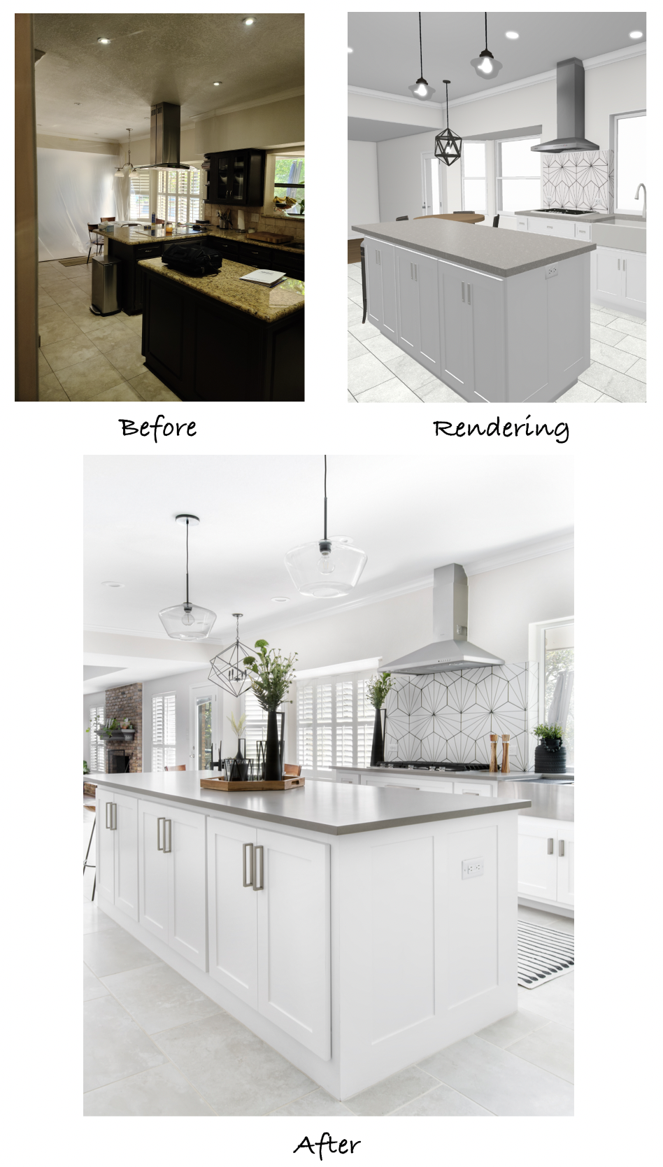
The floor plans also show the removal of the peninsula and relocation of the cooktop and vent hood against the outer wall, as per the client’s request. To make up for the counter space lost by the peninsula, a large island would replace the existing smaller island. The discussion of opening the dining room up to the kitchen also influenced the final design and resulted in the removal of the standard doorway between the rooms.
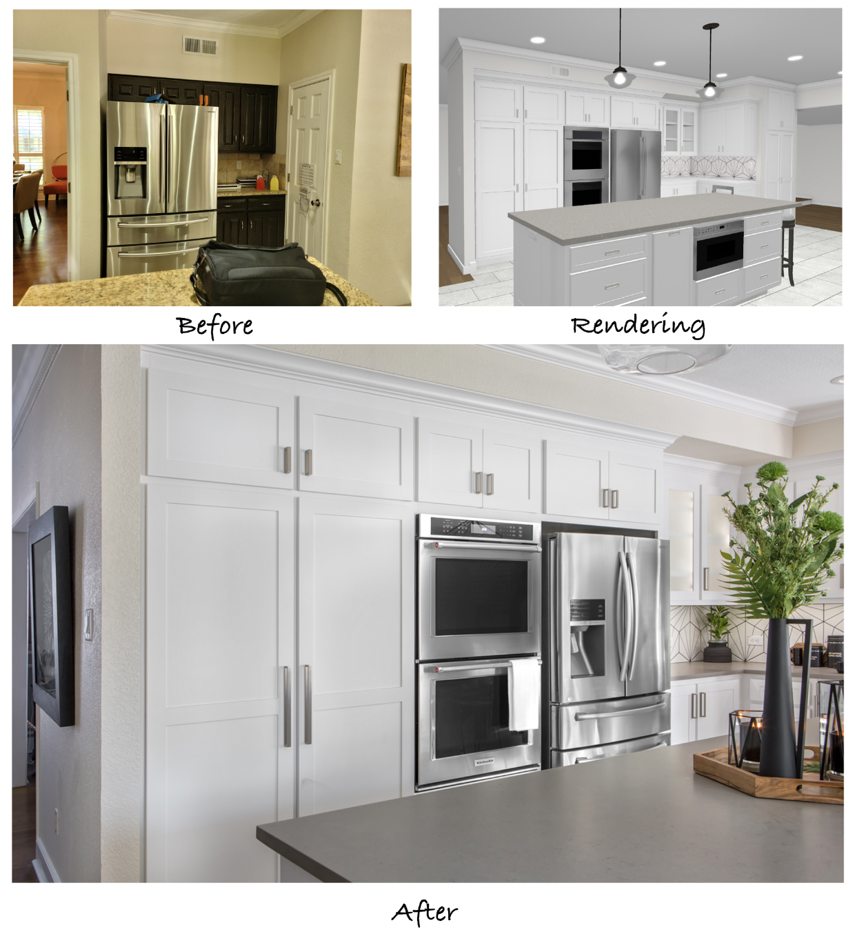
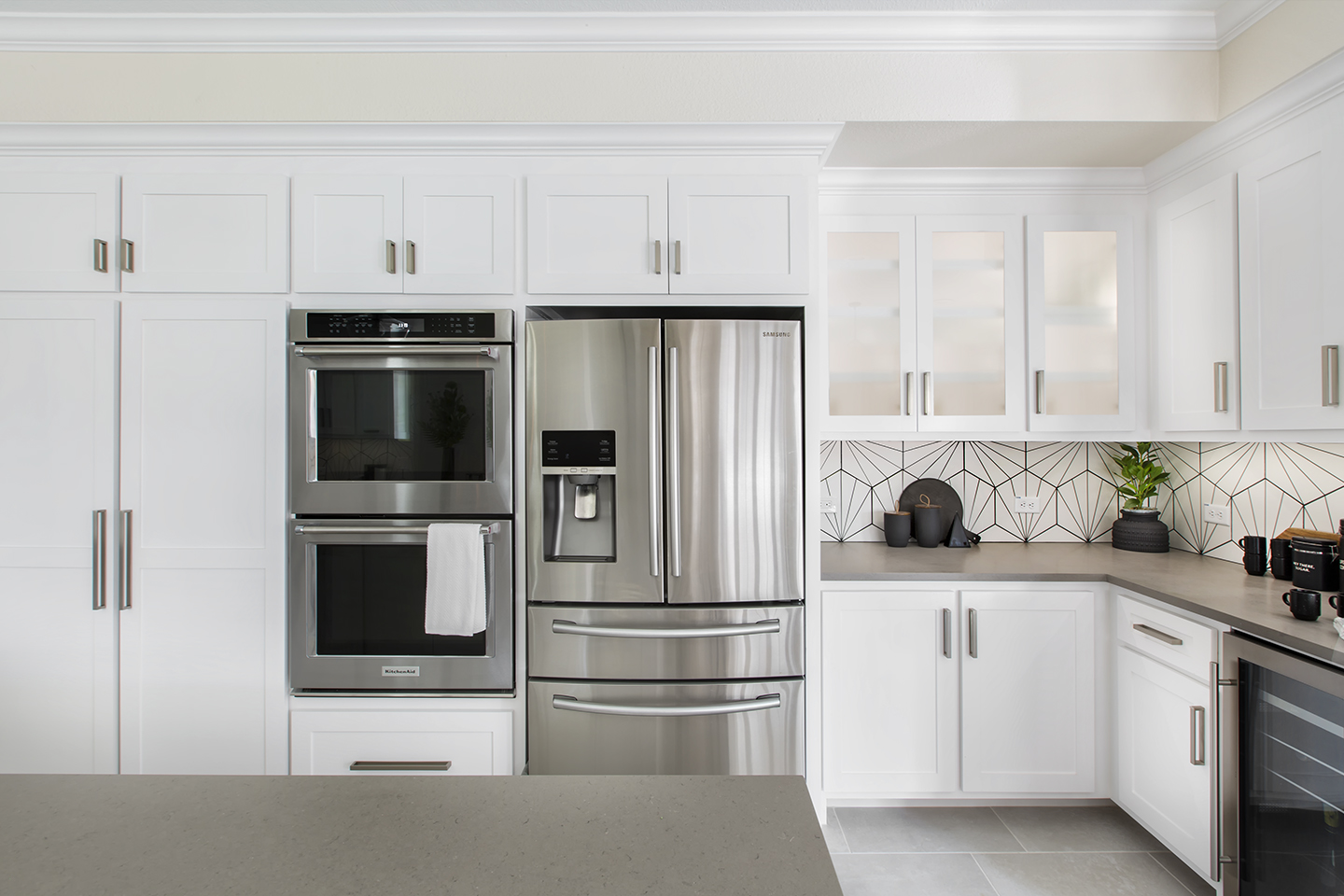
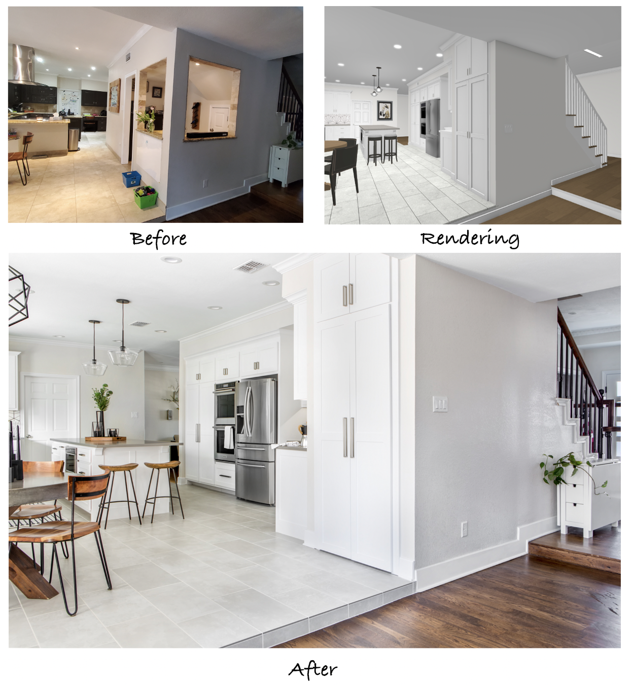
Removing the walk-in pantry and the doorway to the dining room created ample space for cabinets to be installed around the refrigerator and new double wall ovens. The uniform shaker-style cabinets provide a ton of additional storage and create a custom, built-in look.
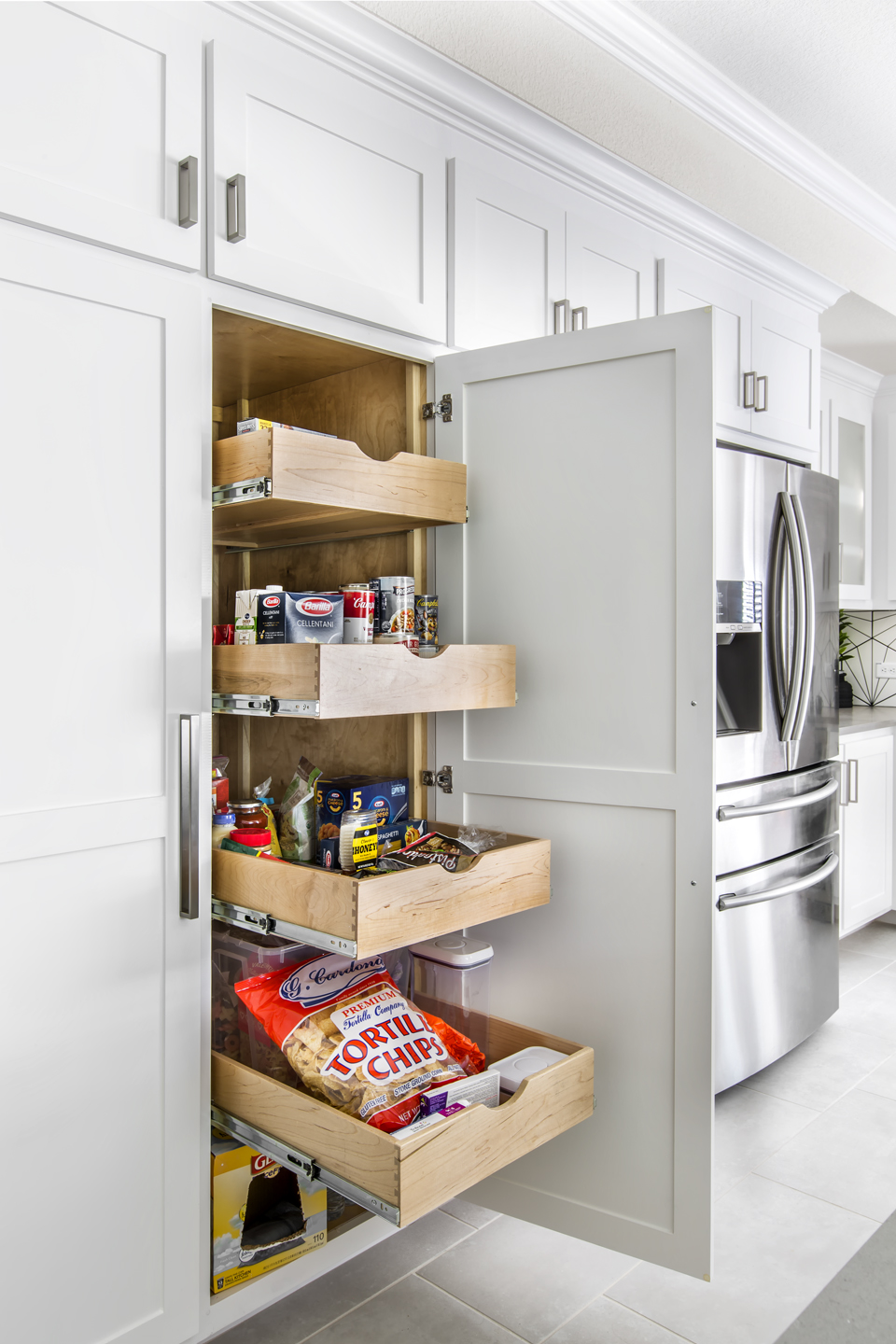
Side-by-side 24” pantries to the left of the ovens house a total of 8 convenient roll-out shelves for easy access and organized storage. Upper cabinets are ideal for storage cookware, cookie sheets, and muffin tins, while a deep pan drawer was installed just below the bottom oven.
This side of the kitchen feels much longer with more usable space due to the new L-shaped countertop and cabinetry that was installed in place of the old pantry. Our team also wanted to incorporate some glass-front upper cabinets with LED backlighting inside to add some visual interest and compliment the undercabinet lighting. The use of frosted glass on these doors provides enough privacy that the contents are not clear, but that the backlighting can still shine through – great for functional cabinets that still have an aesthetic benefit.
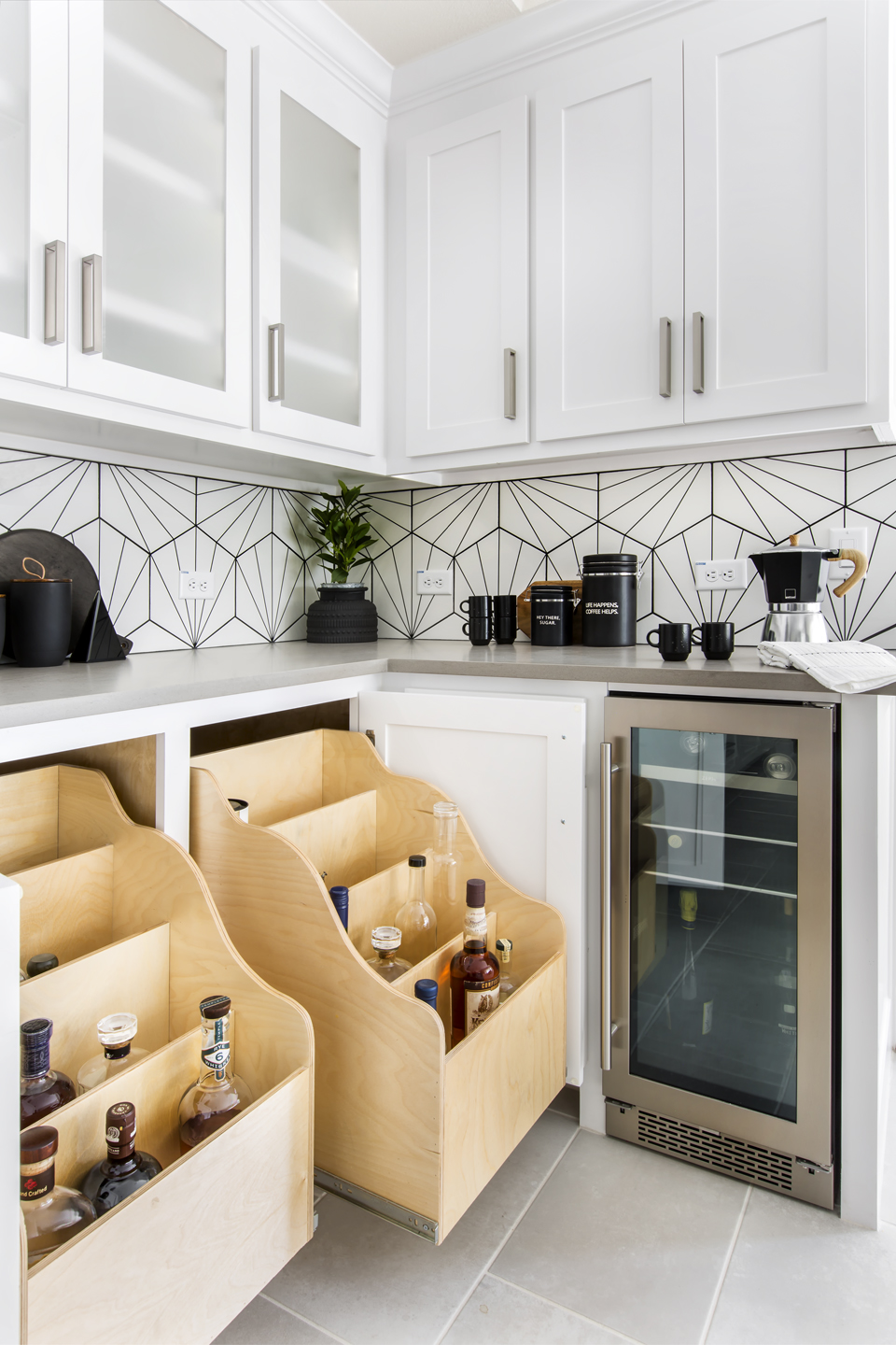
Because our clients had quite the liquor collection, it was important to them that the new kitchen included a designated storage place for the bottles. These custom roll-out drawers were designed with 4 divided levels so multiple bottles could be easily organized and accessed. They are conveniently concealed behind lower cabinet doors, just beside the wine cooler and coffee bar – a dream beverage center!
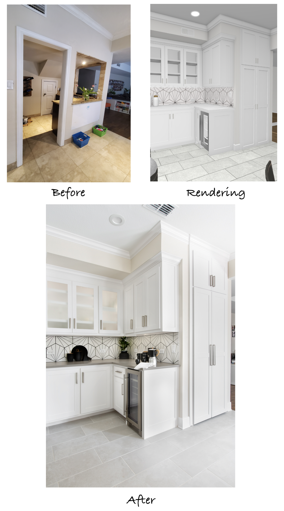
One of the talking points that came up when our Designers discussed removing the bar area was that the clients really wanted to keep the existing under-stair storage closet, which was only accessible from the inside of the bar. After a few layout options were drawn up, the perfect solution became evident – a storage closet that fit just beside the beverage area and extended all the way back to the base of the stairs. Although the ceiling on the inside of this closet angles downward (backing up to the stairs), it still provides more storage space than the original closet, is easily accessible with two large doors, and is perfectly uniform with the rest of the kitchen.
This view from the living room shows the new storage closet anchored on the outside corner of the kitchen where the unused bar once stood. With such a smart design and optimized use of space, you’d assume this layout is how it has always been!
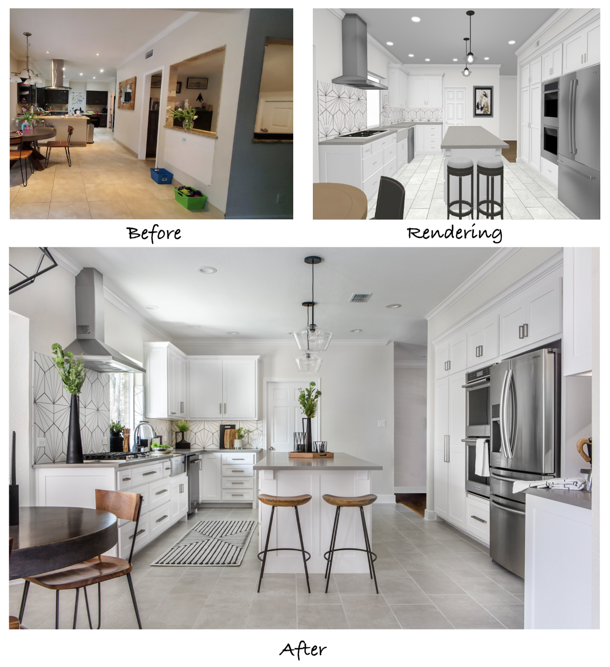
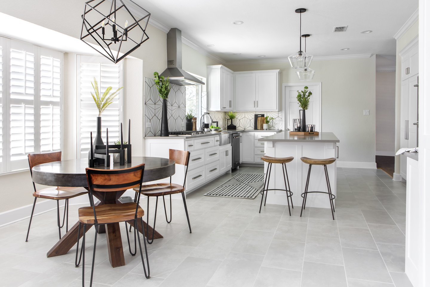
Looking through the kitchen straight on, the whole room feels larger, brighter, and more spacious. The streamlined design, lighter paint colors, and vertically laid floor tile give the illusion of higher ceilings and an overall larger kitchen upon entering through from the living room.
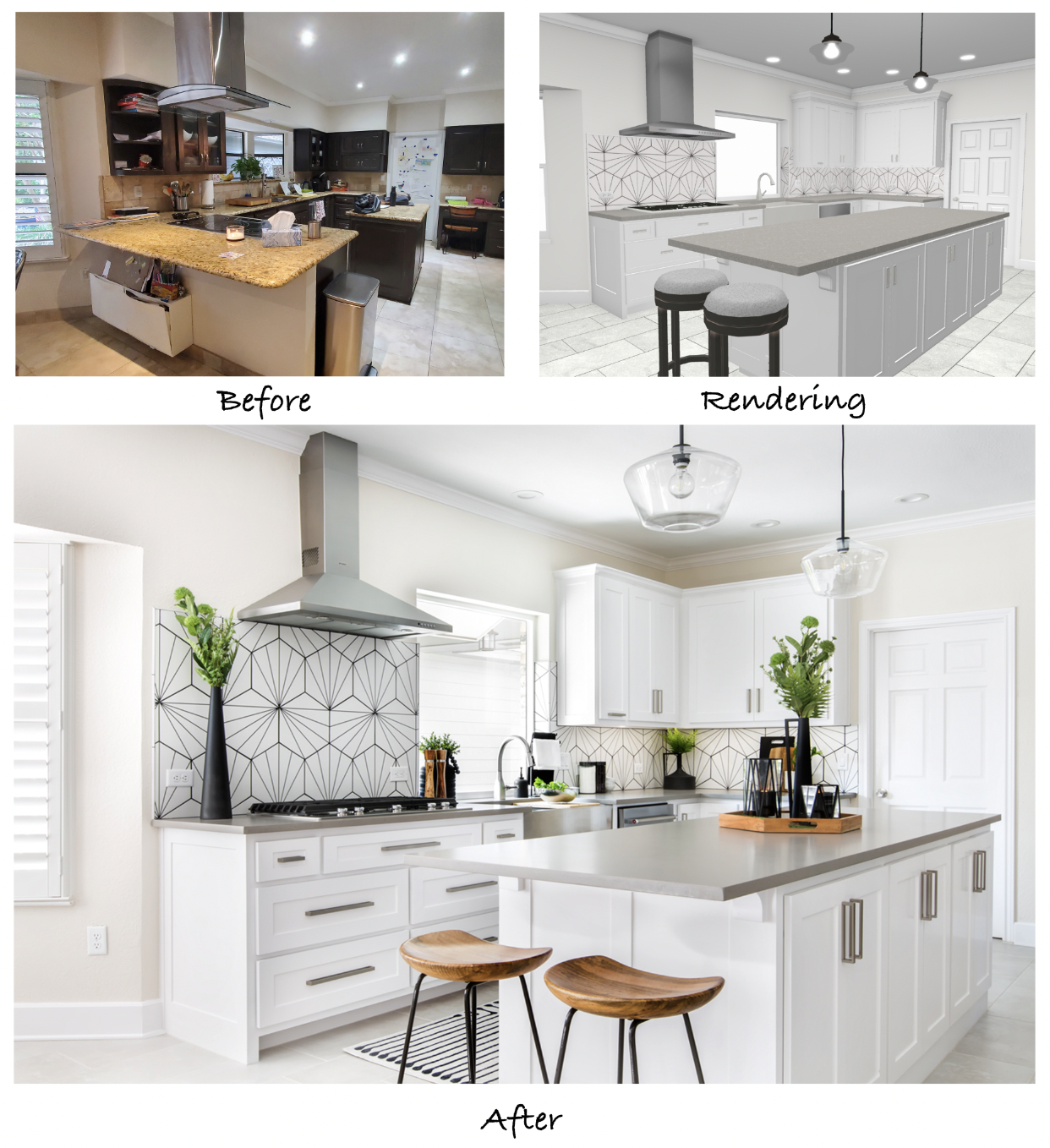
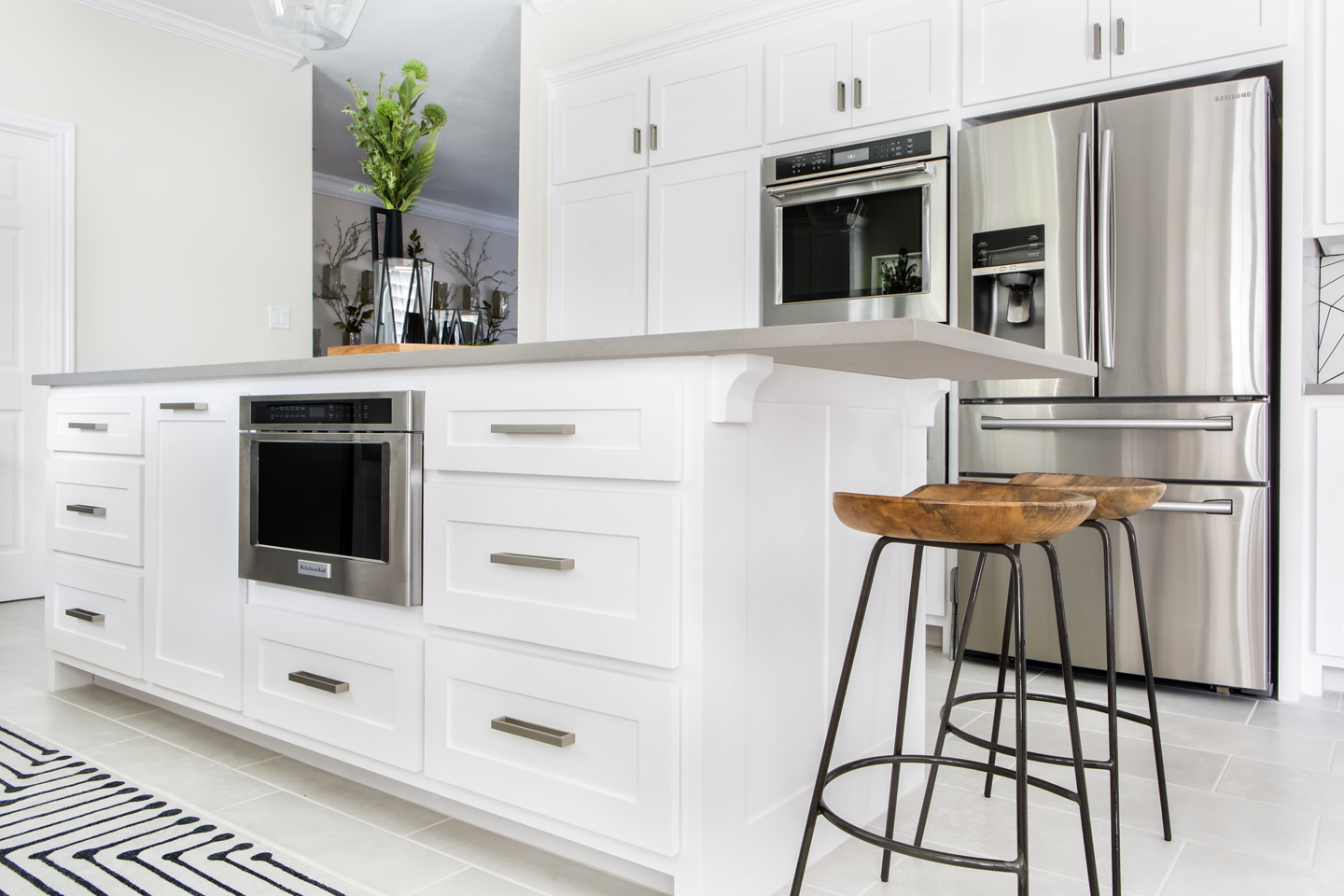
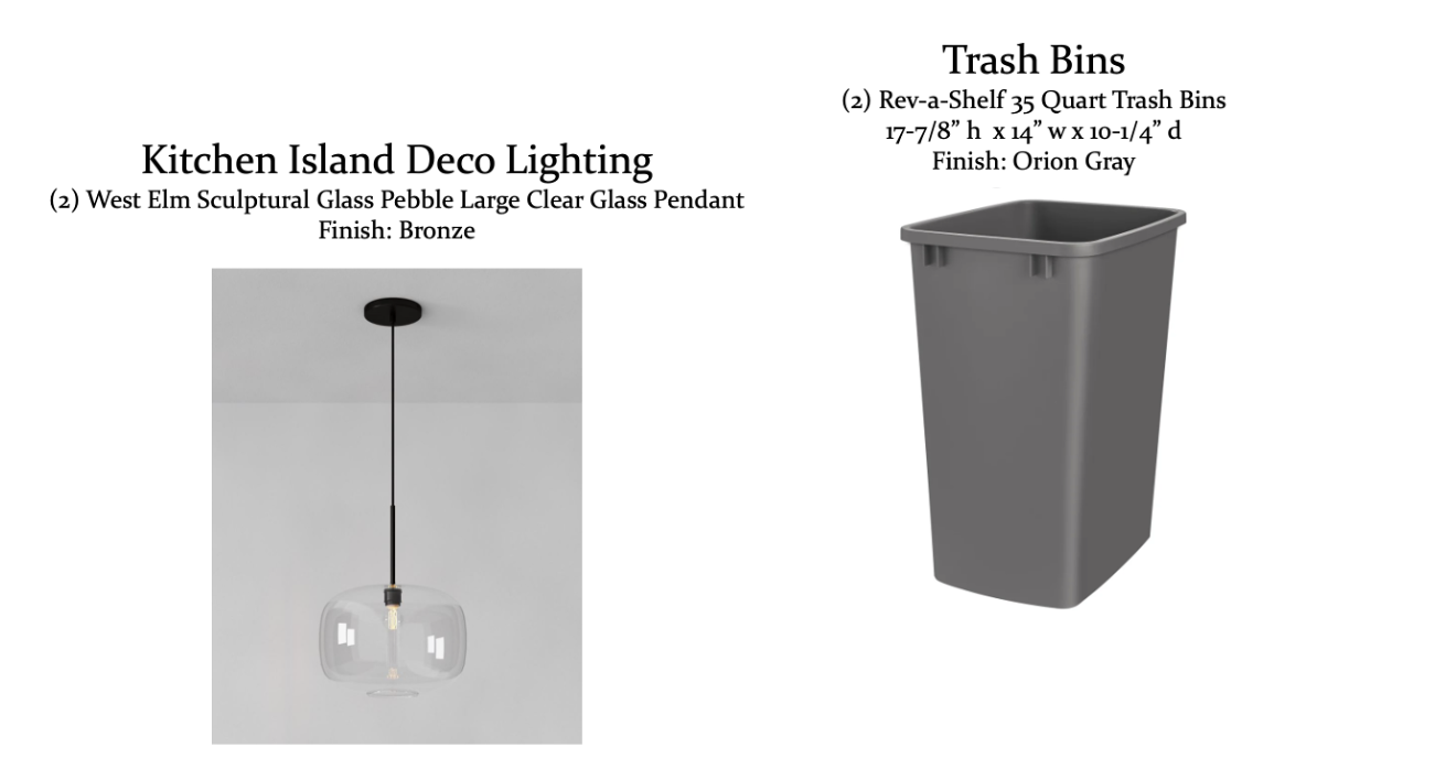
The new island includes a bar area for seating on the end and large lower cabinets below the counter. Minimalistic glass pendants were chosen as decorative lighting above the island to accent the space without hindering the open feel of the room or obstructing the line of sight across the new kitchen.
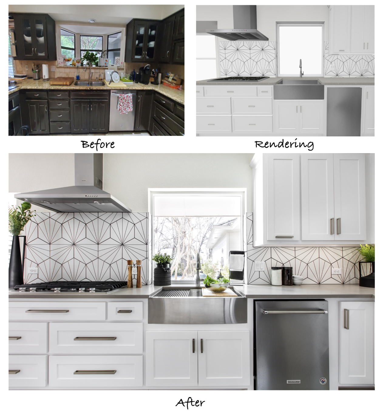
The placement of the cooktop and vent hood were a big topic of discussion regarding the updated layout. Our designers initially had them located on the opposite wall where the refrigerator now sits, but the clients preferred them on the same wall as the sink. We modified the plans to show this revised set up and the clients loved it! The final location is exactly what they wanted.
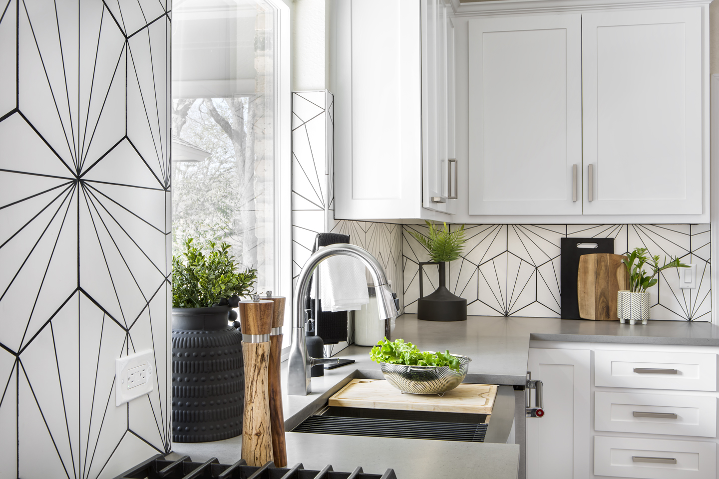
You’ll also notice the bay window behind the sink is now a large, full-view window. This was something the clients knew they wanted from the very start, as they wanted to let more natural light in and showcase their pool and beautiful backyard.
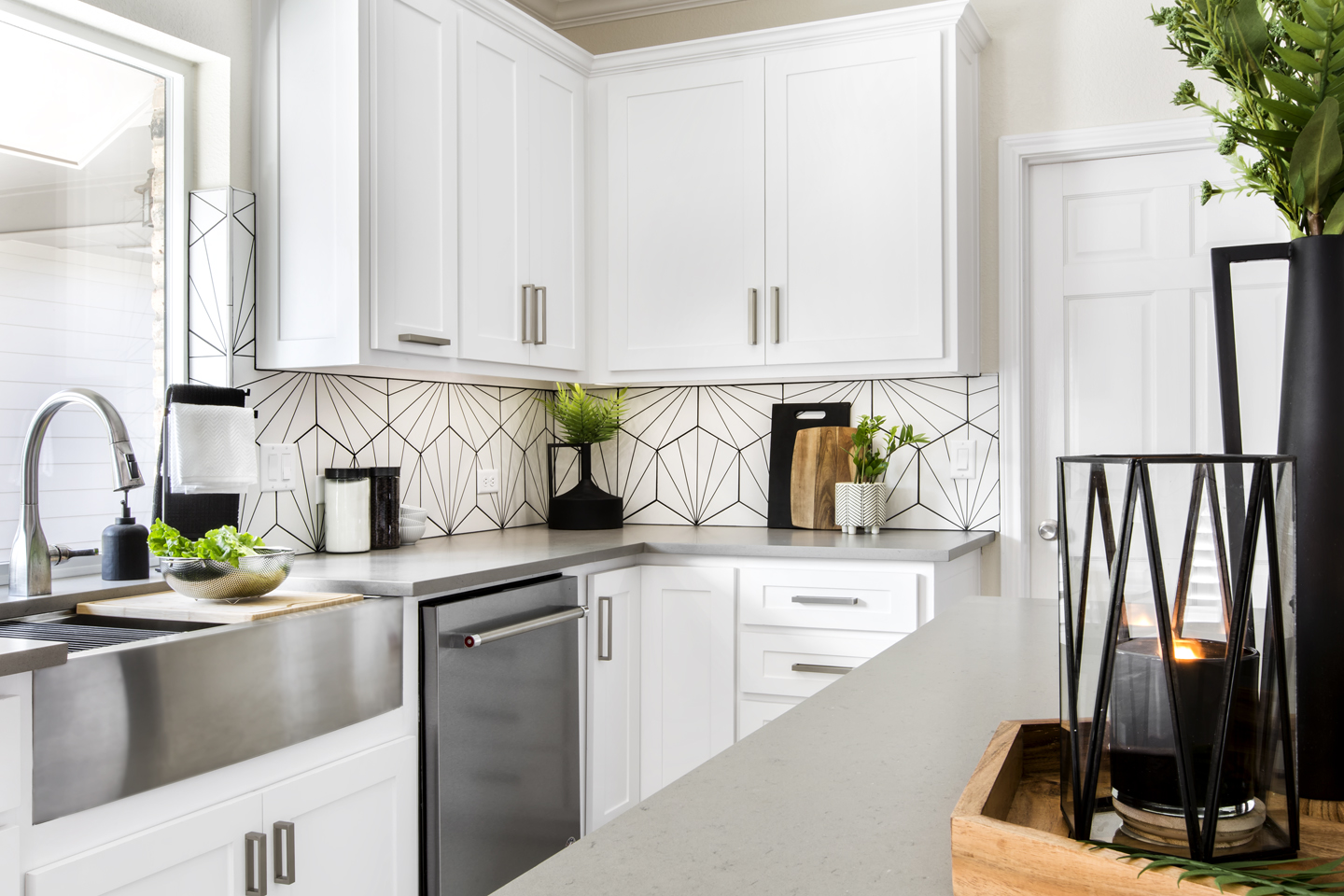
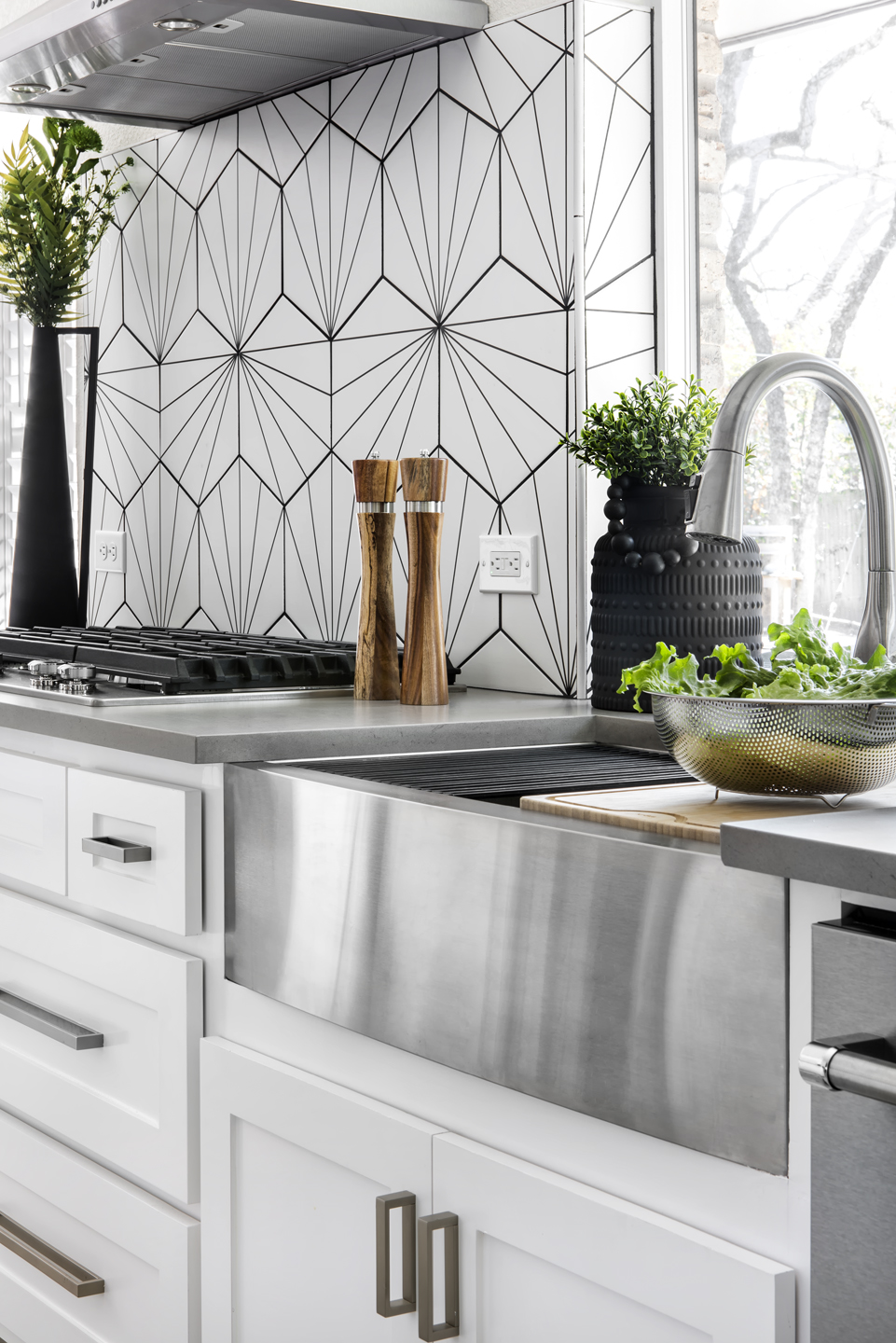
The modern black and white porcelain backsplash tile plays with geometric shapes and lines, creating visual interest and a sense of personality. Our team loves the black and white color scheme with the accents of woodgrain and stainless steel.
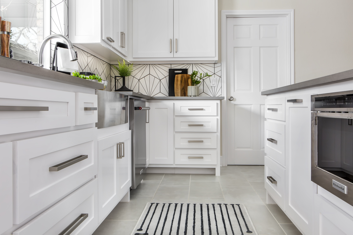
The custom cabinetry includes many deep storage drawers in lieu of lower cabinet doors – this is an option we suggest to all our clients as a means of optimizing storage space and accessibility.
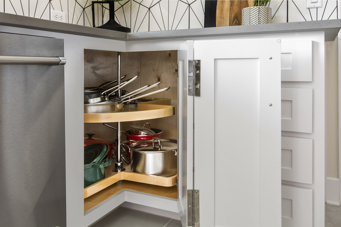
The left lower corner includes a lazy Susan to take full advantage of the corner storage space.
The island also provides extra storage space with deep drawers, a concealed roll-out trash bin, and a sleek under-counter microwave drawer. Our team loves this appliance as a modern option to a standard microwave.
The view from the dining room shows the spacious quartz countertop provided by the new island and the open flow of the remodeled space into the living room.
The finished project is everything the clients dreamed of for their new kitchen. This one-of-a-kind remodel was customized to meet their needs and showcase their modern, trendy taste. The Medford team is grateful we had the opportunity to work with such great clients and help bring their dreams to life!
We’d like to thank everyone that contributed to this beautiful project:
Structural Design: Michael Medford, Jr.
Aesthetic Design: Stephanie Milford
Drafting and Renderings: Brandy Anderson
Production Management: Dave Broadfield
Project Management: Cody Vick
Trim Carpentry: Dave Broadfield, Neil Norris, Greg Haws, Scott Vernon, Cody Vick
Cabinets and Shelving: Bailey Cabinets
Plumbing: Express Plumbing
Electrical: Marc Miller Electric
Drywall: Alex Green Drywall
Paint: Phillip Painting Company
HVAC: Southern Air
Tile & Counters Fabrication: HRG Granite
Glass: Kindred Glass
Countertops & Tile: Hilton’s Flooring & Tile
Staging: Ali Doskocil
Final Photography: Impressia– Todd Ramsey
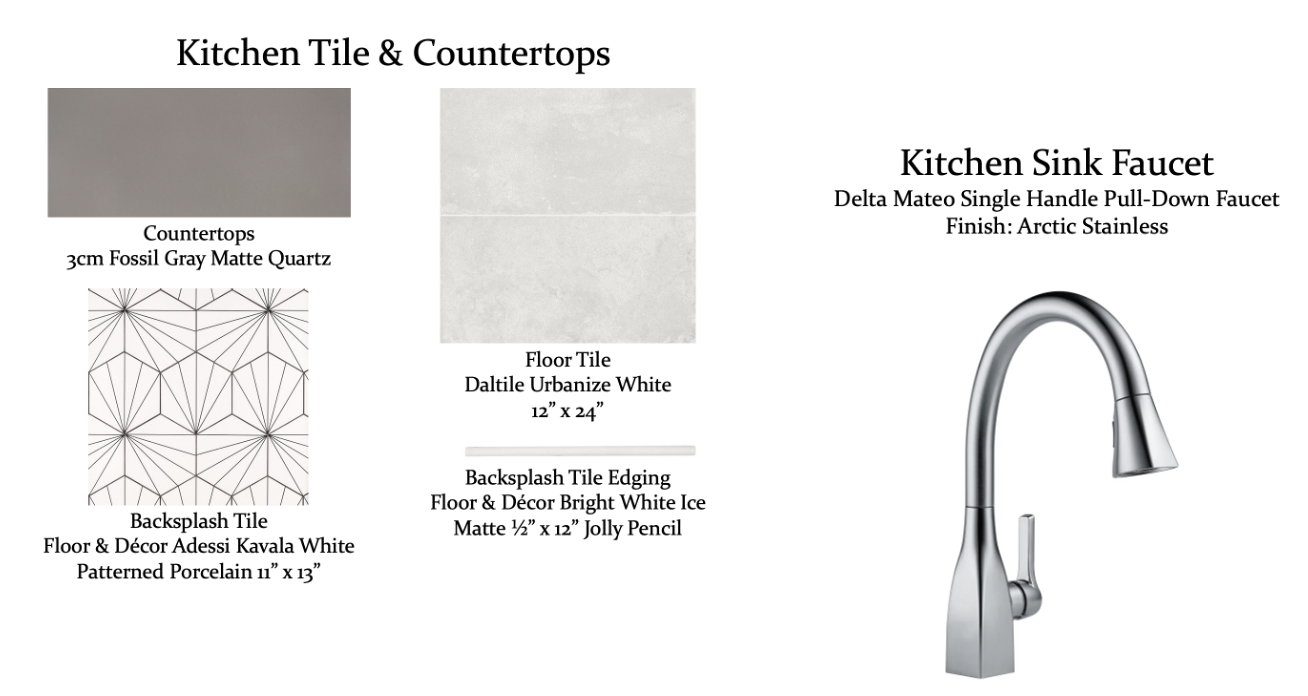
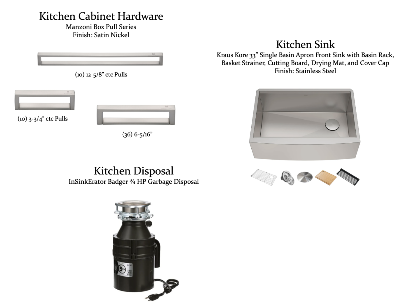
We’d also like to share the design selection items that were used in this remodel:
If your kitchen needs a refresh or you need help getting started with your remodel, Medford Remodeling would be happy to help! We’ll set up an on-site consultation for one of our seasoned Designers to meet with you and discuss the issues with your space and ways to find a solution. If you decide to move forward with purchasing a design package, you’ll be provided with customized floor plans, 3D renderings, a detailed scope of work document, and a complete budget items list – everything you need to understand the process and cost of your kitchen remodel. For more information or to request a sample kitchen design package, fill out a contact form on our website.
We look forward to working with you!
Warm Regards,
The Medford Team

