Our recent clients in Arlington had lived in their 1970’s home for many years and were ready to revamp the dated kitchen. The idea was not only to have a brighter, more modern-looking aesthetic but also to improve the functionality of the room. Cabinet storage, counter space, and a more functional layout overall were big considerations when it came to designing the new area. One of the first items on their wish list was to have a more open, flowing floor plan between the kitchen, dining, and living room.
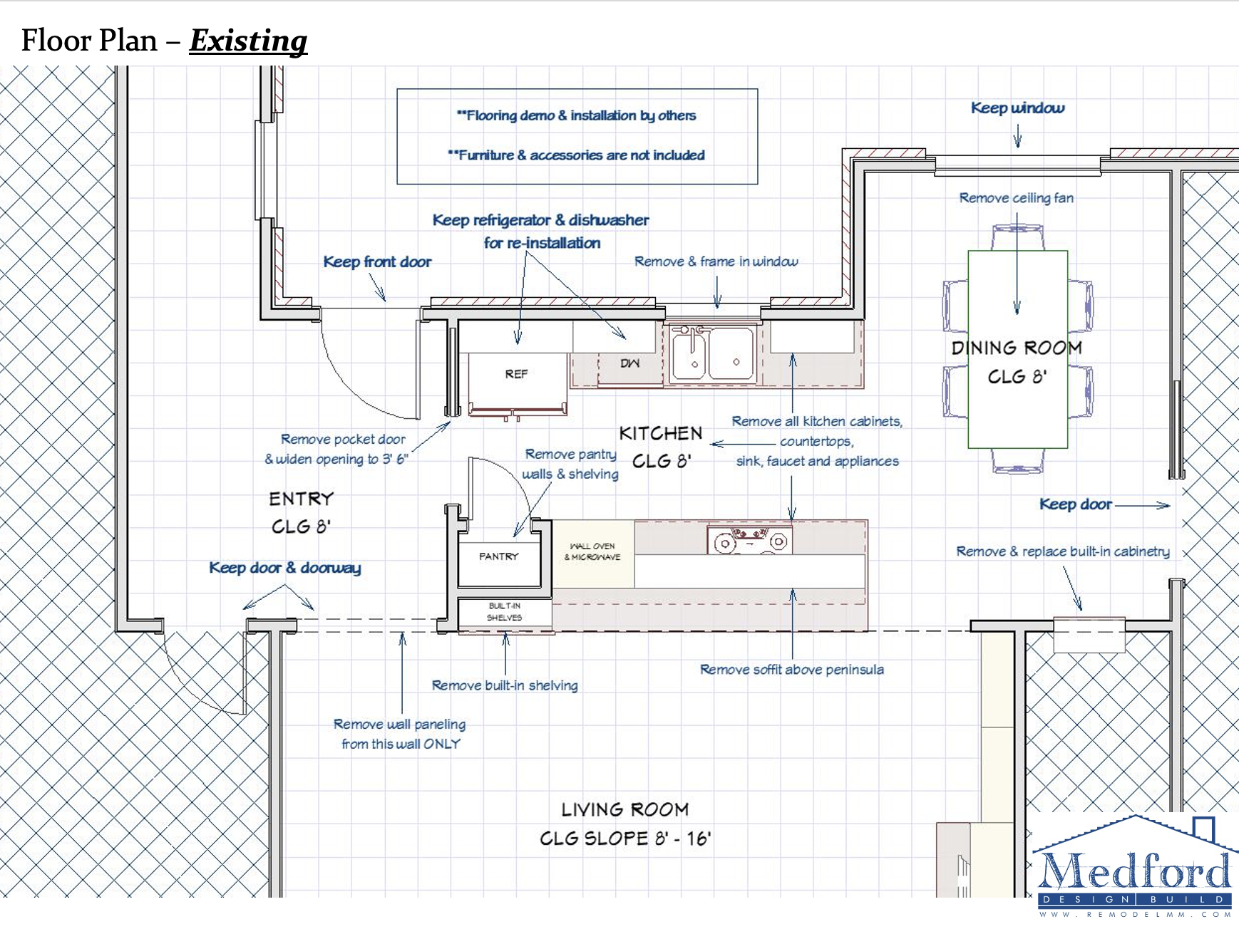
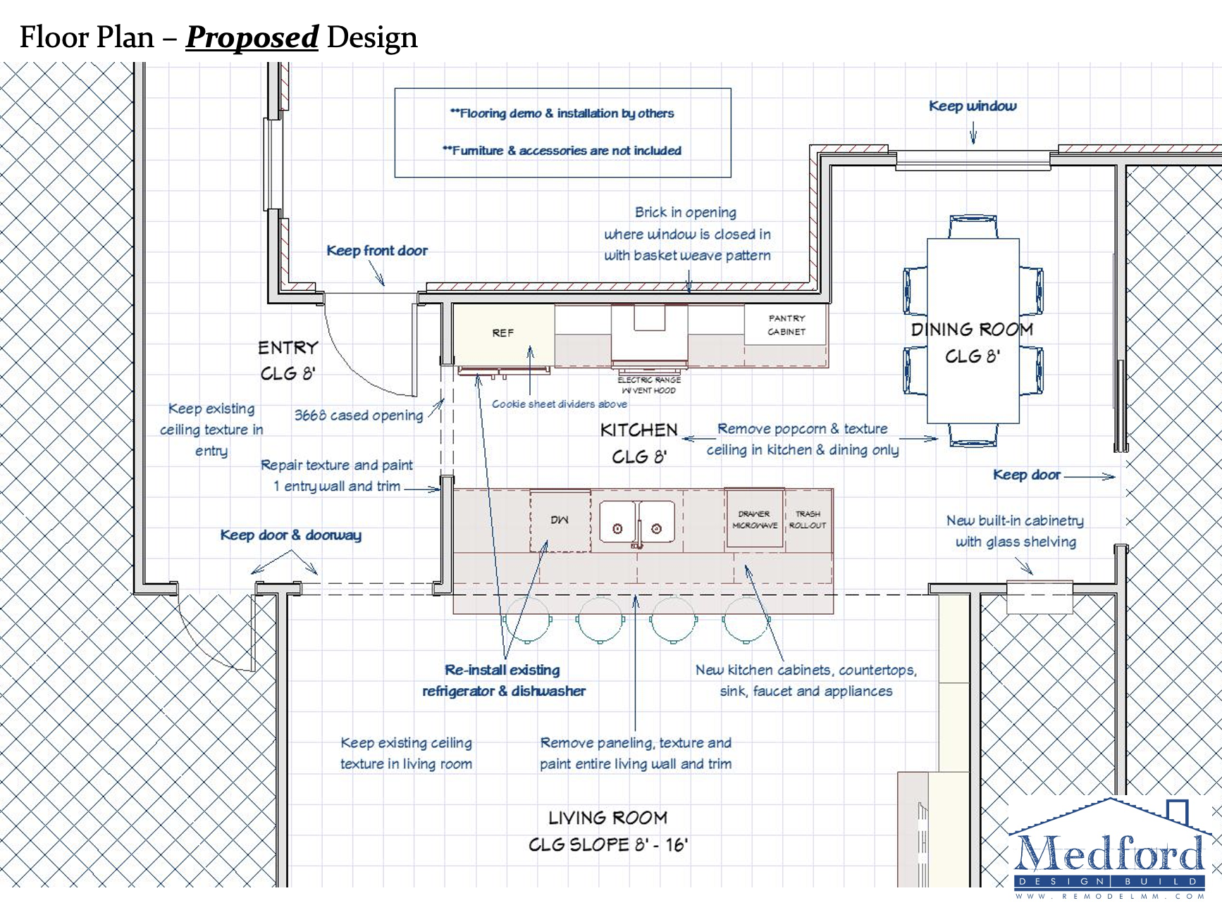
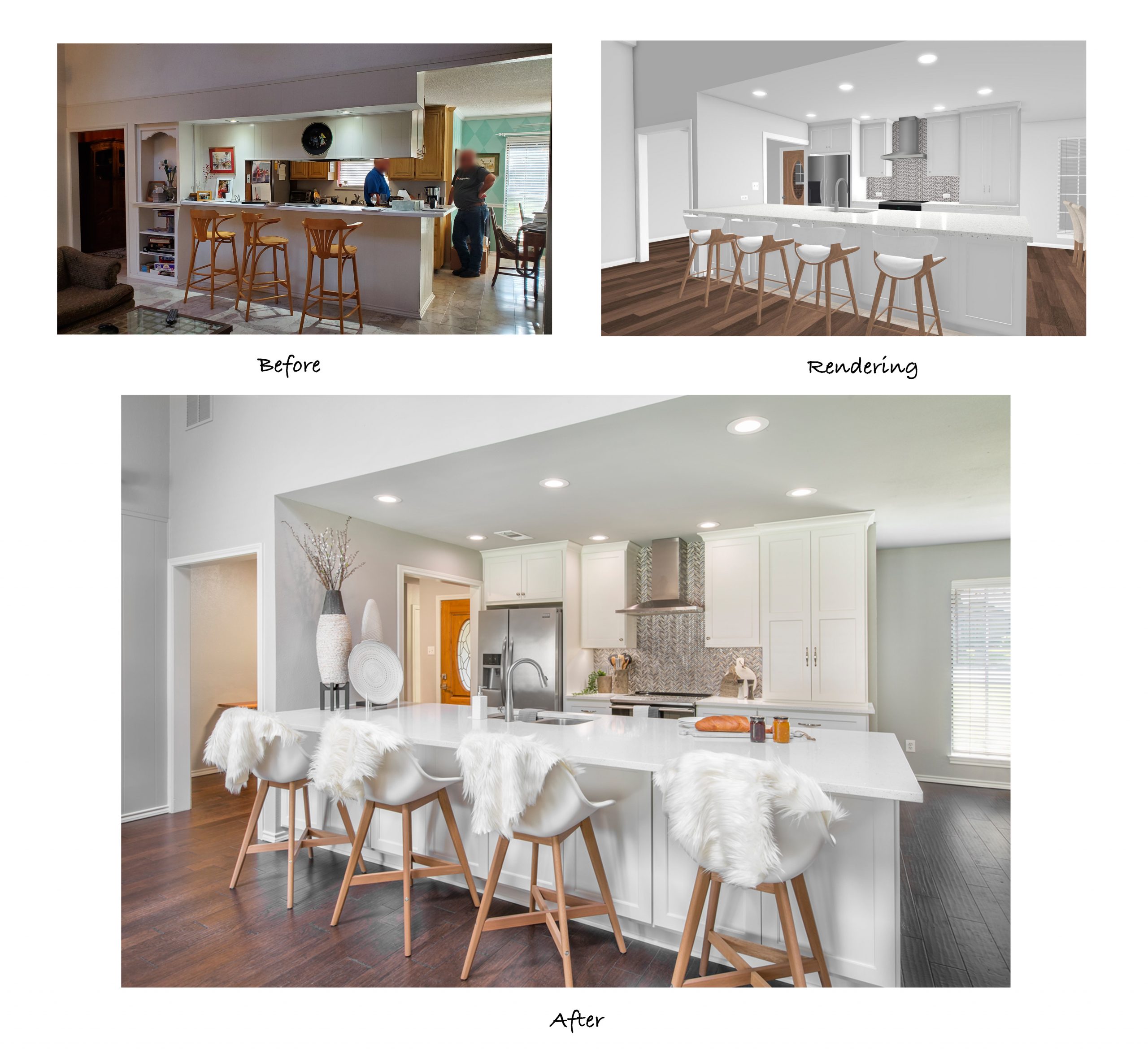
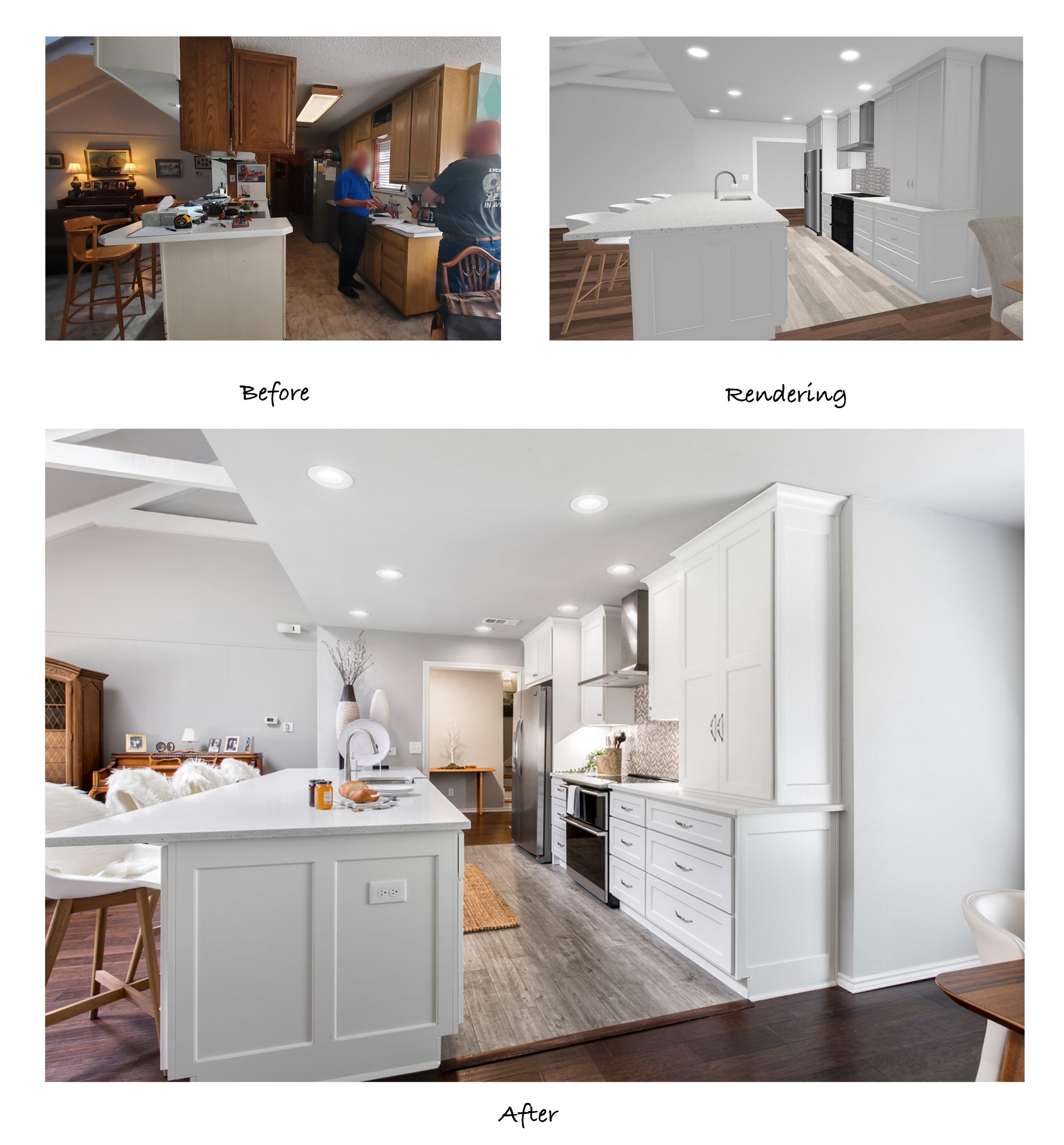
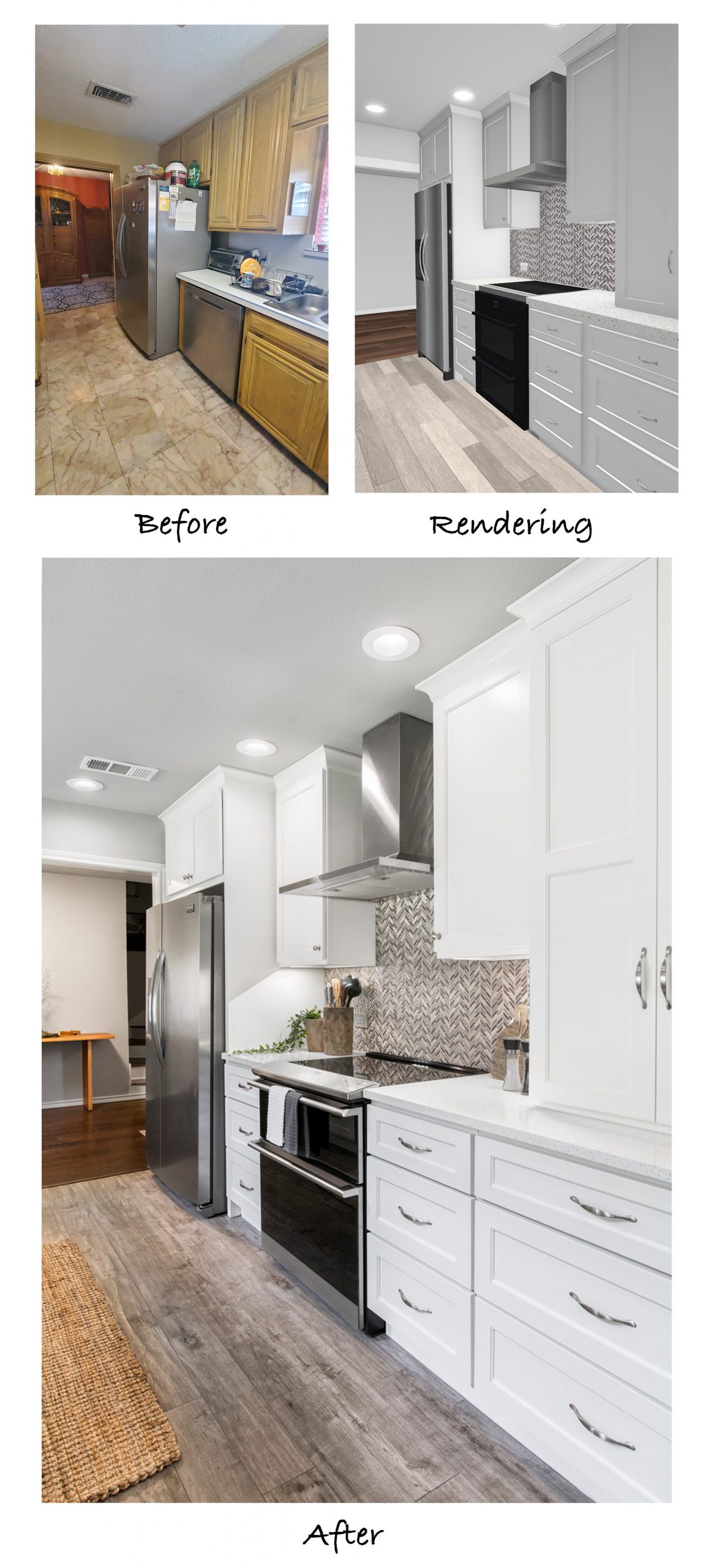
With this project in particular, it was a challenge to change much within the constraints of the existing layout. Our designers had to get creative with minimal structural modifications while still improving the kitchen’s functionality. They drew up detailed floor plans and 3-D renderings to show the clients what changes would be made and how the finished kitchen would look:
The original kitchen included a soffit with upper cabinets above the peninsula and a step-up countertop. These features combined made the area feel small and closed in.
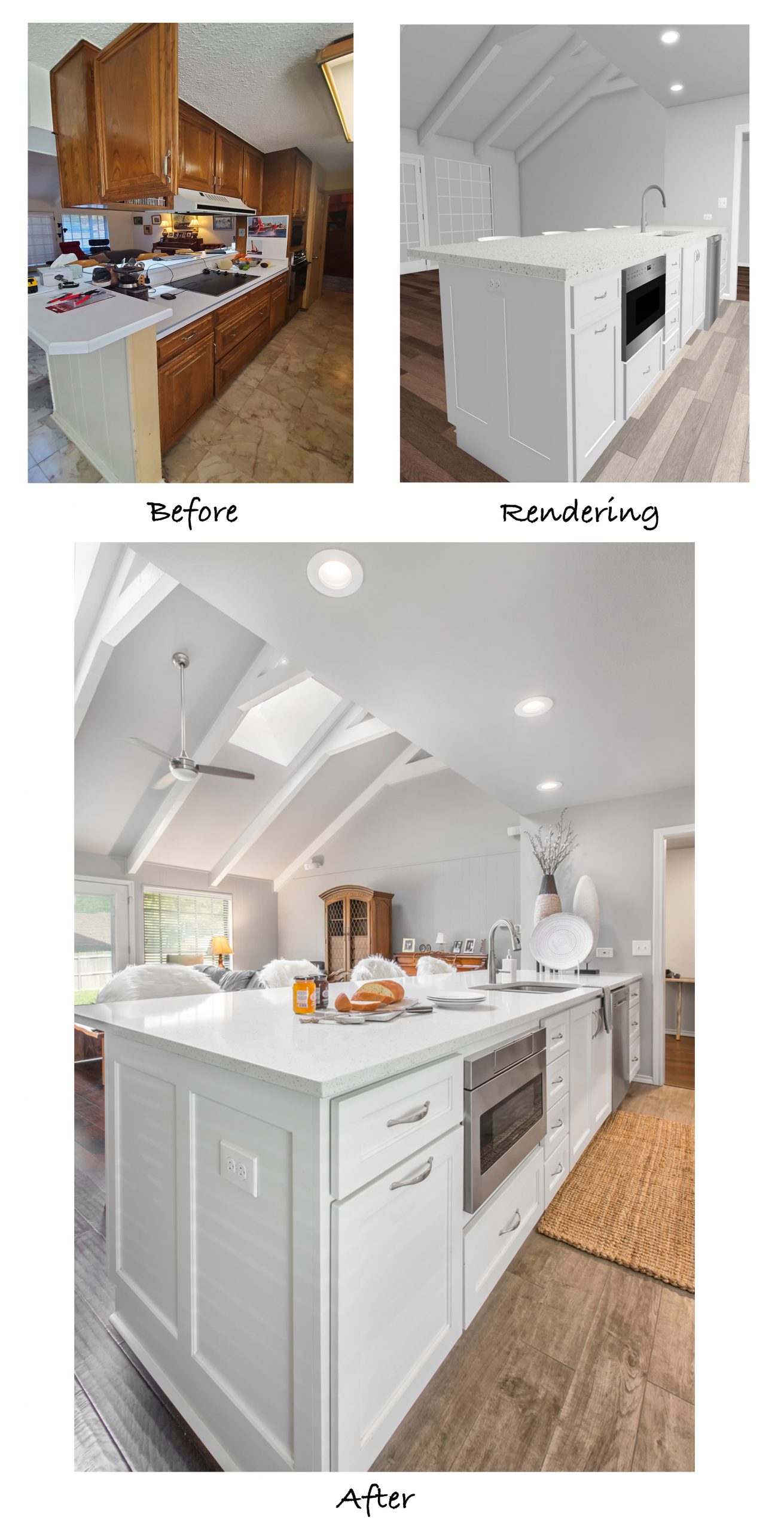
To achieve a more open feel, our designers opted to remove the soffit, upper cabinets, and the stovetop from the step-up bar area, allowing the new countertop to be one level. This provided a huge counter space for cooking and meal prep with seating for 4 on the other side.
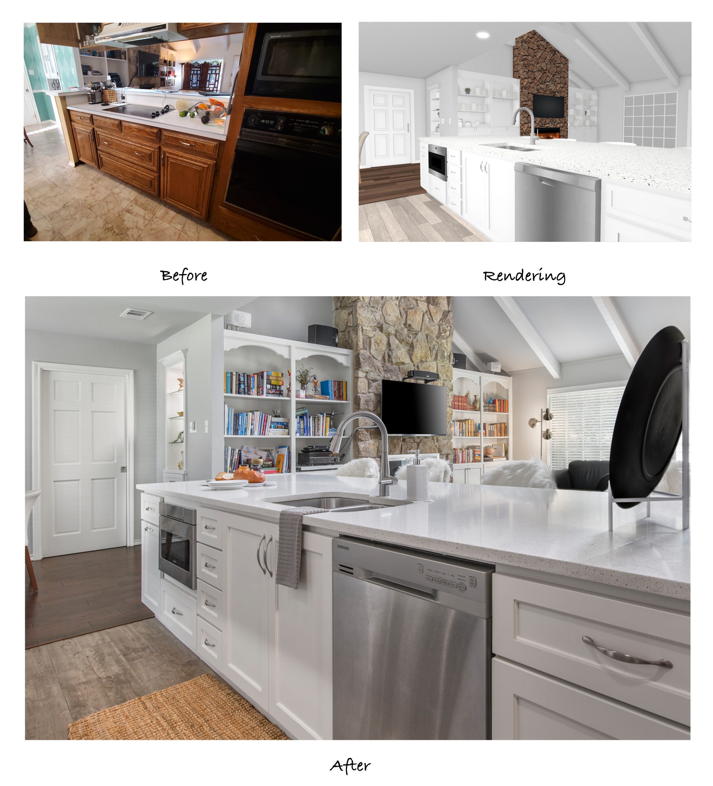
You’ll also notice in the before shot that there is a bookcase on the left end of the peninsula in the living room. Removing this allowed the sitting area for the bar to be extended down further for more usable space and a streamlined look.
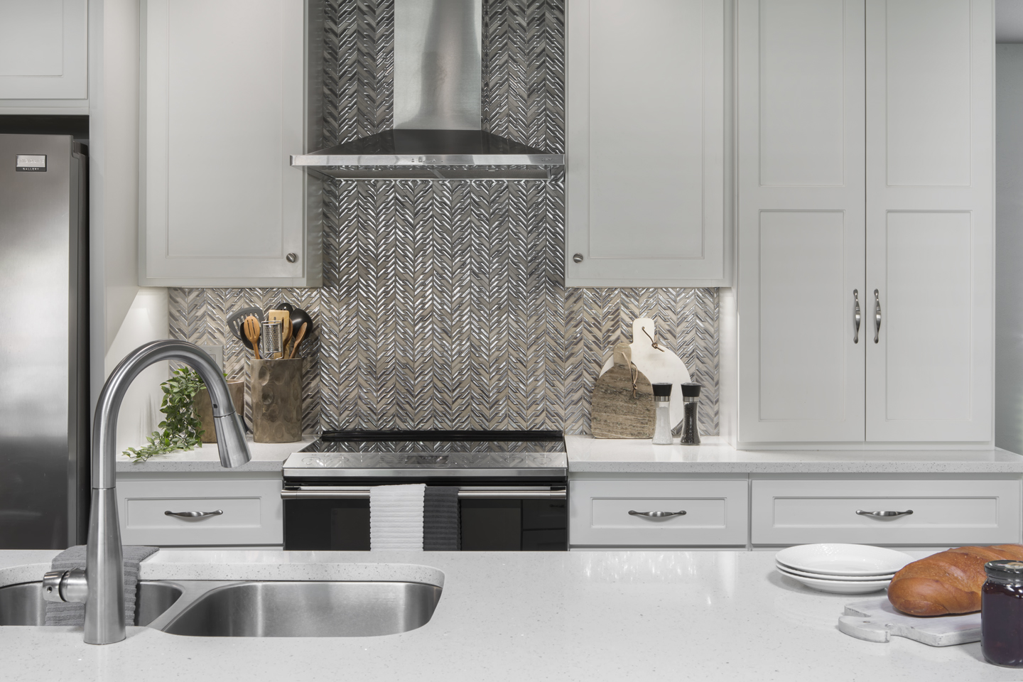
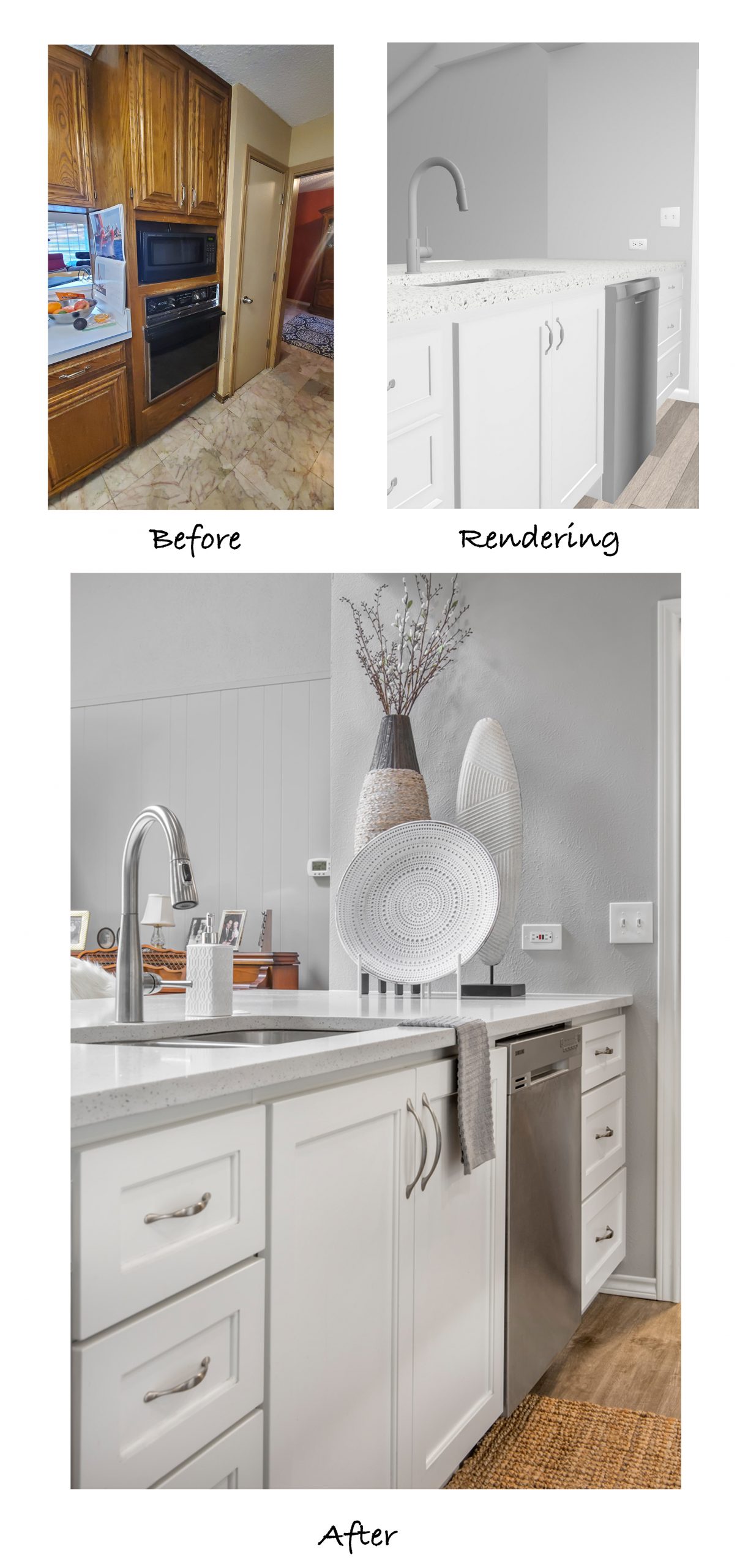
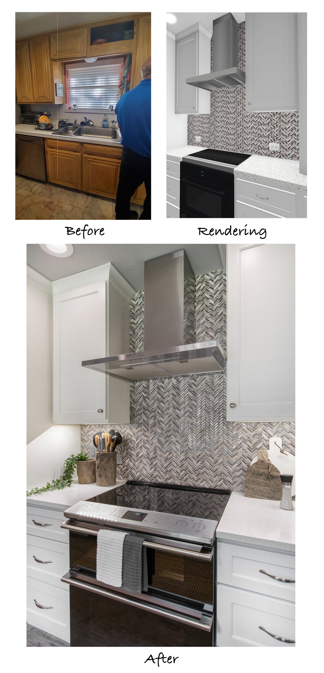
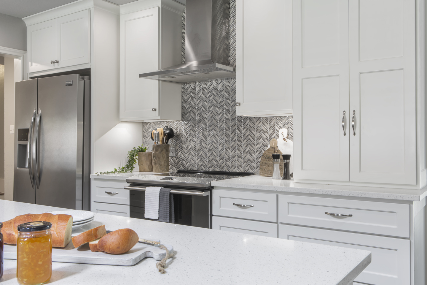
The decision was made to switch the locations of the sink and the cook top which required closing the window that was above the original sink. The clients were okay with this, as a large vent hood and show-stopping backsplash took priority.
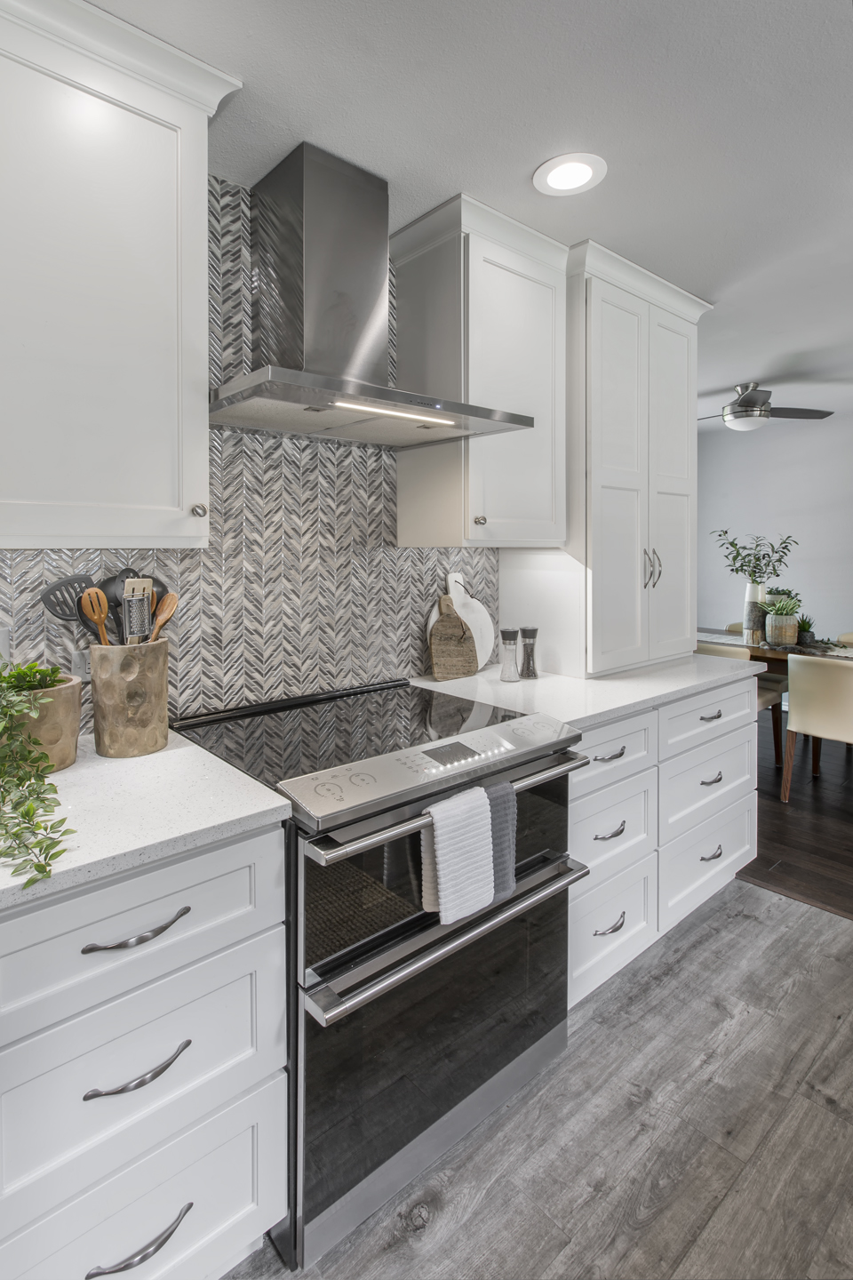
Strategically placed LED can lights work in conjunction with the undercabinet lighting to create a near-shadowless environment – ideal for a master chef!
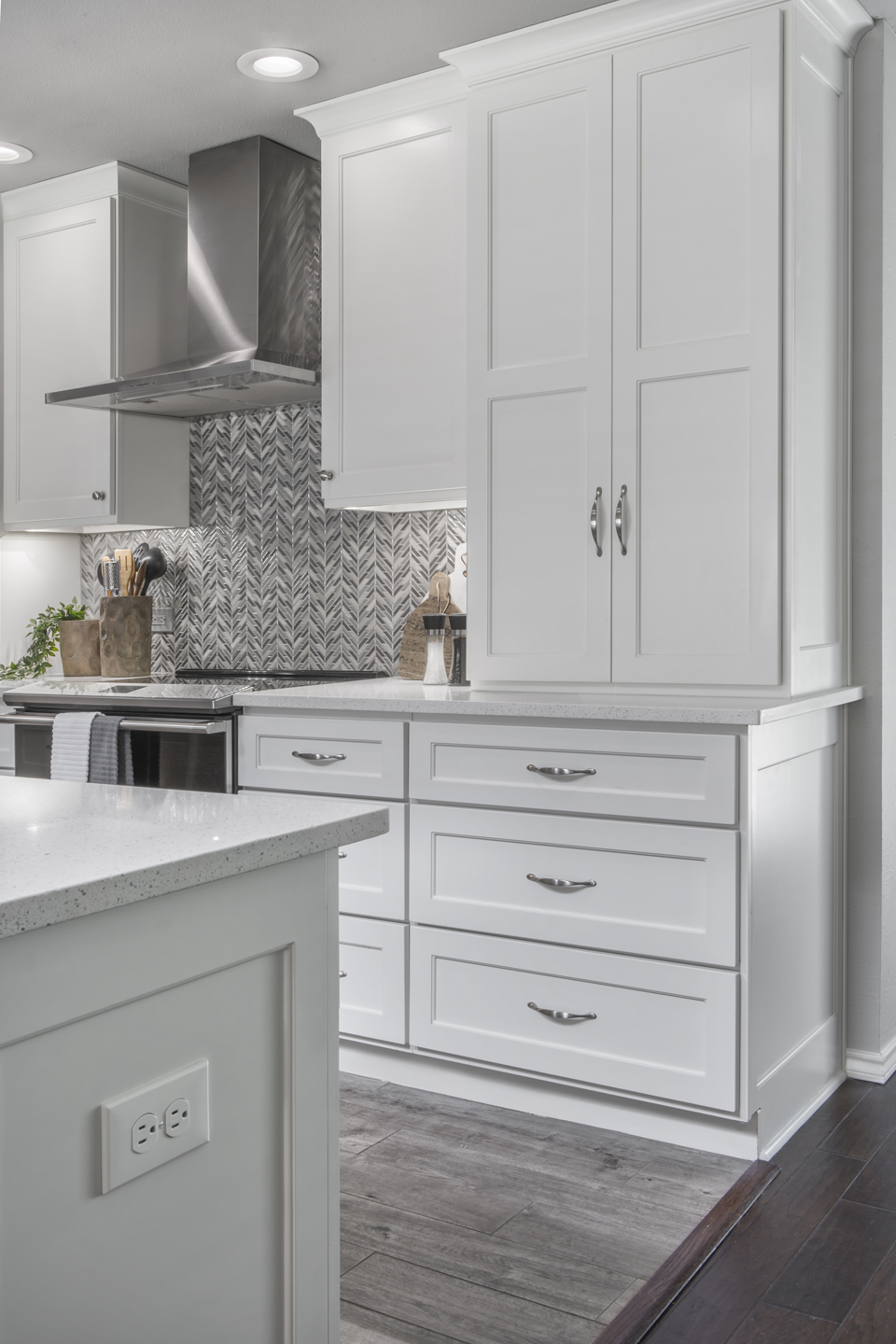
Below the counter on the peninsula is a convenient microwave drawer and a roll-out trash bin. Including these features within the cabinetry prevents clutter in the kitchen. Stacked utensil and pan drawers are also included, located near the sink, dishwasher, and meal prep counter for easy access.
Removing the soffit and upper cabinets made all the difference looking into the living space! The ceilings feel higher, the space is open, and the bright light from the windows in the living room floods the beautiful new kitchen.
The original walk-in pantry was removed, along with the double oven and bookshelf previously mentioned from the living room side. This provided more counter and storage space within the peninsula. A new pantry cabinet was added at the opposite end to make up for the pantry storage.
The back wall cabinetry has lots of drawer space and upper cabinets providing a ton of convenient storage. The new location of the stainless steel oven and vent hood compliment the stunning chevron mosaic backsplash forming a beautiful focal point.
The combination of deep pan drawers and a tall pantry cabinet provide ample storage in place of the walk-in pantry that was removed. This design feature creates a much cleaner look and takes up less space by utilizing vertical square footage.
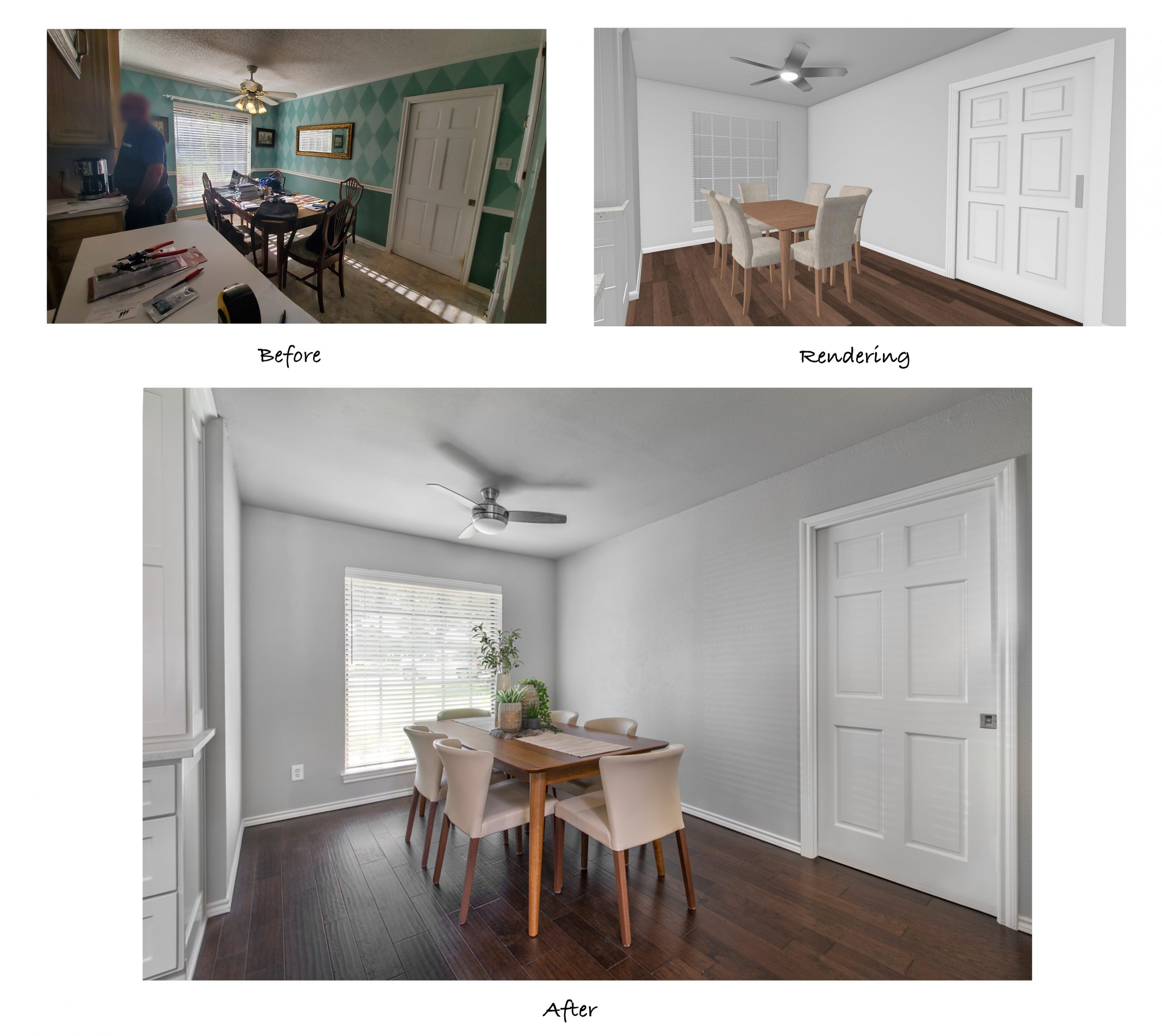
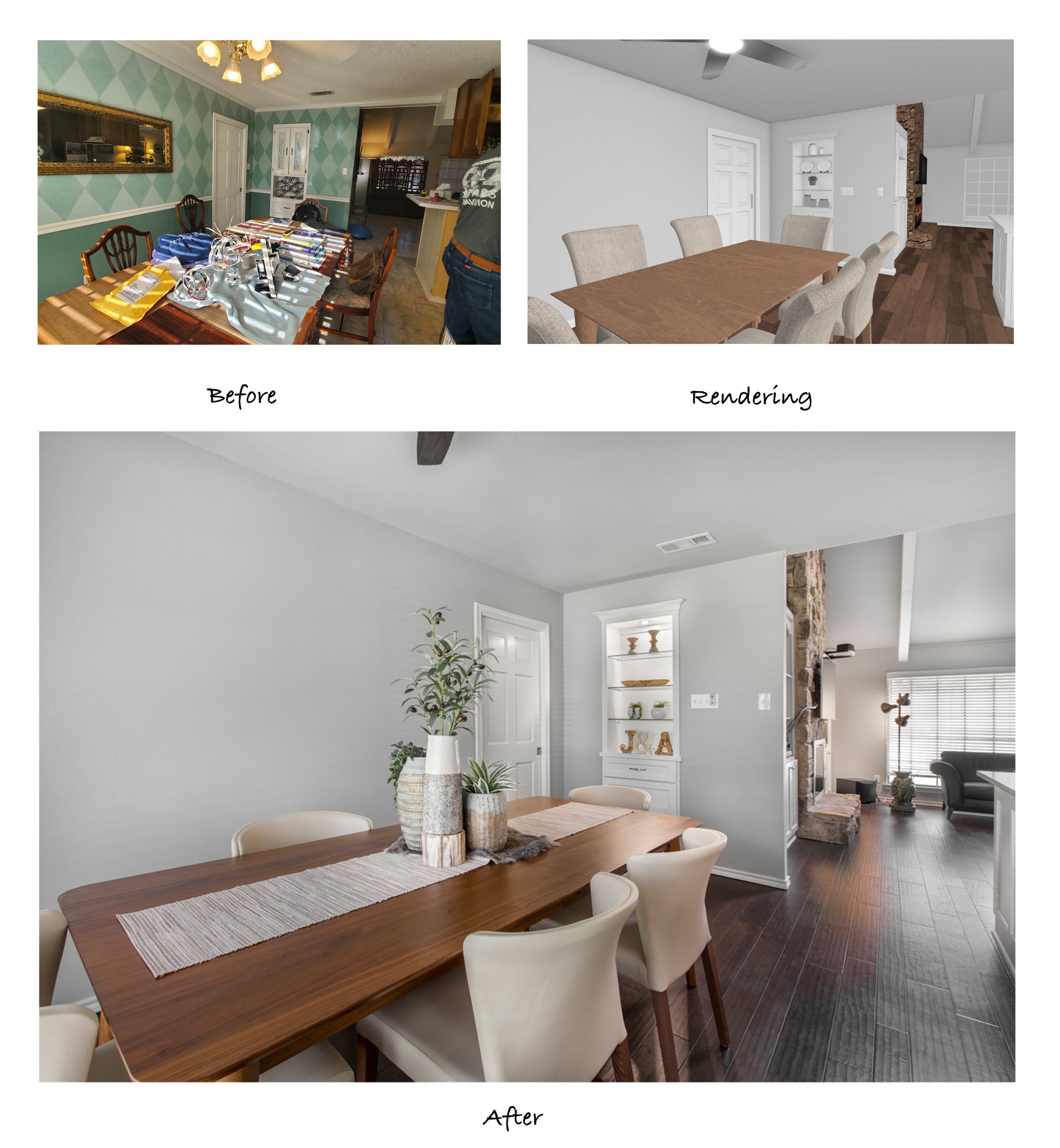
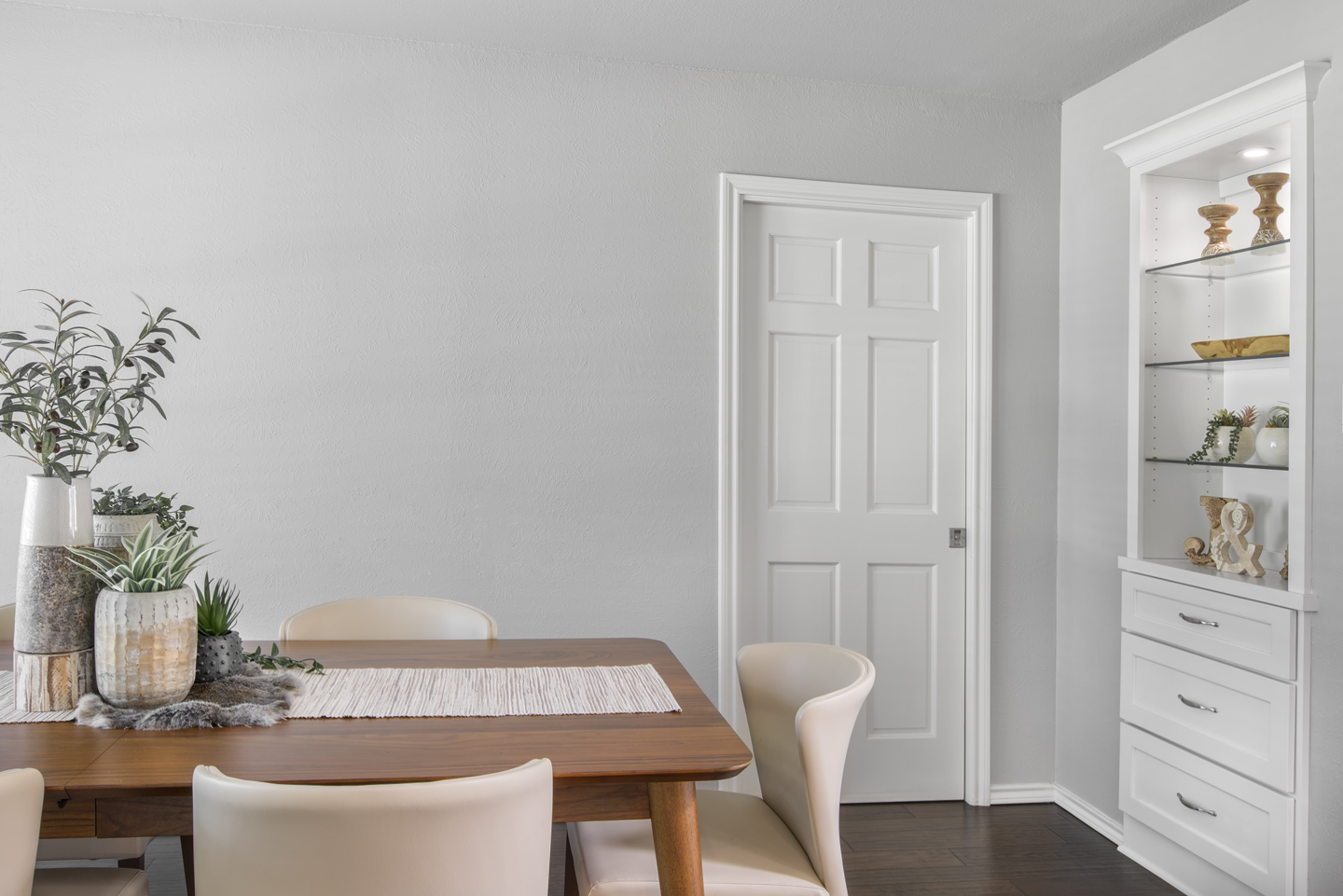
The dining room was toned down by removing the green patterned wallpaper and the dated chair rail, and then refinishing the walls with new texture and Sherwin Williams ‘Silver Plate’ paint. This cool gray is a great neutral color that complements the kitchen and provides a seamless transition from room to room. The client added a smaller but stylish table and chairs and a compact ceiling fan, which makes the room feel much larger. Removing the popcorn ceiling also contributed to a sleeker finished look.
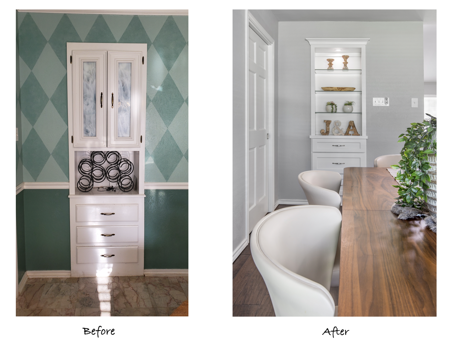
The dining room cabinet was replaced with a glass shelves and lower drawer cabinet that match the kitchen cabinets, making a great functional display space.
The finished project is just what the clients wanted – a modern, updated kitchen and dining area that is open to the neighboring living room. It came together beautifully, and we’re glad our team was able to help bring it to life!
We’d like to shout out to everyone that helped with this gorgeous remodel:
Aesthetic Design: Stephanie Milford
Structural Design: Mike Medford, Sr.
Drafting and Renderings: Brandy Anderson
Production Management: Michael Medford, Jr.
Project Management: Neil Norris
Trim Carpentry: Neil Norris, Greg Haws
Plumbing: Express Plumbing
Drywall: Alex Green Drywall
Electrical: Marc Miller Electric
Paint: Phillip Painting Company
Tile & Counter Fabrication: HRG Granite
HVAC: Southern Air
Countertops & Tile: Hilton’s Flooring & Tile
Staging: Ali Doskocil & Terri Doskocil
Professional Photography: Impressia Photography
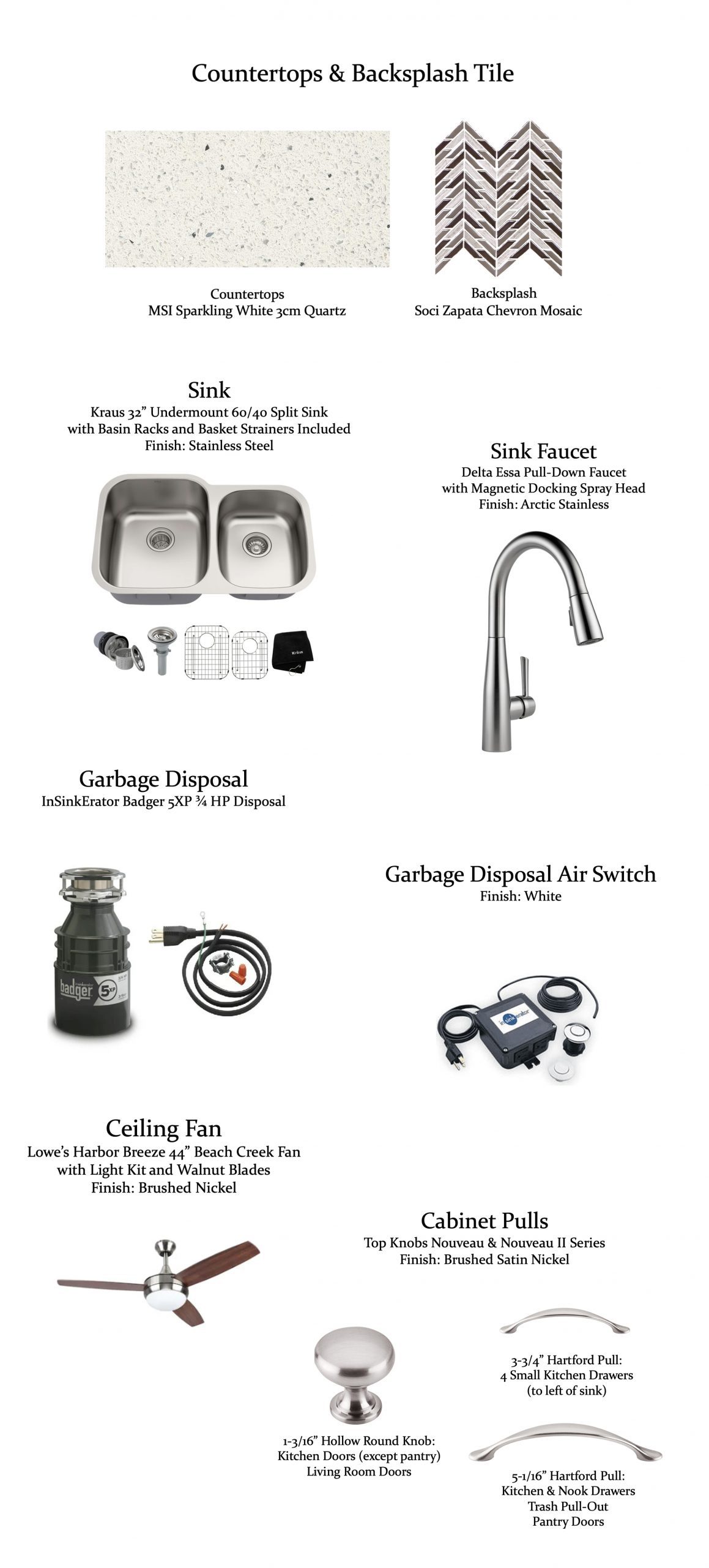
We’d also like to share the list of the design selection items that were used:
If you are planning a kitchen remodel or need help solving an issue or layout, storage optimization, or aesthetics, the Medford Team would be happy to help!
Contact us today for more information!
Warm Regards,
The Medford Team

