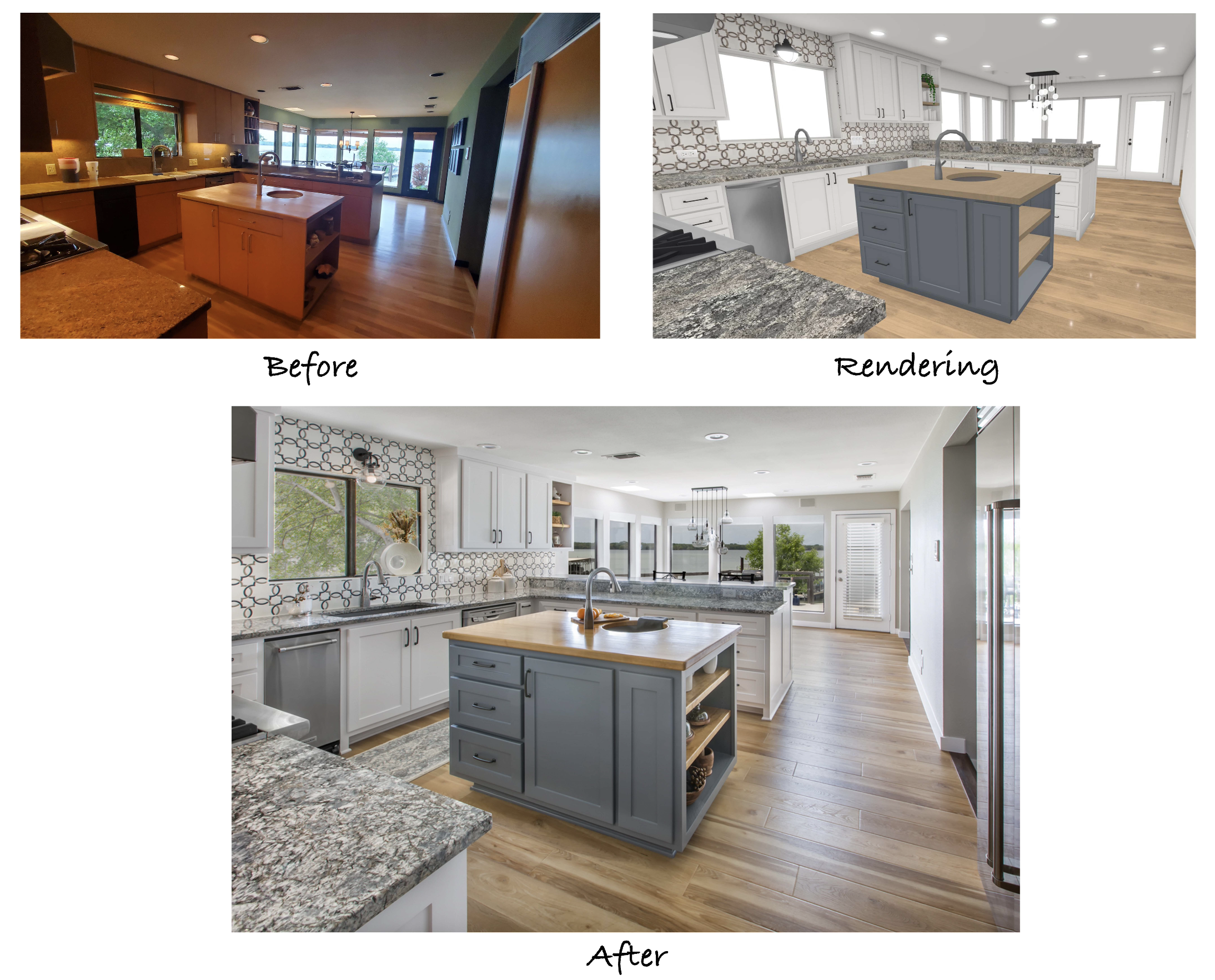
Our recent clients have a gorgeous home just off the lake in Arlington, TX. Many updates had already been made throughout the original 1978 build when the clients initially came to us, and the kitchen was one of the last items on their list to remodel. They knew the space needed a more modern aesthetic to match the rest of the house and the stunning view of the lake from the large breakfast nook windows.
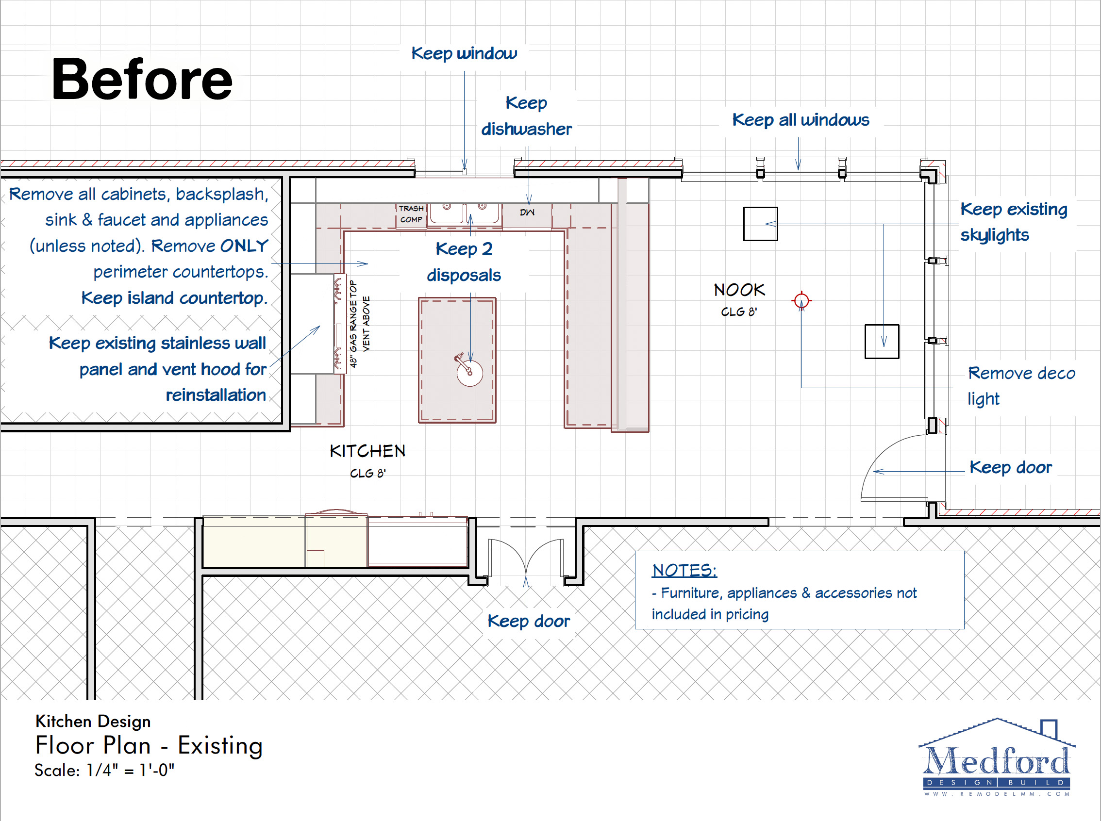
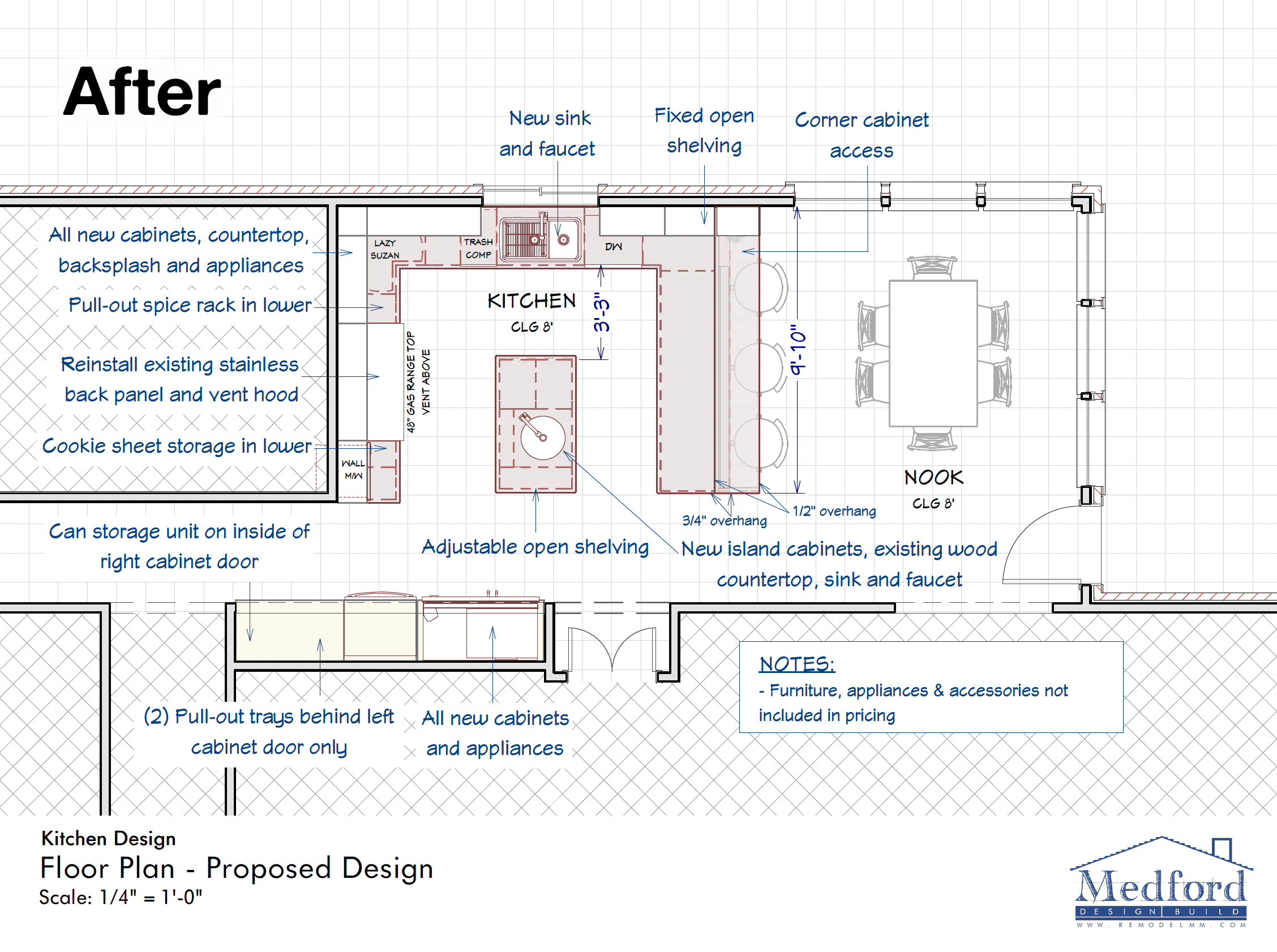
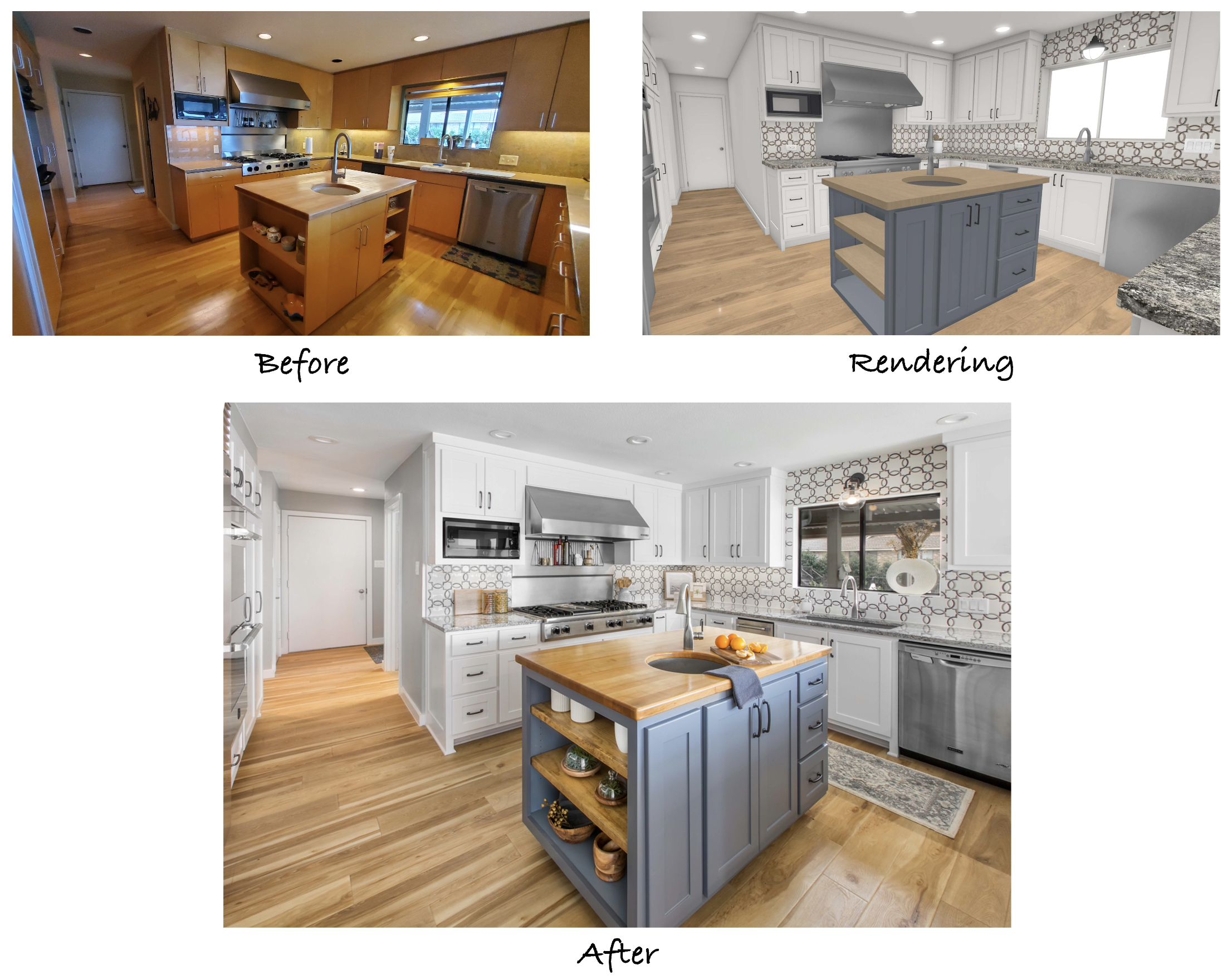
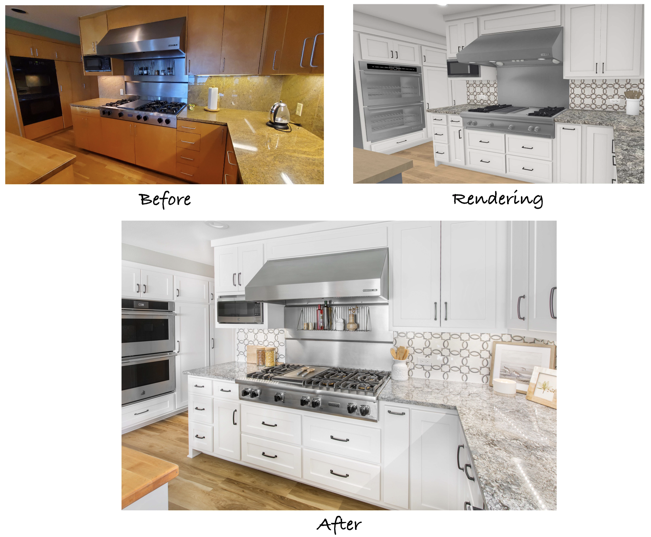
Because the layout wasn’t going to change, it was important that the functional and aesthetic modifications were impactful. Custom cabinetry, new backsplash tile, countertops, and updated stainless steel appliances were a few of the items discussed early on. Along with keeping the butcher block countertop on the island, the clients also wanted to keep the existing stainless steel back panel and vent hood with the gas range, which was noted in the designs. Our team began working on the design package to showcase these changes and detail the scope of work required for completion.
Beautiful shaker cabinetry was installed in place of the original slab-style doors. New features, such as a pull-out pantry and can storage unit, enhance the updated storage space.
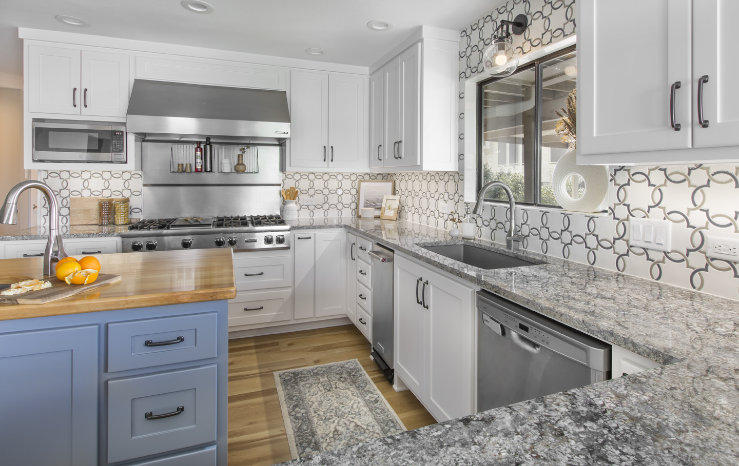
Upon entering the remodeled kitchen, the view of the lake provides a stunning backdrop to the renovated space. The blue-gray and neutral color scheme compliments the serene theme of the lake environment and flows with the rest of the house. It’s amazing how much brighter the kitchen and breakfast nook feel with lighter paint colors!
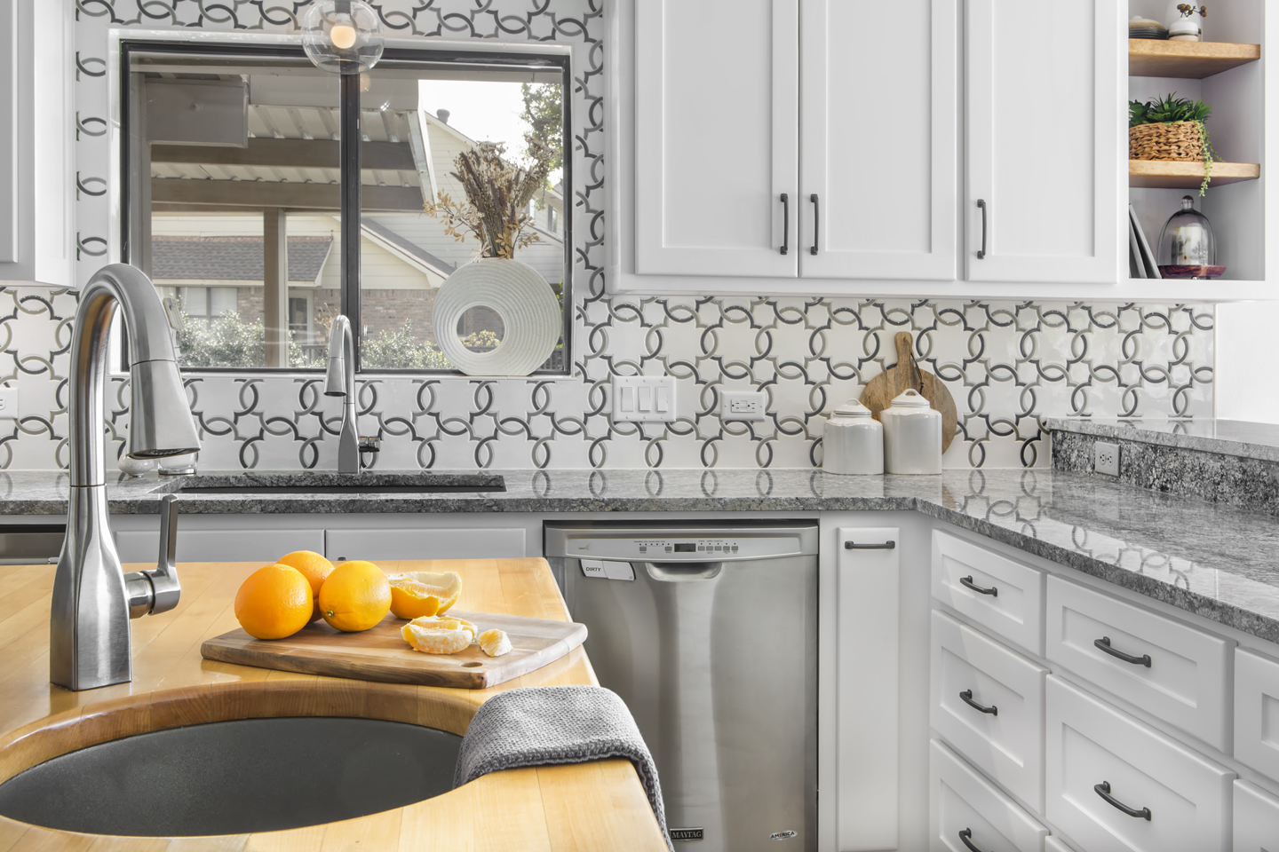
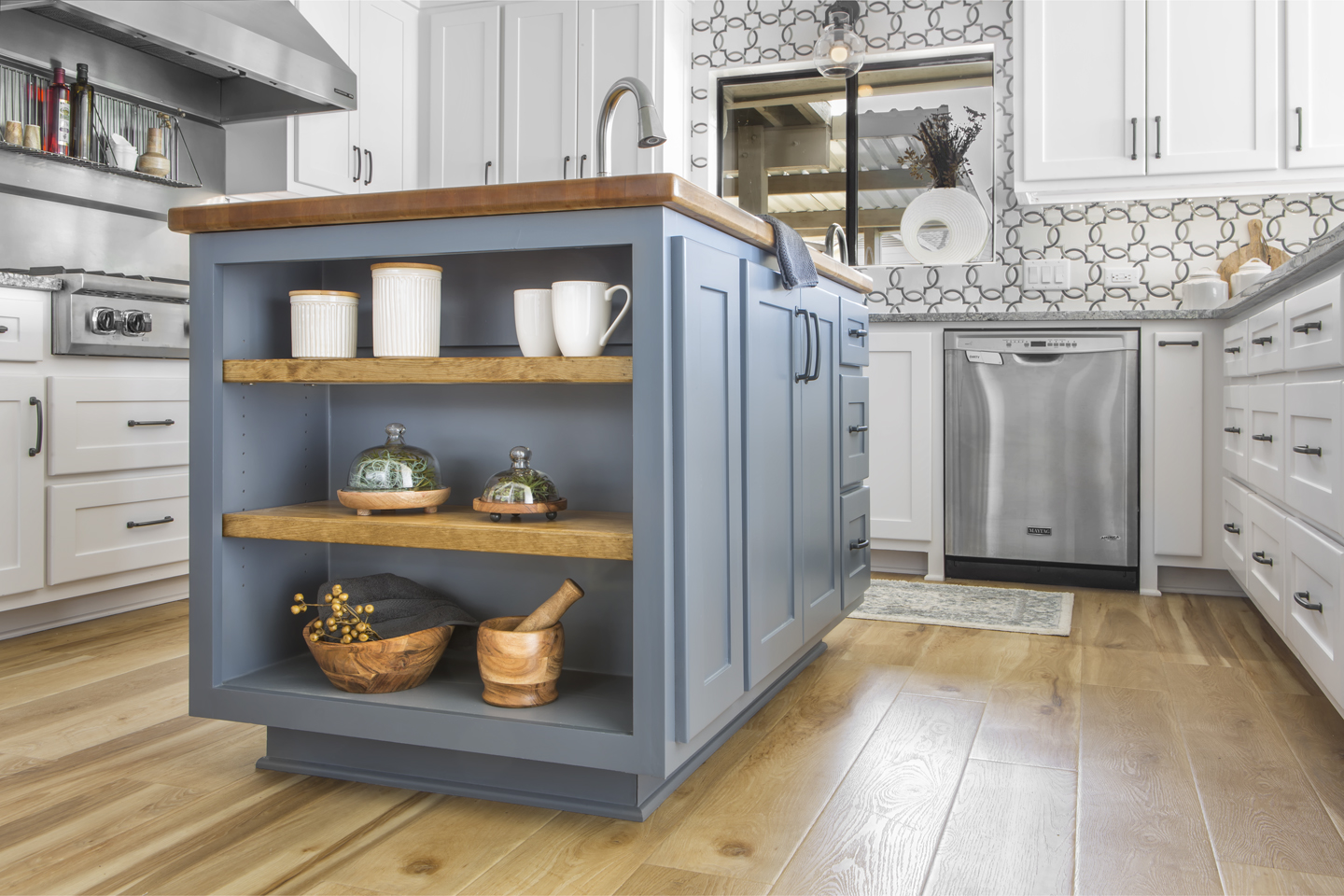
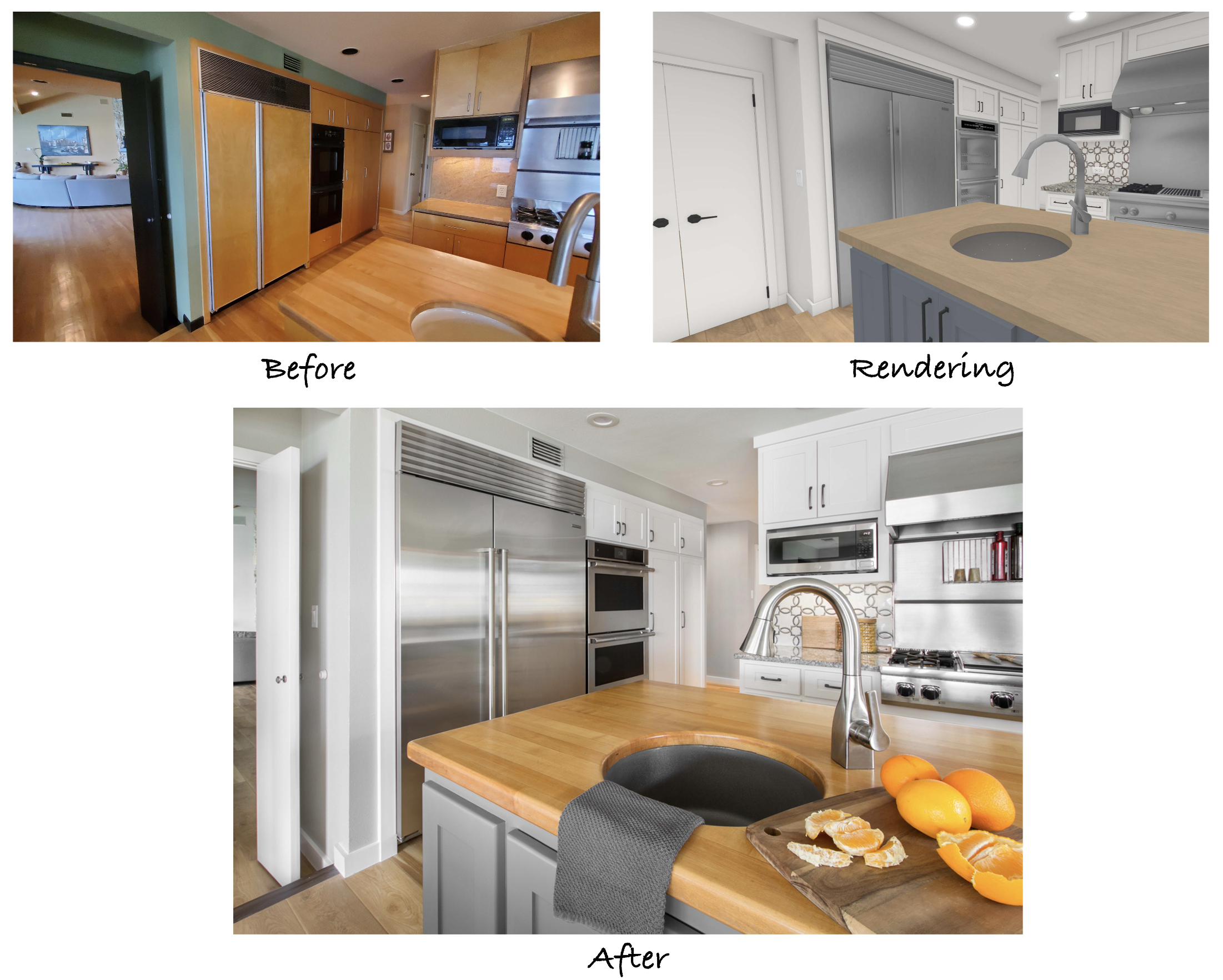
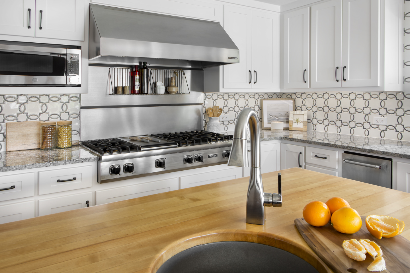
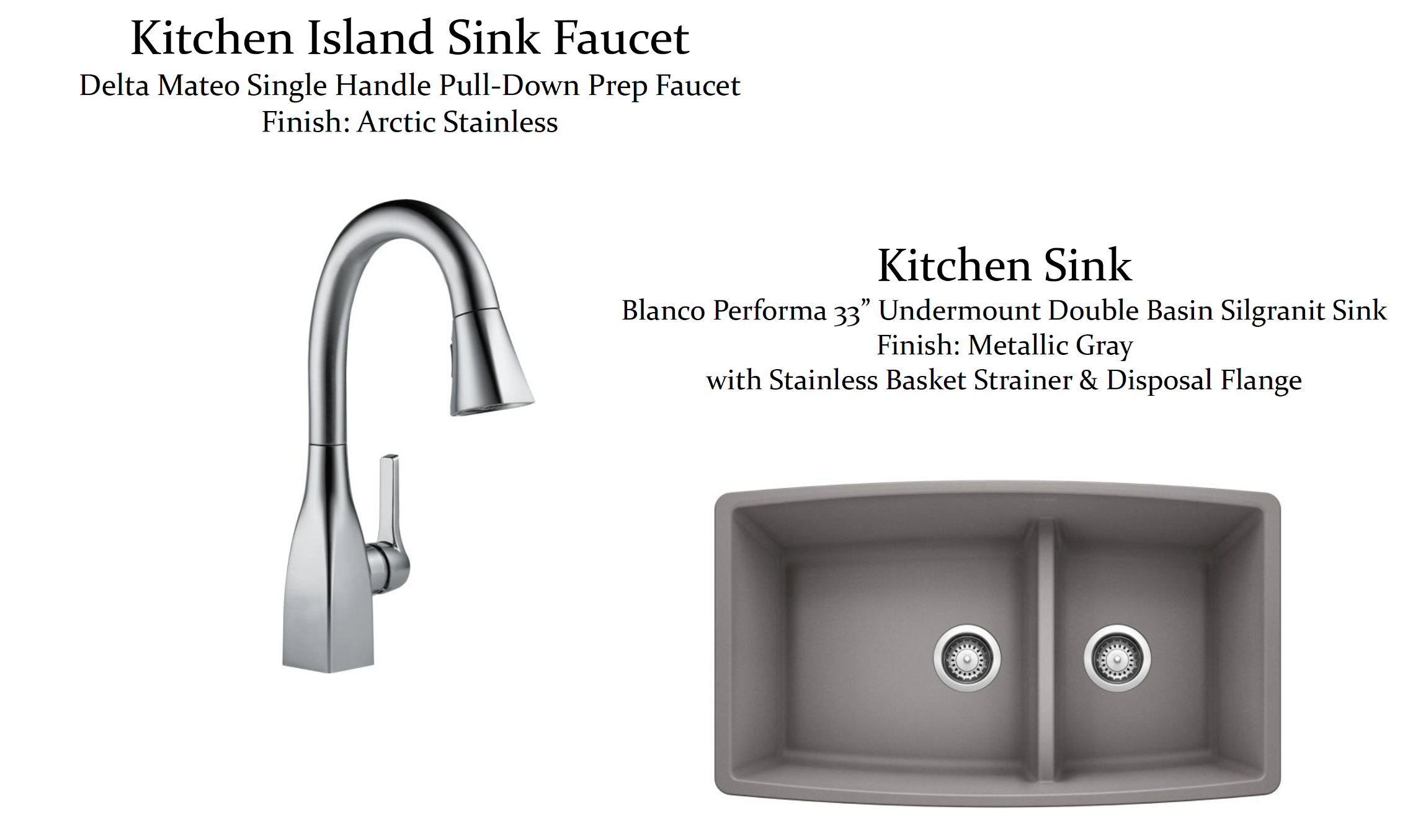
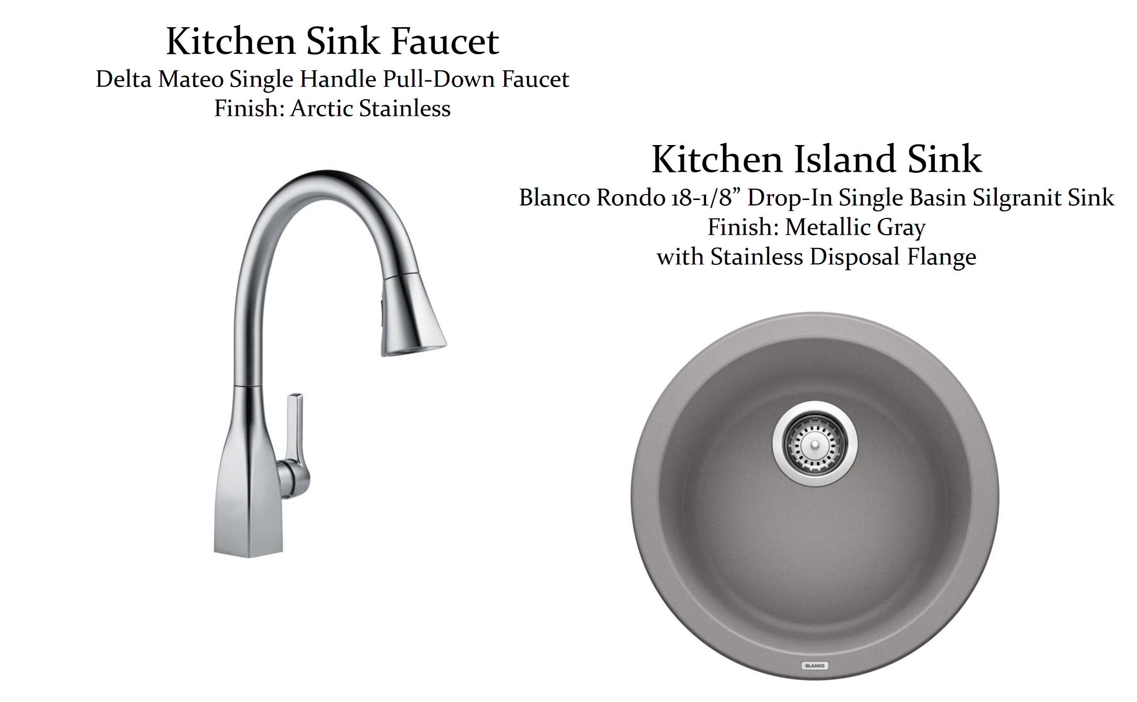
The original countertop remains on the island with a new sink and faucet. The cabinetry below was re-designed to include additional storage space with drawers and adjustable shelving. The choice of Sherwin Williams ‘Downing Slate’ paint color was the perfect balance between blue and gray that the clients were looking for.
The adjustable 1 ½” thick shelves on the end of the island are a great place to showcase trinkets and hold cooking accessories. The wood stain used adds personality and interest while complimenting the flooring, island countertop, and the wood beams used in the neighboring living room.
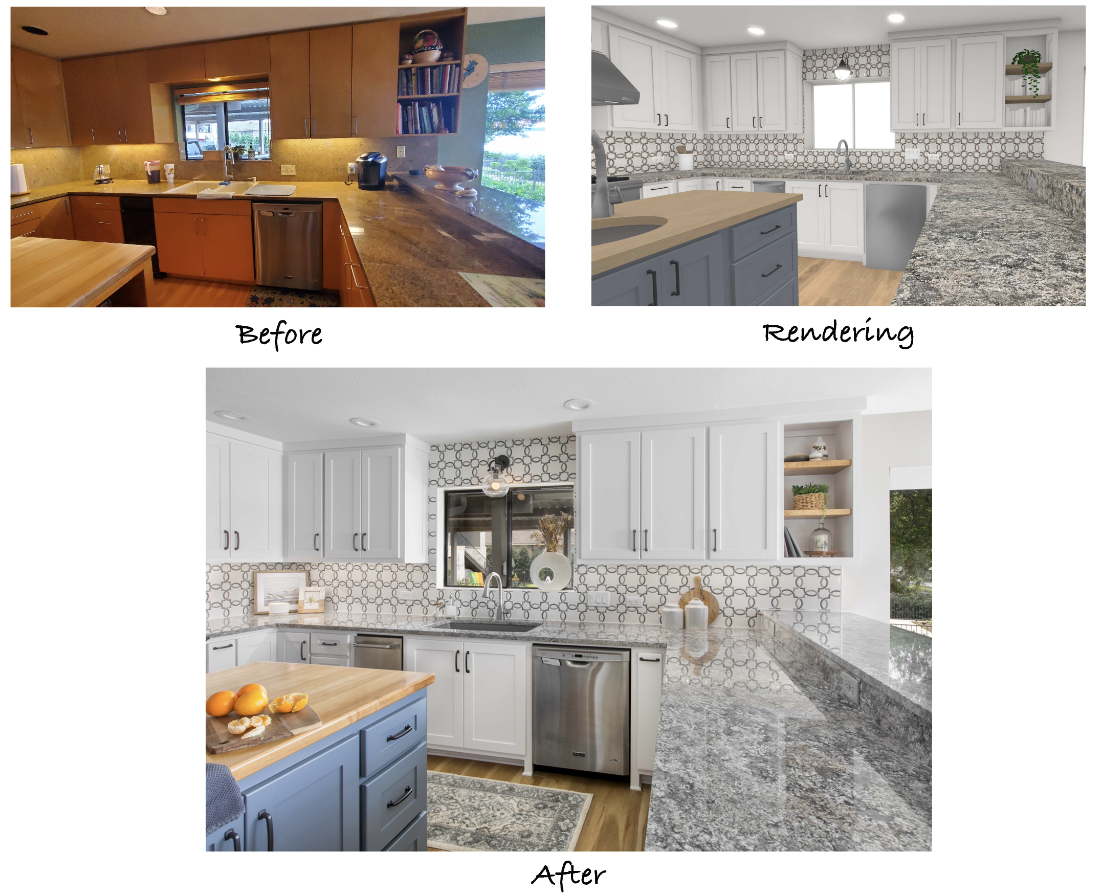
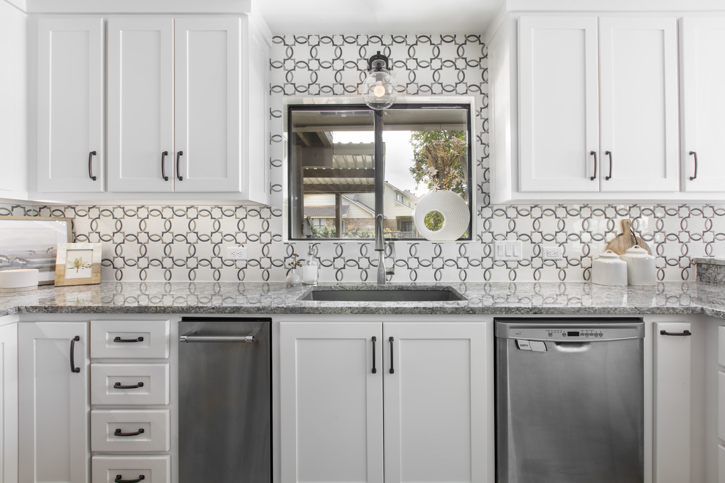
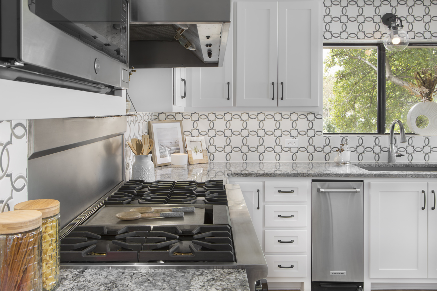
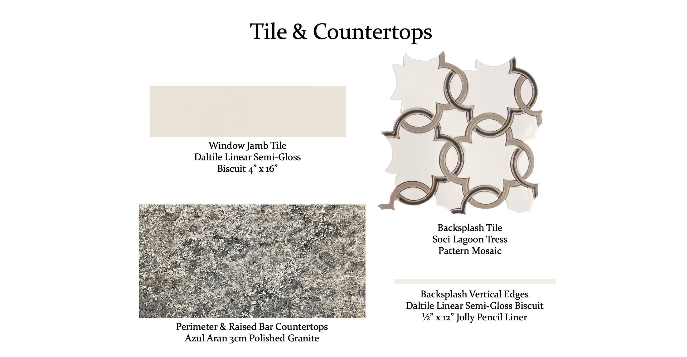
3CM ‘Azul Aran’ polished granite was chosen for the new countertops, which frame the U-shaped kitchen beautifully and compliment the colors of the mosaic backsplash tile. Our designers opted for the tress-pattern tile to extend up to the ceiling to make the room feel larger and create visual interest. The wood accent shelving at the end of the upper cabinets ties in with the wood details of the island while providing a useful space for cookbooks and décor.
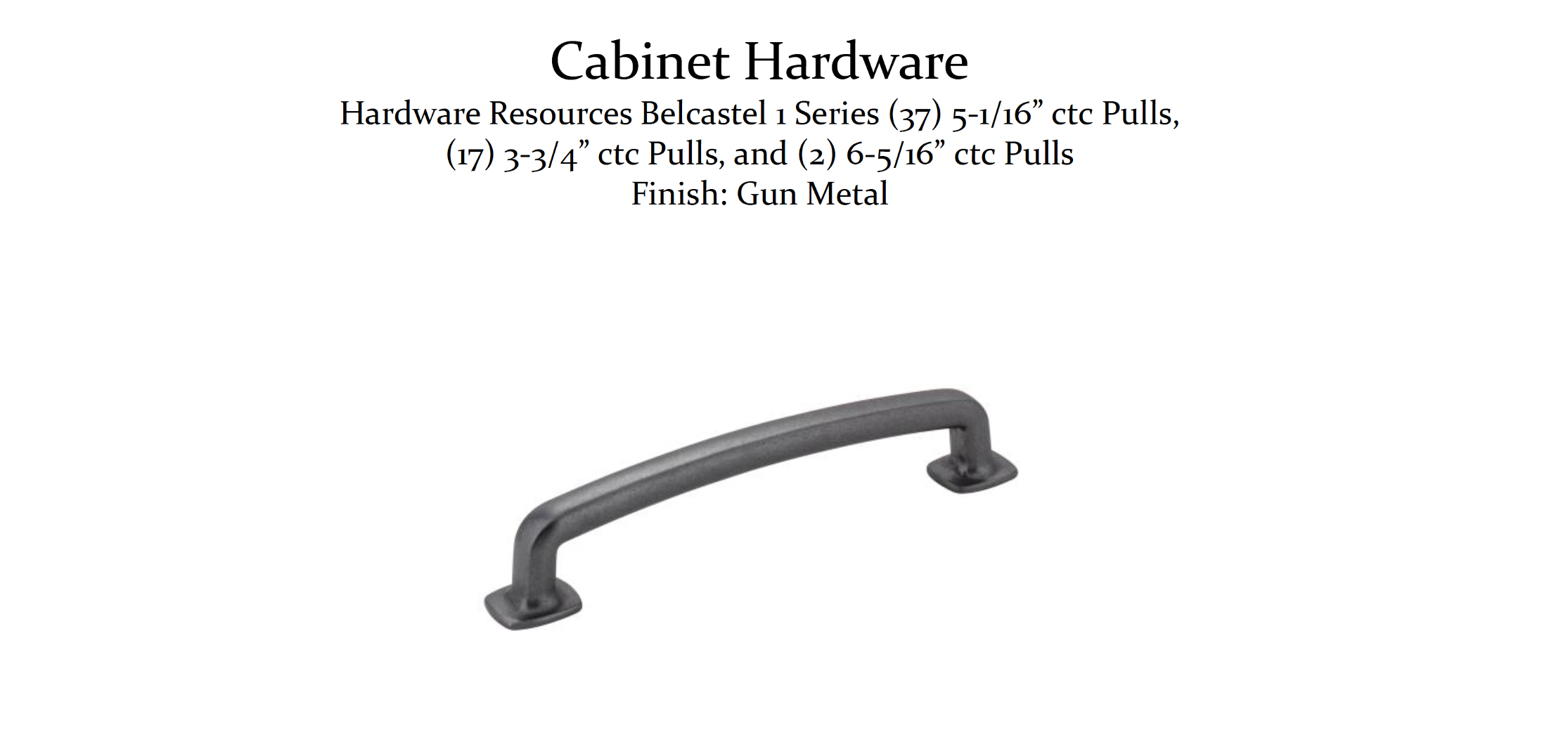
A dark gun metal finish was selected for the cabinet hardware, tying in with the darker tones in the granite, the window frame, and the decorative sconce light installed above the window.
The dishwasher, stacked utensil drawers, and trash compactor are all conveniently located near the sink for easy clean up and put away.
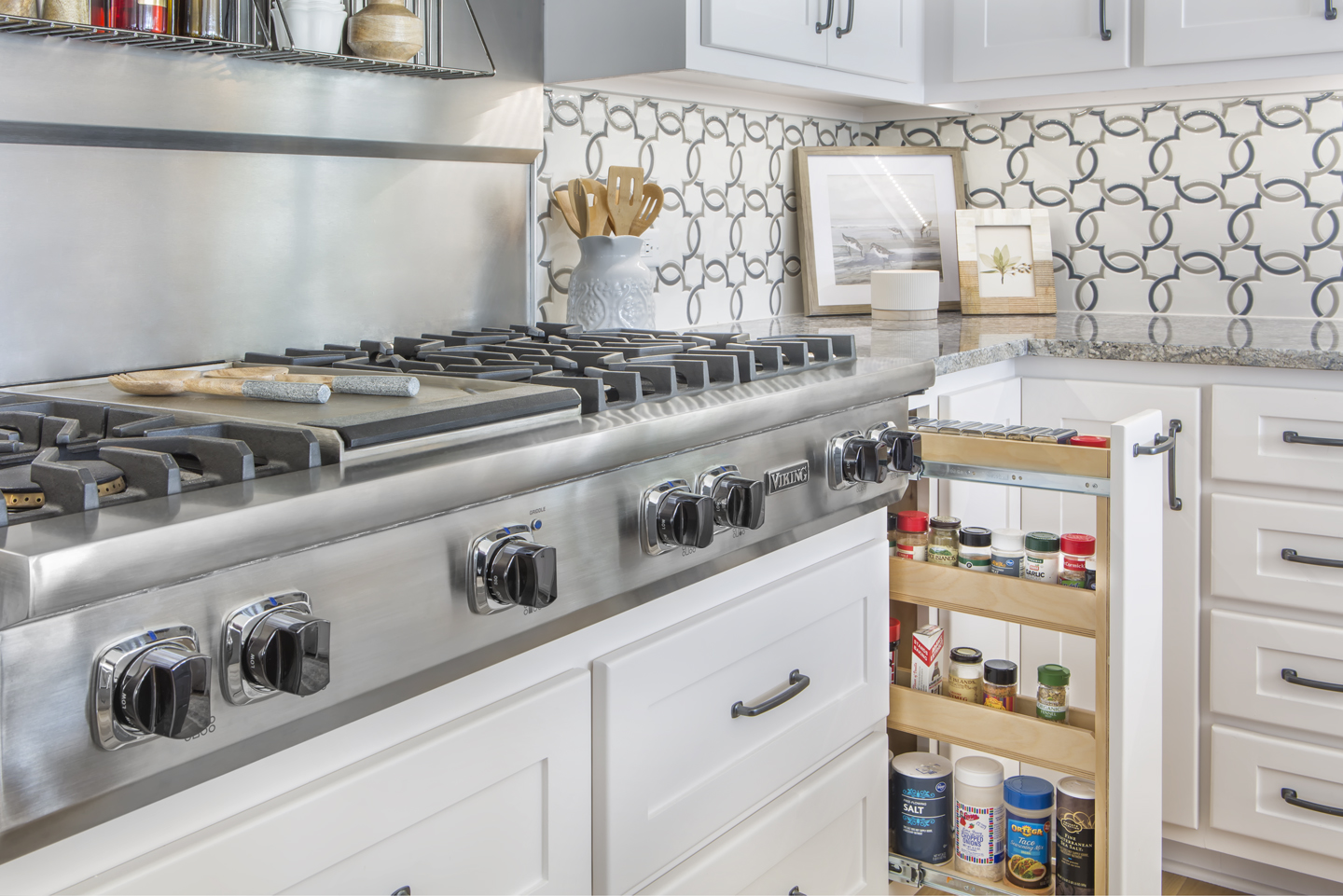
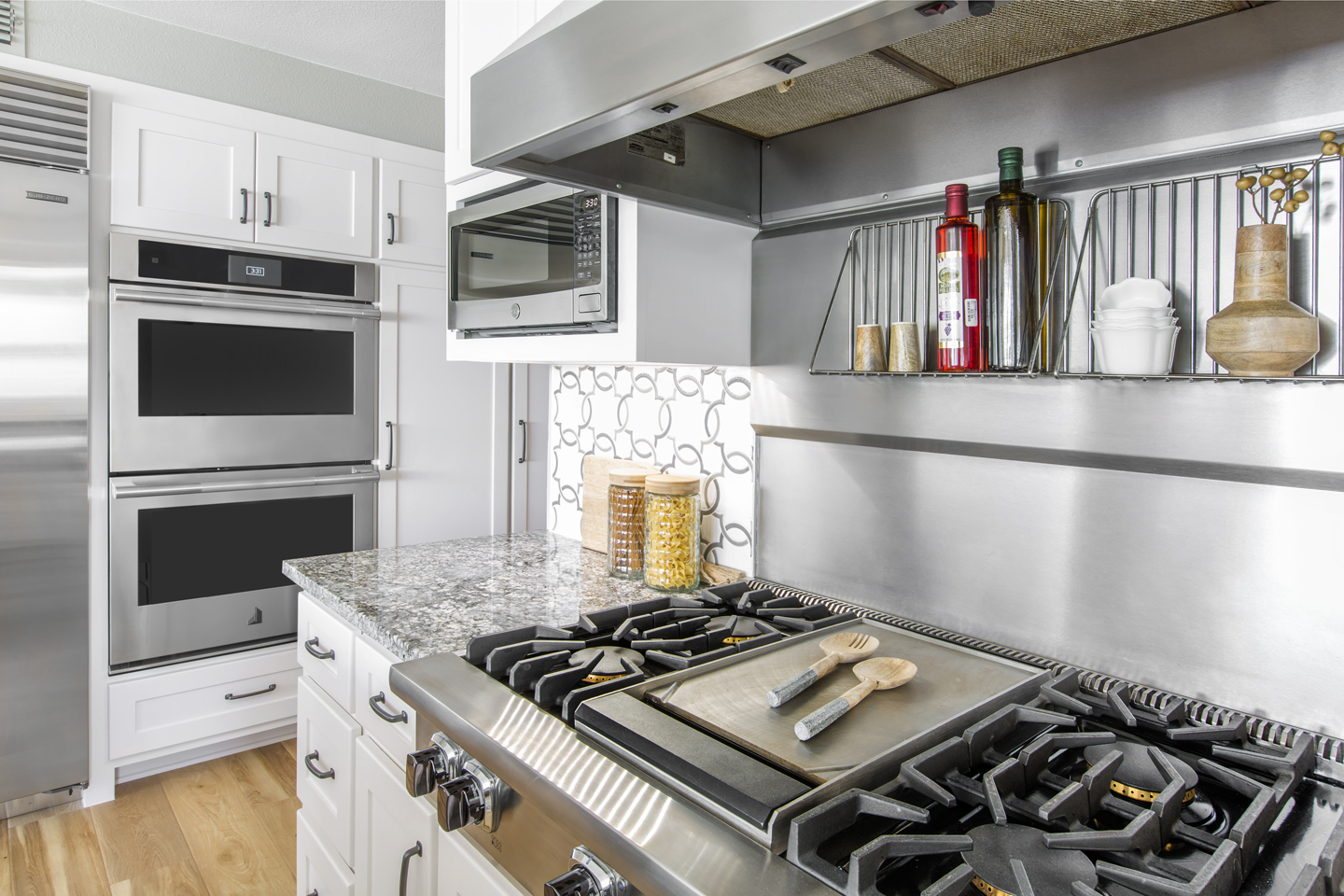
While the vent hood, back panel, range cooktop, and microwave remained in the same place, the cabinetry around the unit was customized to improve functionality. Deep storage drawers were installed below the cooktop in place of lower cabinet doors for easier access to large pots and other cookware.
Just to the right of the deep pan drawers is a convenient spice rack pull-out. This neat little feature discreetly conceals spices while keeping them orderly and within reach of the cook. It’s surprising just how much will fit in this narrow pull-out!
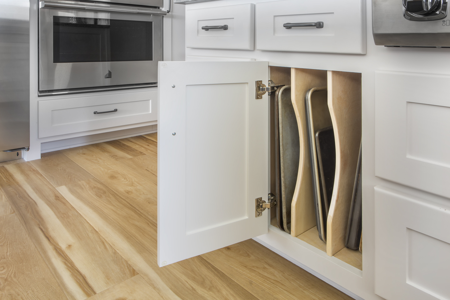
To the left of the range is another neat storage feature – a cabinet made specifically for muffin tins and cookie sheets! If you’ve ever tried to store these items, you know how frustrating it can be to find a good place for them. Our clients loved the idea of having an easily accessible cabinet made just for these long, flat trays.
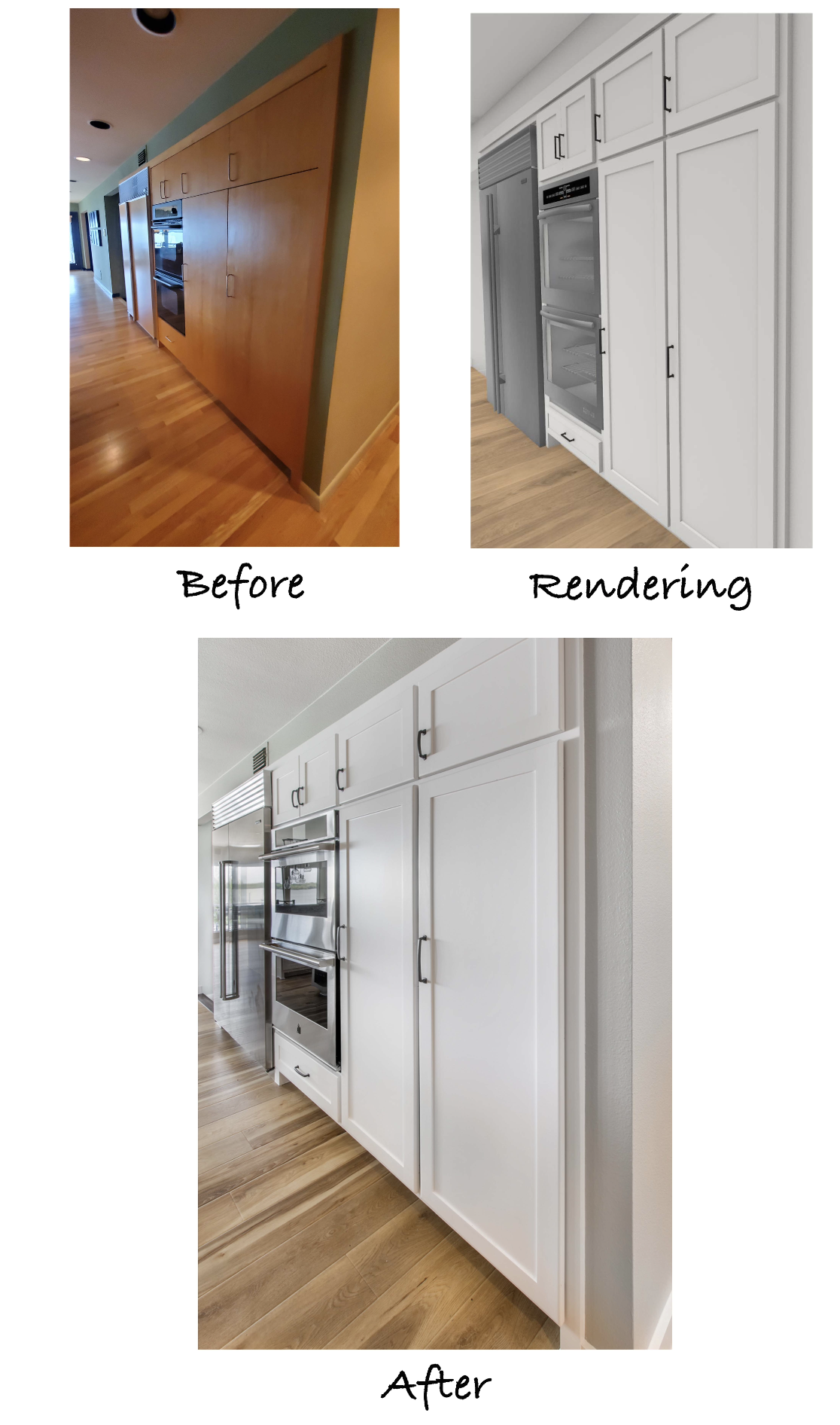
A sleek, Stainless Steel refrigerator replaced the original, matching the stacked ovens to the right. This is one of the items the clients knew would substantially upgrade the functionality of their new kitchen.
The refreshed kitchen was designed to flow perfectly with the rest of this beautiful home. The style, colors, and materials used compliment the atmosphere of the lake and the aesthetic the clients were hoping for. It’s now a point of pride they can enjoy for years to come!
We’d like to say a big thank you to everyone on our team and our wonderful trade partners that worked so hard to get this job completed successfully:
Structural Design: Michael Medford, Jr.
Aesthetic Design: Stephanie Milford
Drafting and Renderings: Brandy Anderson
Production Management: Dave Broadfield
Project Management: Neil Norris
Trim Carpentry: Dave Broadfield, Greg Haws, Cody Vick
Cabinets and Shelving: Bailey Cabinets
Plumbing: Express Master Plumbing
Electrical: Marc Miller Electric
Drywall: Alex Green Drywall
HVAC: Southern Air
Paint: Phillip Painting Company
Tile & Counters Fabrication: HRG Granite
Countertops & Tile: Hilton’s Flooring & Tile
Staging: Ali Doskocil
Final Photography: Impressia– Todd Ramsey
We’d also like to share the design selection items that came together to create this beautiful aesthetic:
This project is a wonderful reminder that refreshing a space doesn’t always involve changing the layout. If your kitchen could use a refresh, whether you are changing the floor plan or not, our team would be glad to help. Contact us today to get started!
Warm Regards,
The Medford Team

