It’s interesting to watch interior design trends change as the years go by. One of the most popular trends we are seeing recently is a more modern aesthetic, typically with shaker-style or slab cabinetry for a streamlined look. These cabinets are often paint-grade with a cool or light color scheme (gray and white is a big favorite!) A quick search on Pinterest or Houzz will provide hundreds of inspiring examples. This aesthetic is certainly beautiful and is the ideal design for many of our clients. However, it is always a welcomed change of pace to get the request for the more classic, traditional vibe – dark wood stain, raised-panel cabinetry, and warm tones. Our recent clients in Arlington, Texas, wanted just that for their long-awaited kitchen renovation.
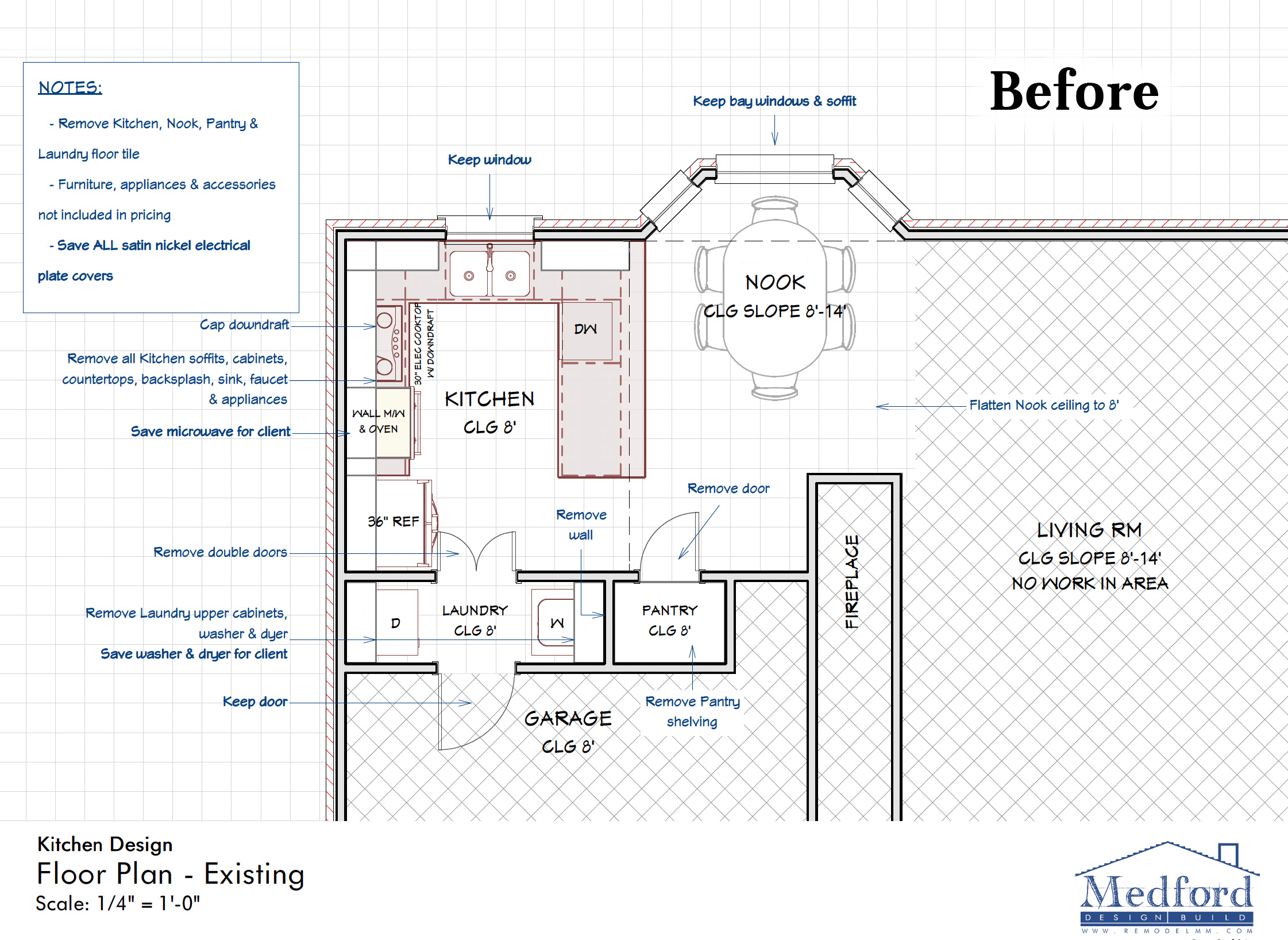
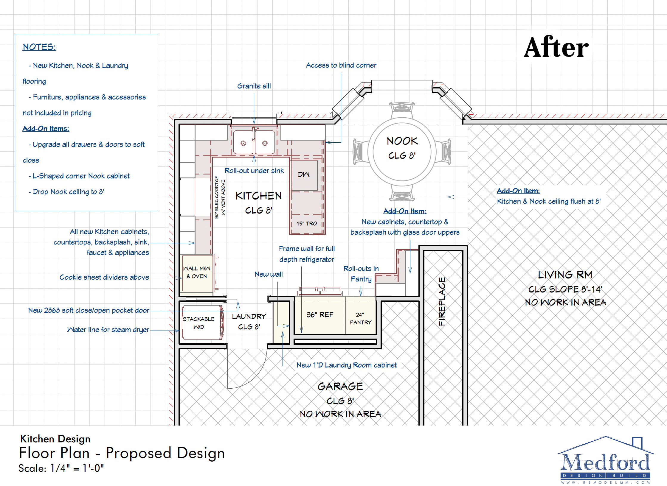
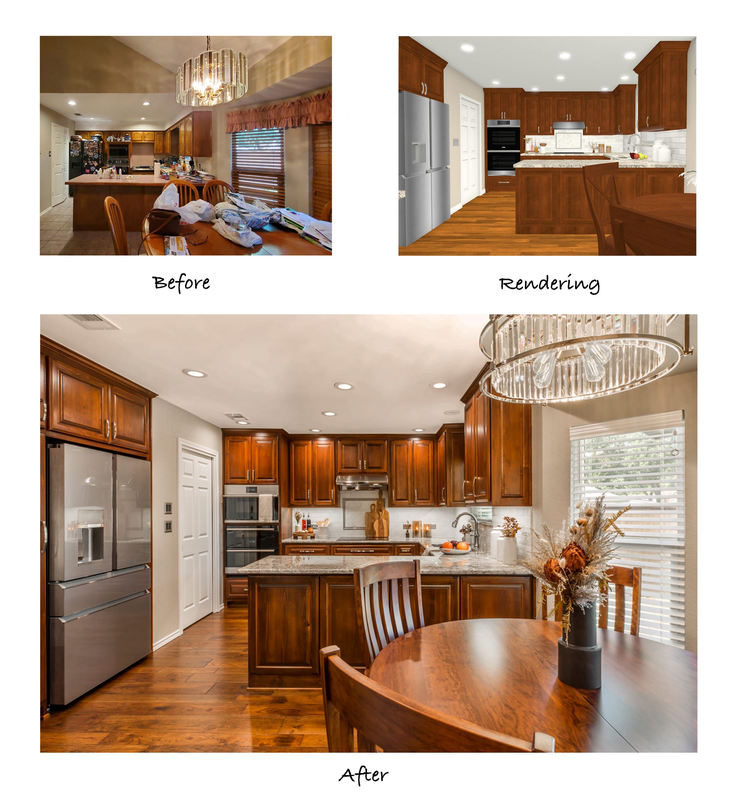
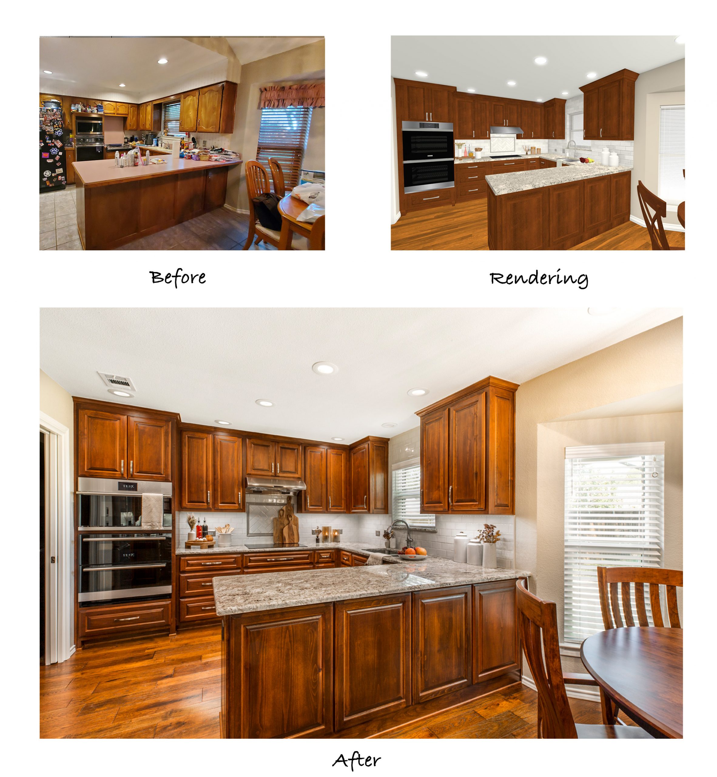
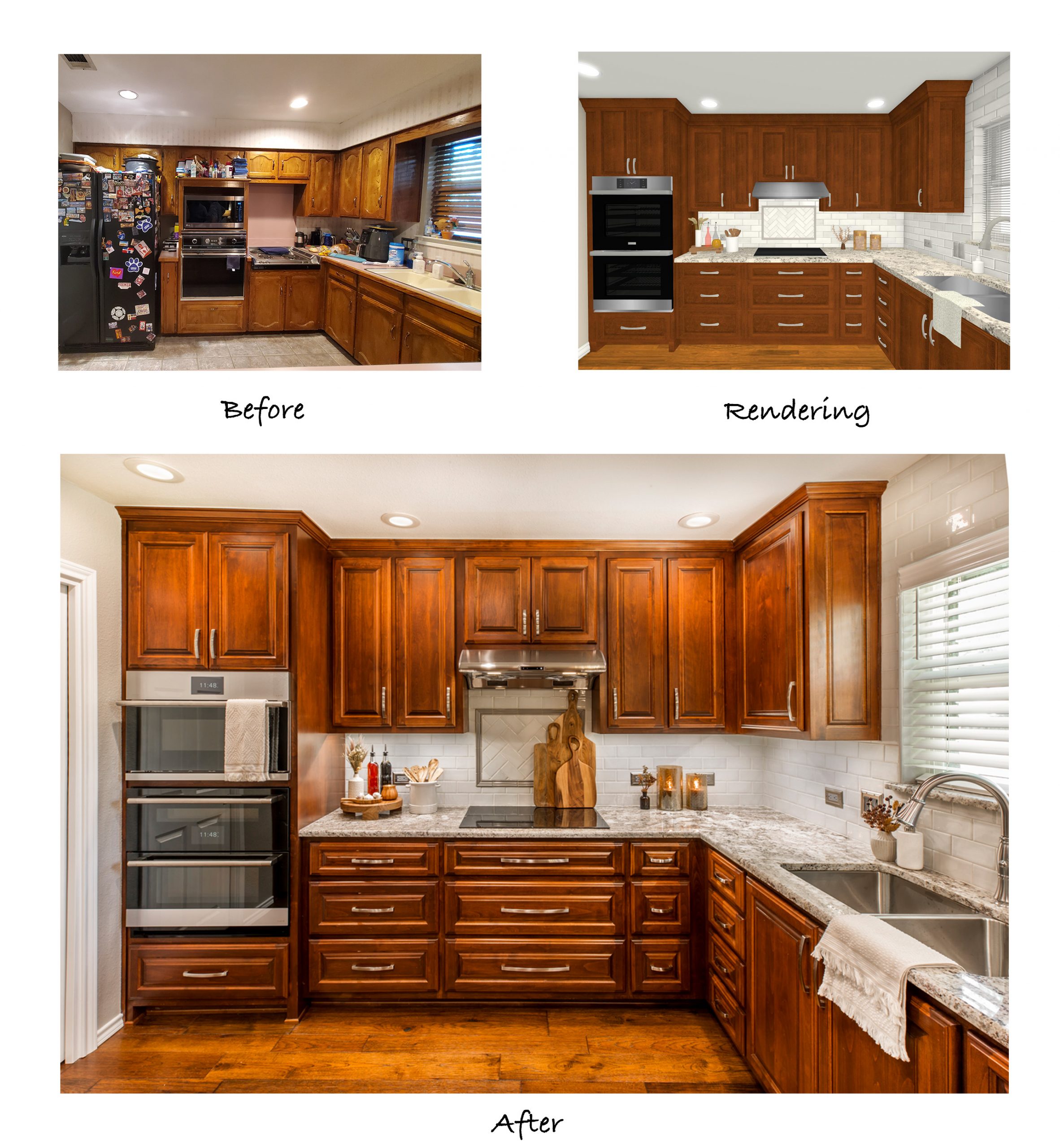
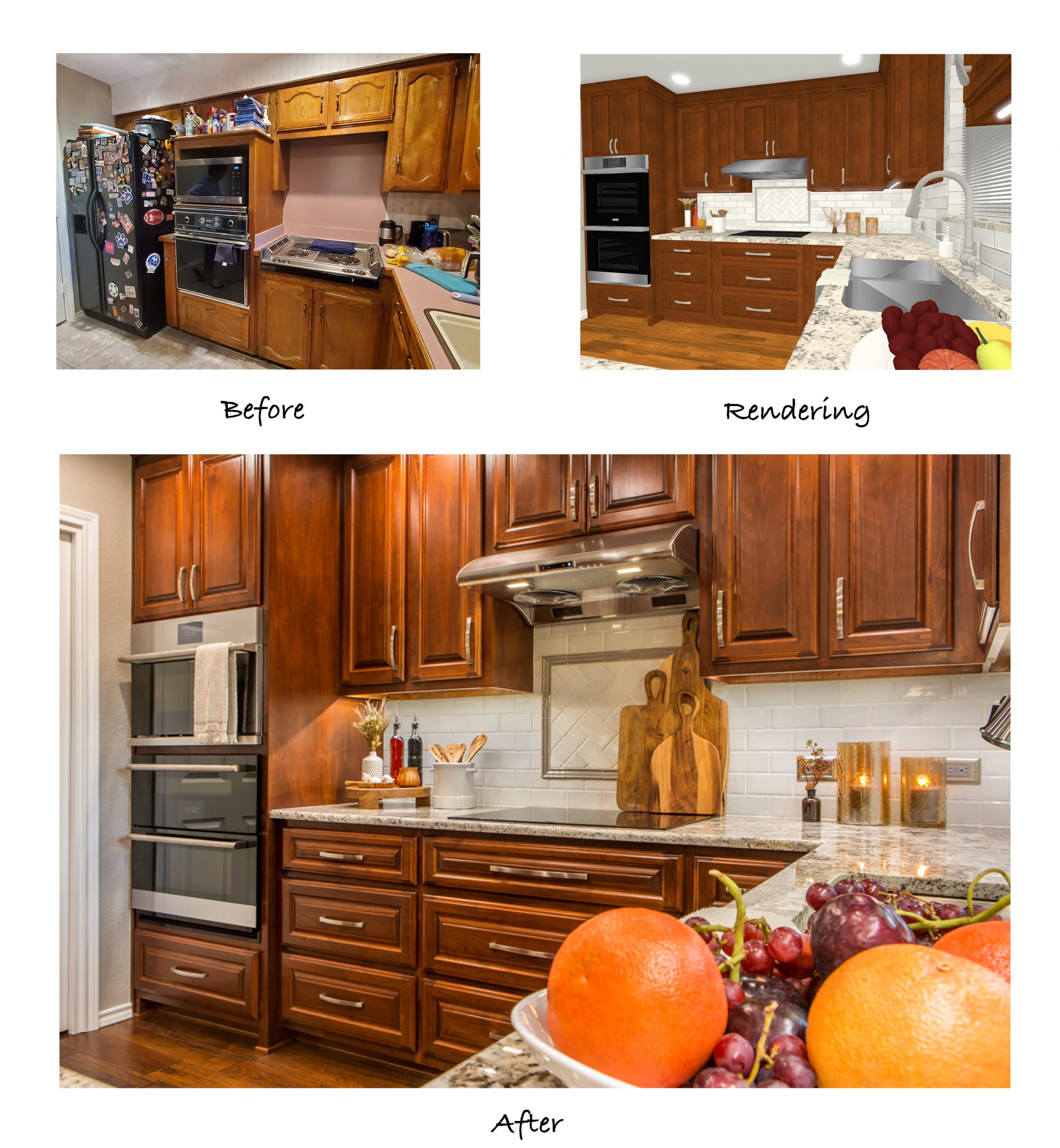
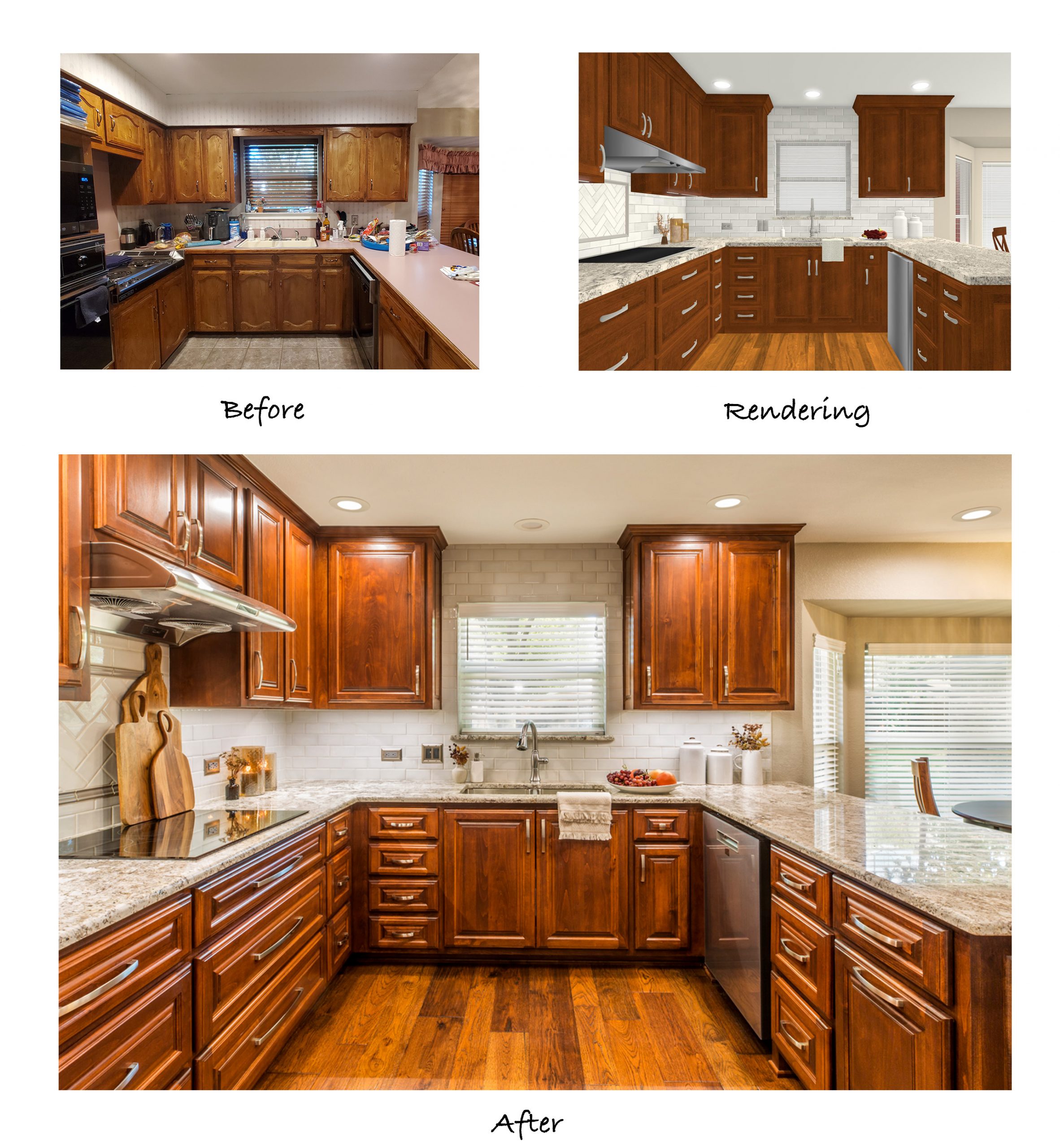
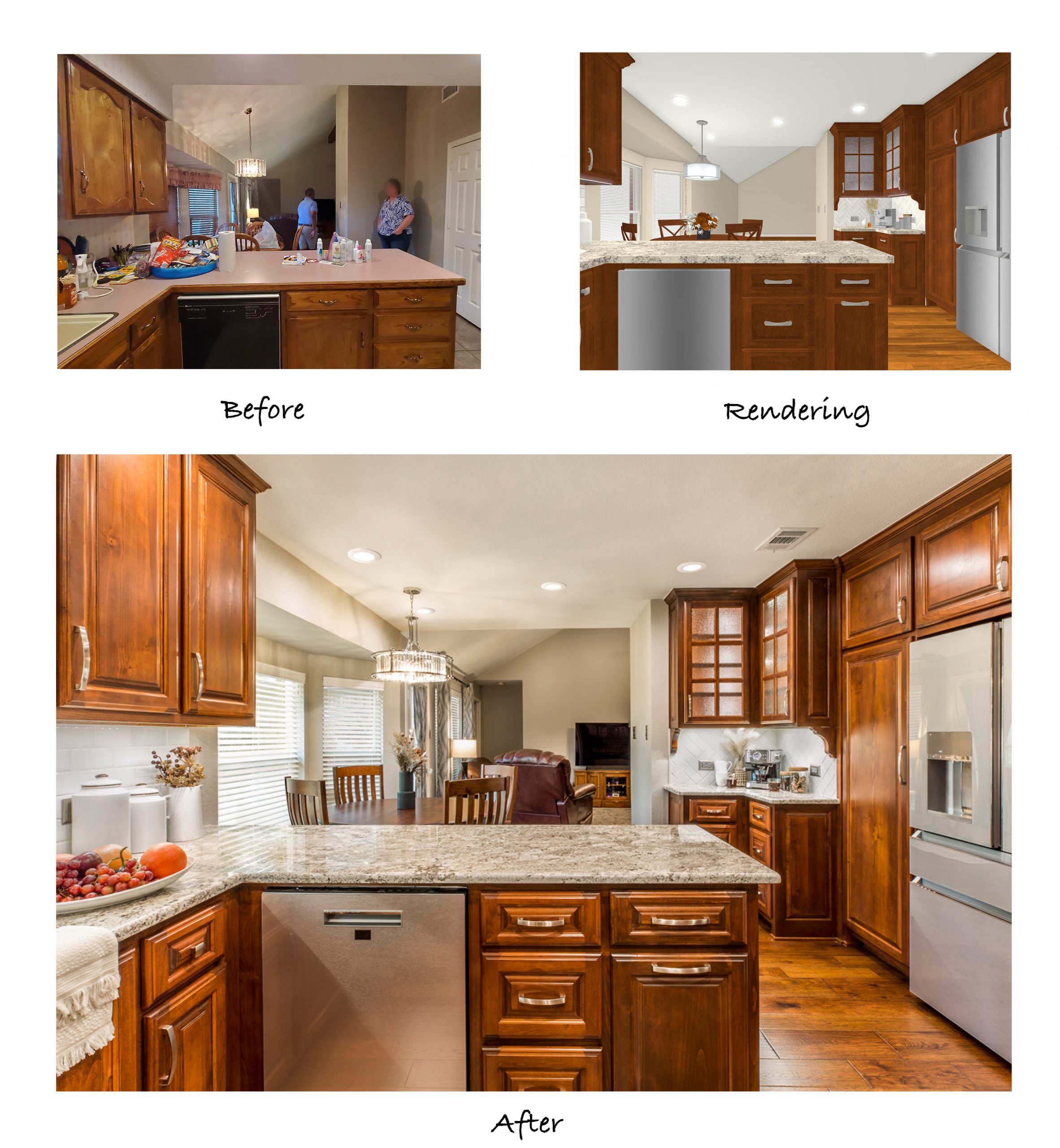
Our kind clients had already been in their forever home for 35 years when they reached out to us to discuss a full-gut kitchen remodel. Our designers emphasized the importance of keeping the style consistent with the rest of their home while still creating the updated space the homeowners had dreamed of for so many years. After a few good discussions regarding the issues with the existing kitchen, the pain points of its functionality, and the overall wish list of the clients, our team got to work drawing up new floor plans and 3D renderings to showcase the modifications:
In regard to the layout, the clients wanted to keep the peninsula where it was, so the sink and dishwasher also stayed in their same locations. The corner refrigerator was relocated, providing more countertop space on each side of the cooktop. The existing laundry area was used to recess the fridge, and the left-over space in the laundry room was converted into a 1-foot-deep floor-to-ceiling storage cabinet.
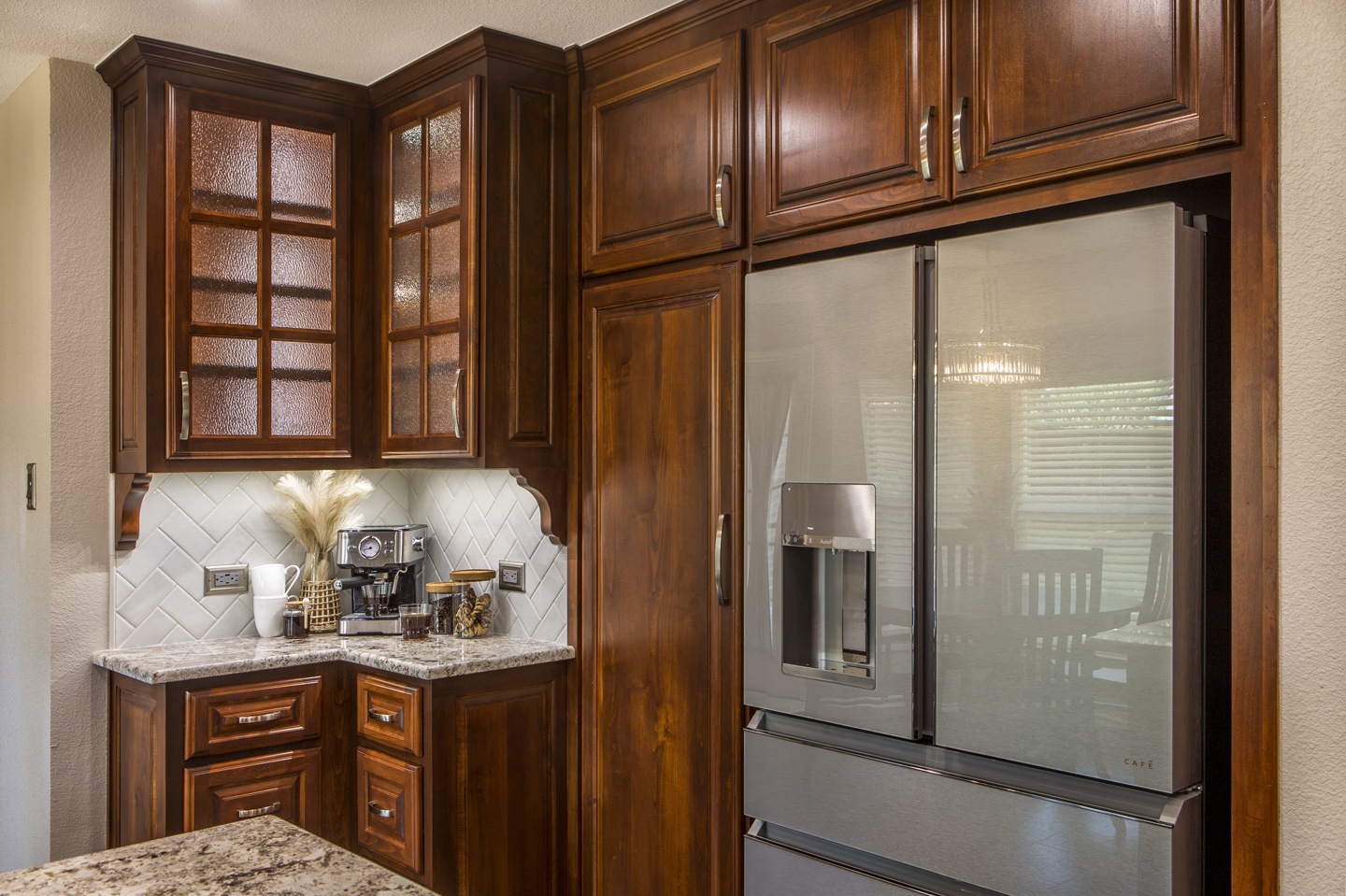
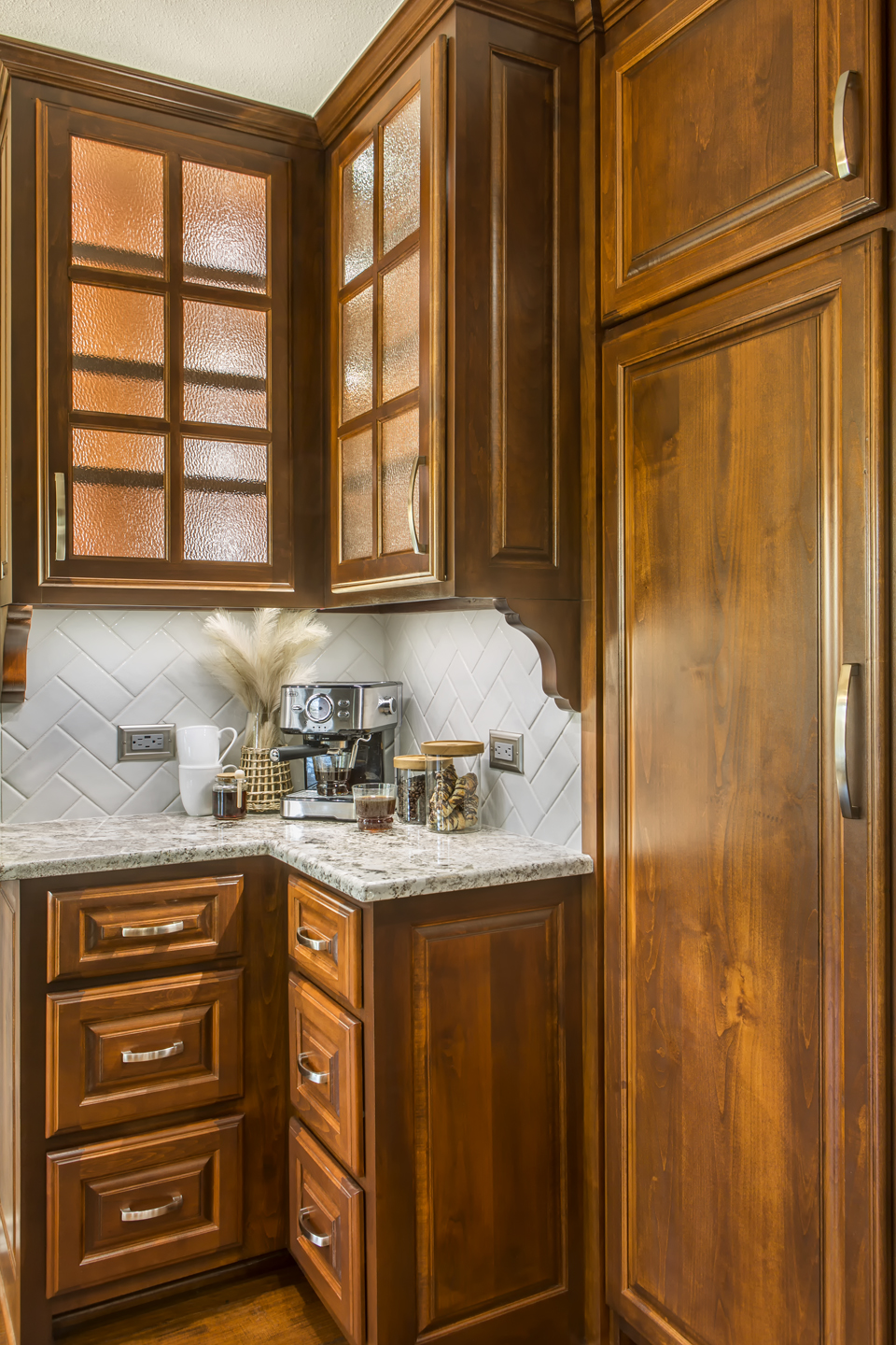
A built-in L-shaped cabinet was designed into the original breakfast nook to provide even more storage and a convenient coffee bar. The existing pantry closet area was modified to a more functional recessed pantry cabinet with space-optimizing pull-out drawers.
Looking at the before photos, you can see that the breakfast nook ceiling is vaulted like the living room. Our designers’ suggestion was to lower it to 8′ to match the kitchen and make both spaces feel like one large area. Dropping the ceiling in the nook makes the entire kitchen and nook area now feel cozy and cohesive. In order to lower the ceiling, we moved an air register into the new ceiling and cut from the existing attic into the new attic space above the breakfast nook to make it accessible. The lowered ceiling provided a nice backdrop for the new deco light above the dining table as well.
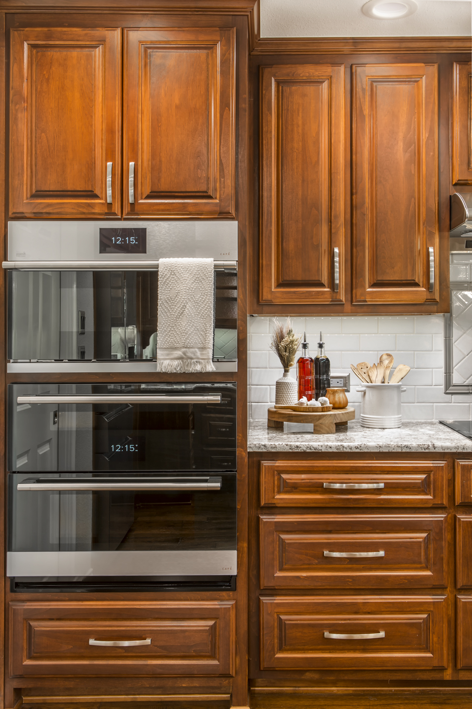
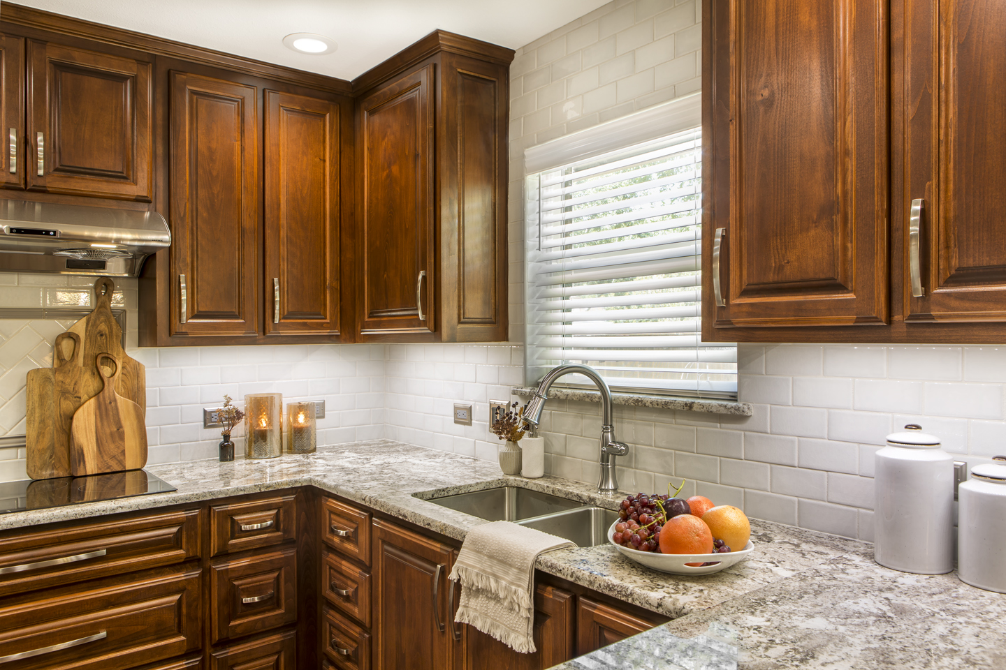
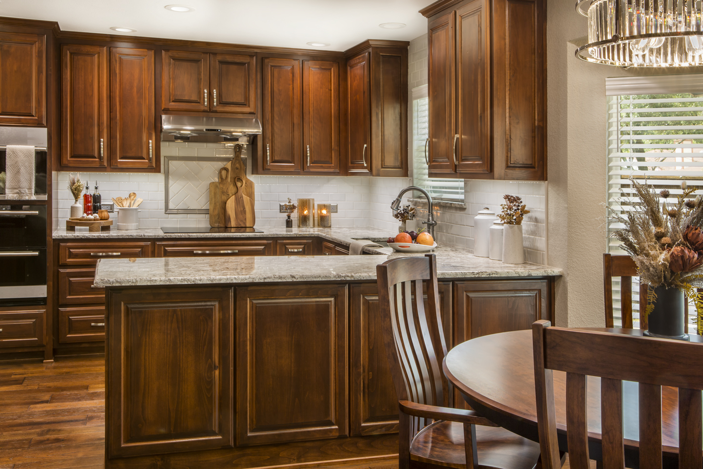
Looking into the remodeled kitchen, one of the most stunning changes is the elegant dark-stained cabinetry. The soffit above the uppers was removed, allowing new cabinets to extend up to the ceiling. The raised-panel doors provide a custom, high-end aesthetic along with the traditional feel the clients were hoping for.
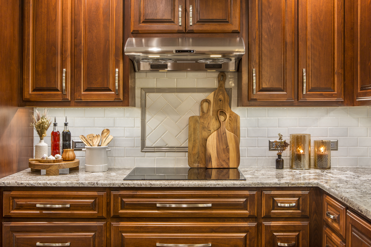
It’s impressive to consider how much storage space was created with the reworked cabinetry. Deep pan drawers and stacked utensil drawers are within reach beside the cooktop and provide a sleek, uniform look.
A stacked wall microwave and oven sit where the refrigerator was previously. The tall cabinet above houses convenient cookie sheet racks and compliments the custom built-in look of the kitchen. Truly no space was wasted in this kitchen!
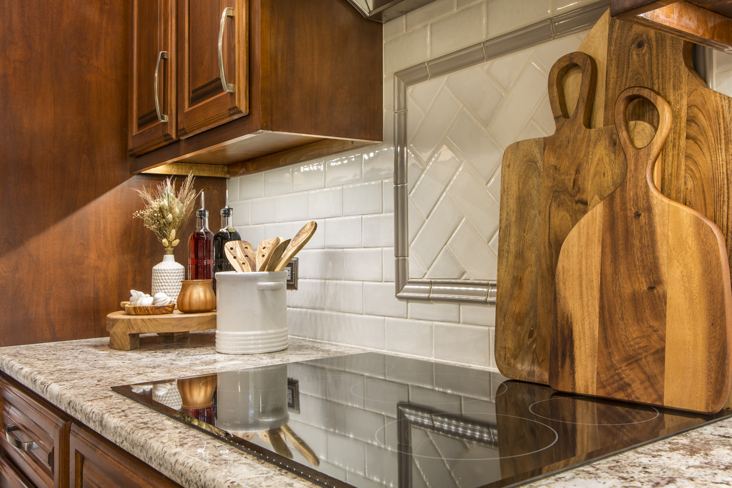
The 30-inch electric cooktop and stainless-steel vent hood are sleek and clean, adding to the timelessness and functionality created in this design. We especially love how the vent hood ties in with the satin nickel handles and hardware. Consistency in the small details is what really ties the finished look together.
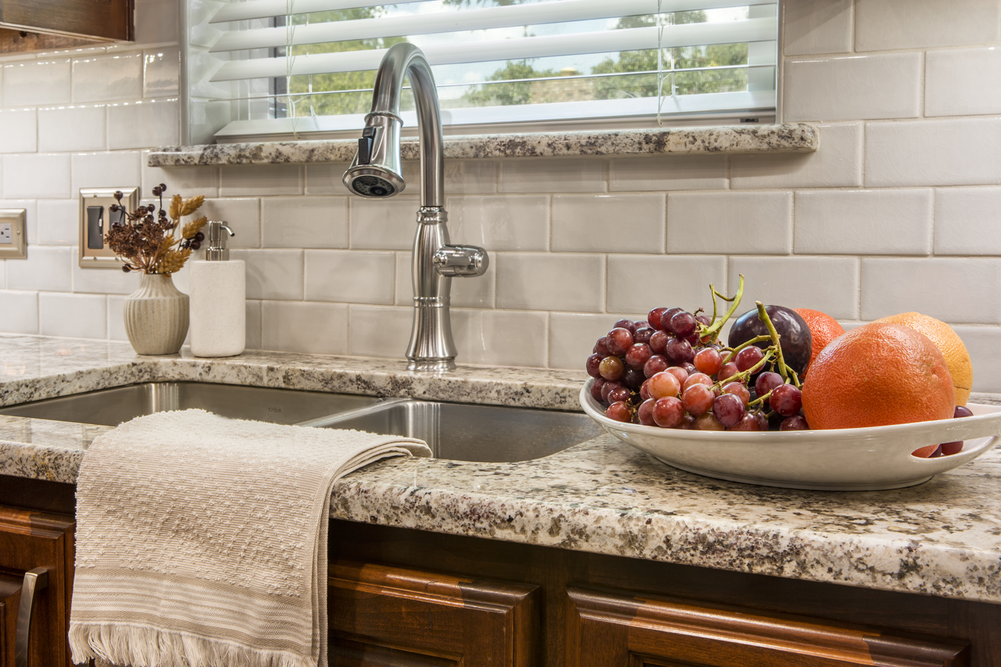
The various warm tones in the Alaska White granite countertops tie in beautifully with the cabinet stain and the off-white subway tile backsplash. The décor is perfect for the upcoming Fall season, and will provide a cozy setting year-round!
Strategically placed LED can lights paired with under-cabinet lighting makes for a near-shadowless environment on all the countertop surfaces. Not only is this great for meal prepping, but it also spotlights the stunning countertop and décor.
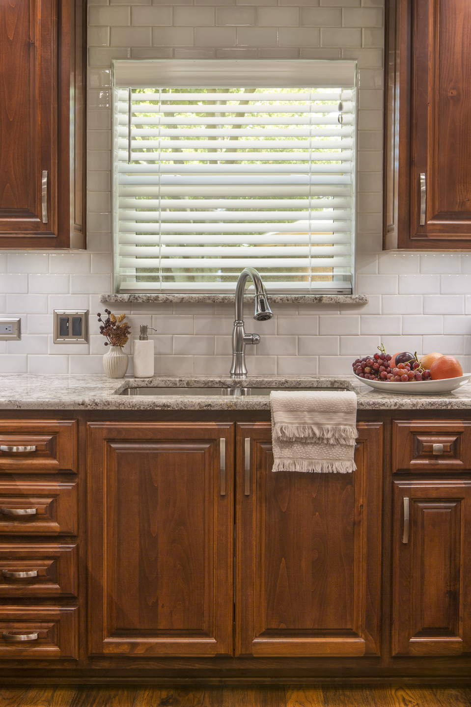
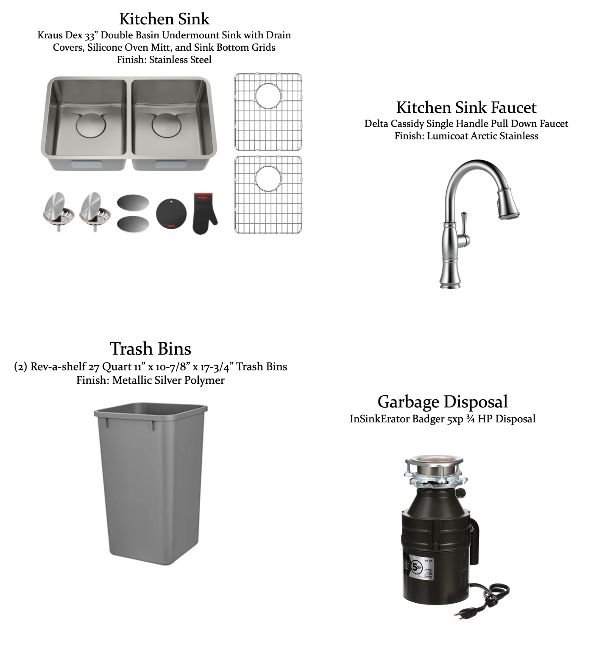
A Stainless-Steel double-basin under-mount sink was installed with a matching new faucet in place of the old one. The backsplash tile behind the sink was installed up to the ceiling to make the wall feel taller and draw the eyes upward. You’ll also notice the detail of the granite used as the window ledge; this is just another small detail that elevates this design for a truly luxurious finish!
Looking across the kitchen toward the living room, you can really see how the lowered ceiling in this area makes the kitchen as a whole feel like one large, cohesive space. The added cabinetry in the corner takes advantage of an otherwise unused space.
This corner is such a stunning finished section! The recessed fridge surrounded by built-in cabinets and the new pantry create such a high-end, custom look. The biggest difference is the amount of storage space that did not exist here before. Improving functionality, creating more storage space, AND creating a stunning aesthetic? That is what a successful design is made of!
The completed remodel is absolutely stunning and checked each item off the client’s wish list. It’s always a pleasure for our team to know that we had a hand in providing the homeowners with something they had only dreamt of for so many years. The classic, timeless look of this traditional-style kitchen will surely withstand the test of time.
We’d like to recognize everyone on our team, as well as our faithful vendors and trade partners, that helped bring this beauty to fruition:
Structural Design: Michael Medford, Jr.
Aesthetic Design: Stephanie Milford
Drafting and Renderings: Brandy Anderson & Chelsie Winiger
Production Management: Dave Broadfield
Project Management: Scott Vernon
Trim Carpentry: Scott Vernon, Greg Haws, Neil Norris, Cody Vick
Cabinets and Shelving: Genesis Cabinets
Plumbing: Express Master Plumbing
Electrical: Marc Miller Electric
Drywall: Alex Green Drywall
HVAC: Southern Air Mechanical
Glass: Kindred Glass
Paint: Phillip Painting Company
Countertops & Tile: Hilton’s Flooring & Tile
Tile, Flooring, & Counters Fabrication: HRG Granite
Staging: Ali Doskocil
Final Photography: Impressia– Todd Ramsey
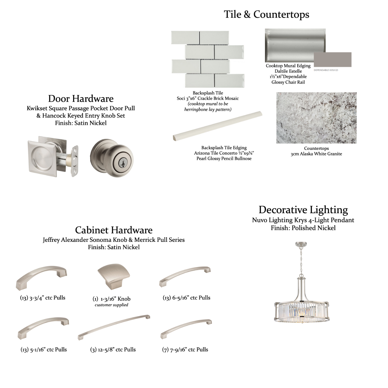
We’d also like to share the design selection items used for this project:
If you’ve been considering renovating your kitchen (or another part of your home!), our knowledgeable team of designers would be happy to talk you through the process and answer your questions. Contact us today for more information!
Warm Regards,
The Medford Team

