Our recent clients are thrilled to have completed the long-awaited kitchen and bar remodel of their 1975 home. They told us at our first meeting that they had been dreaming of this kitchen for over 20 years! The Medford Design-Build team was grateful for the opportunity to help bring their dream to life. By removing low-hanging soffits and multiple walls and thresholds throughout the heart of this home, the entire space feels bigger, brighter, and more open. What a stunning transformation!

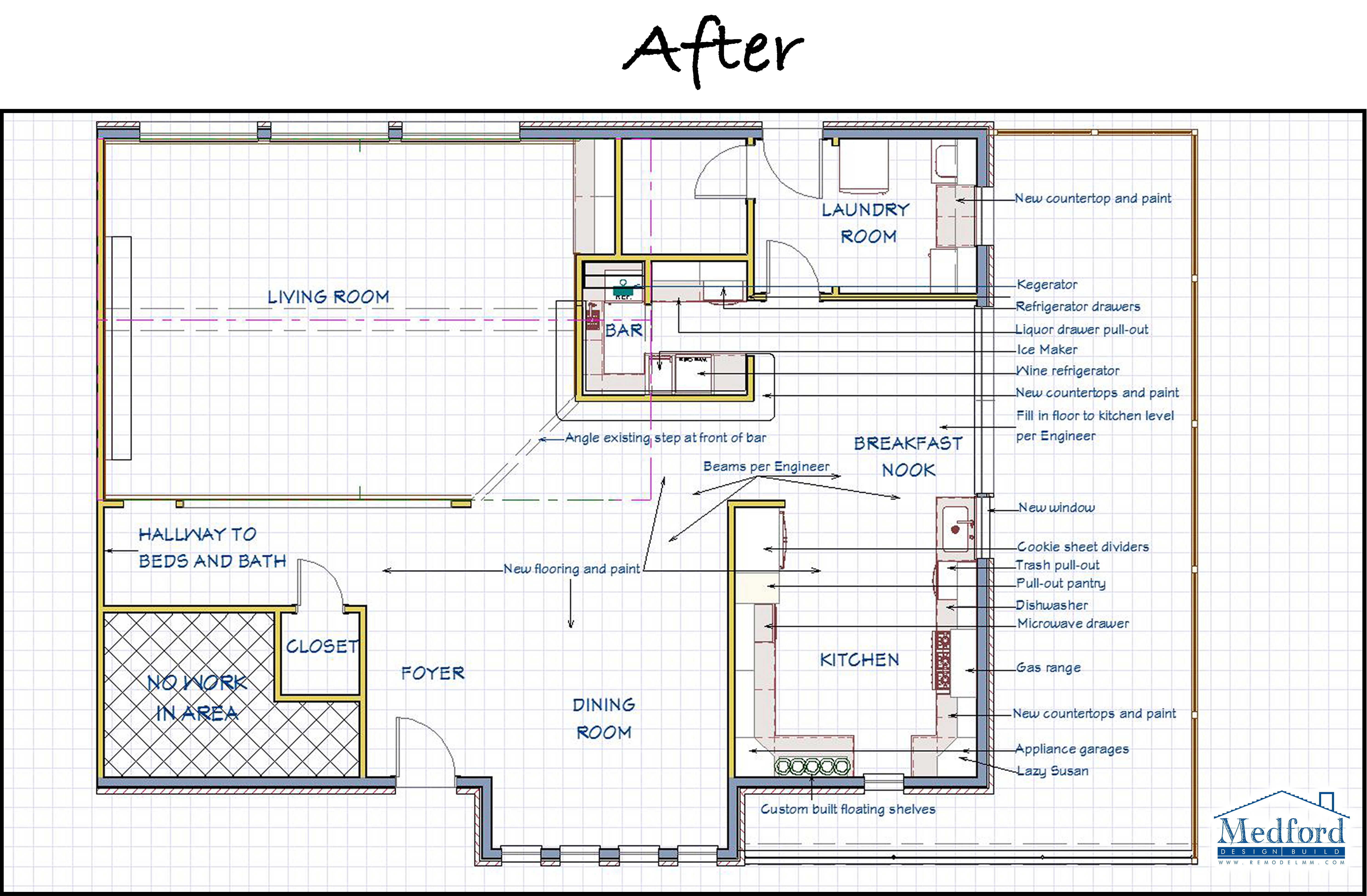
The original floor plan included a 45-degree angled wall in the kitchen designed to separate the space from the neighboring dining area and enclosed porch. Many homes of this era feature a similar angled wall in the kitchen as a way to incorporate architectural interest into the space. Unfortunately, this set up doesn’t quite agree with today’s trending “open concept floor plan” that so many homeowners crave. This wall also formed what we refer to as a “pinch point” at the entrance to the kitchen, creating a bottleneck effect where people enter and exit the room.
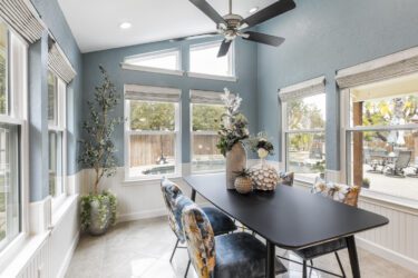
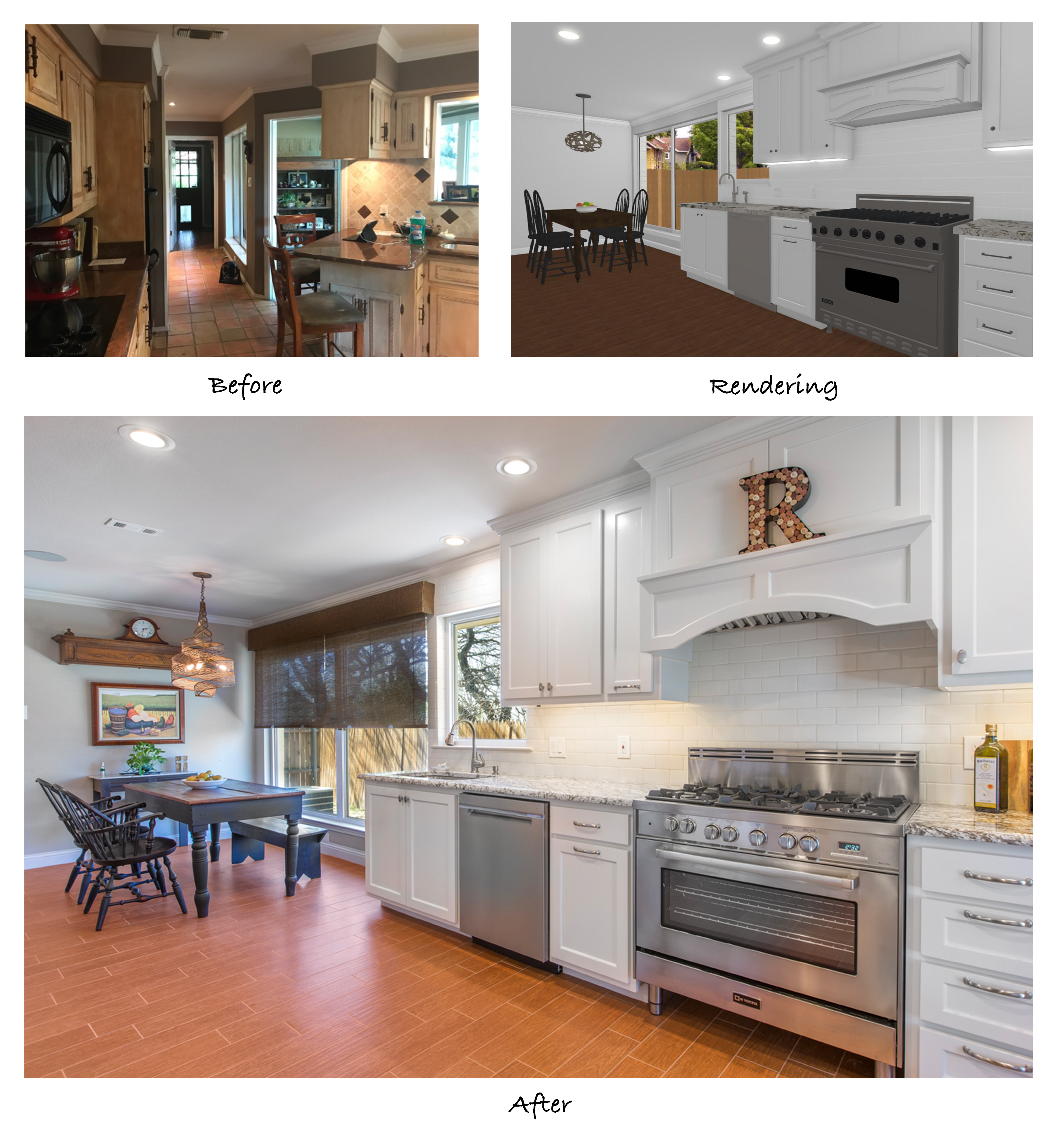
The enclosed porch previously located just off the kitchen and behind the angled wall was completely removed, allowing us to open the kitchen up and extend the breakfast area into that space. The step-down to the porch was leveled to the same height as the kitchen floor and only one of the three large windows from the porch was lost. The new layout allowed for the breakfast area to come all the way up to two remaining windows and the line of cabinetry in the kitchen was extended down the newly created wall space. This change alone made the whole kitchen feel significantly larger and brighter!
The load bearing wall over the bar area was removed and replaced with a beam inverted into the attic, providing a more spacious feel and allowing us to lengthen the bar itself. This modification also contributes to a brighter look, as there is now a clear line of sight all the way to the large windows at the end of the breakfast area.
The formal dining room at the front of the home was separated completely from the kitchen and bar area by a dividing wall and a narrow hallway. Initially, removing these walls was not part of the scope of work, but our clients decided to incorporate it to ensure the beautiful renovations could be seen upon entering the front door. Definitely a smart move!
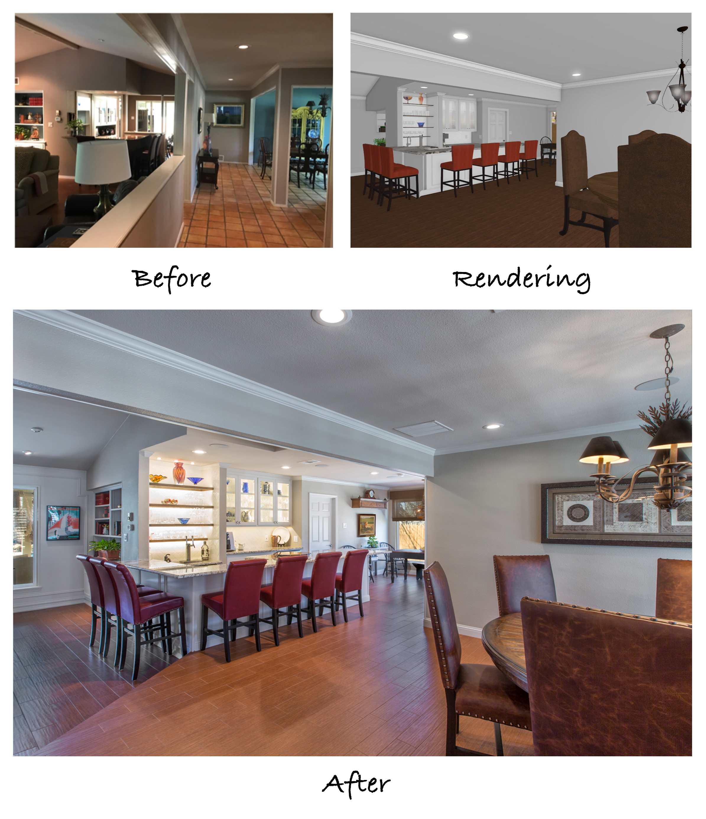
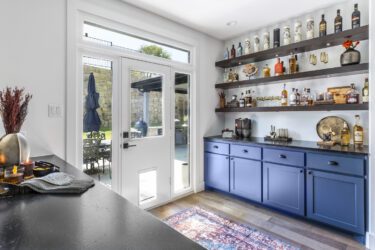
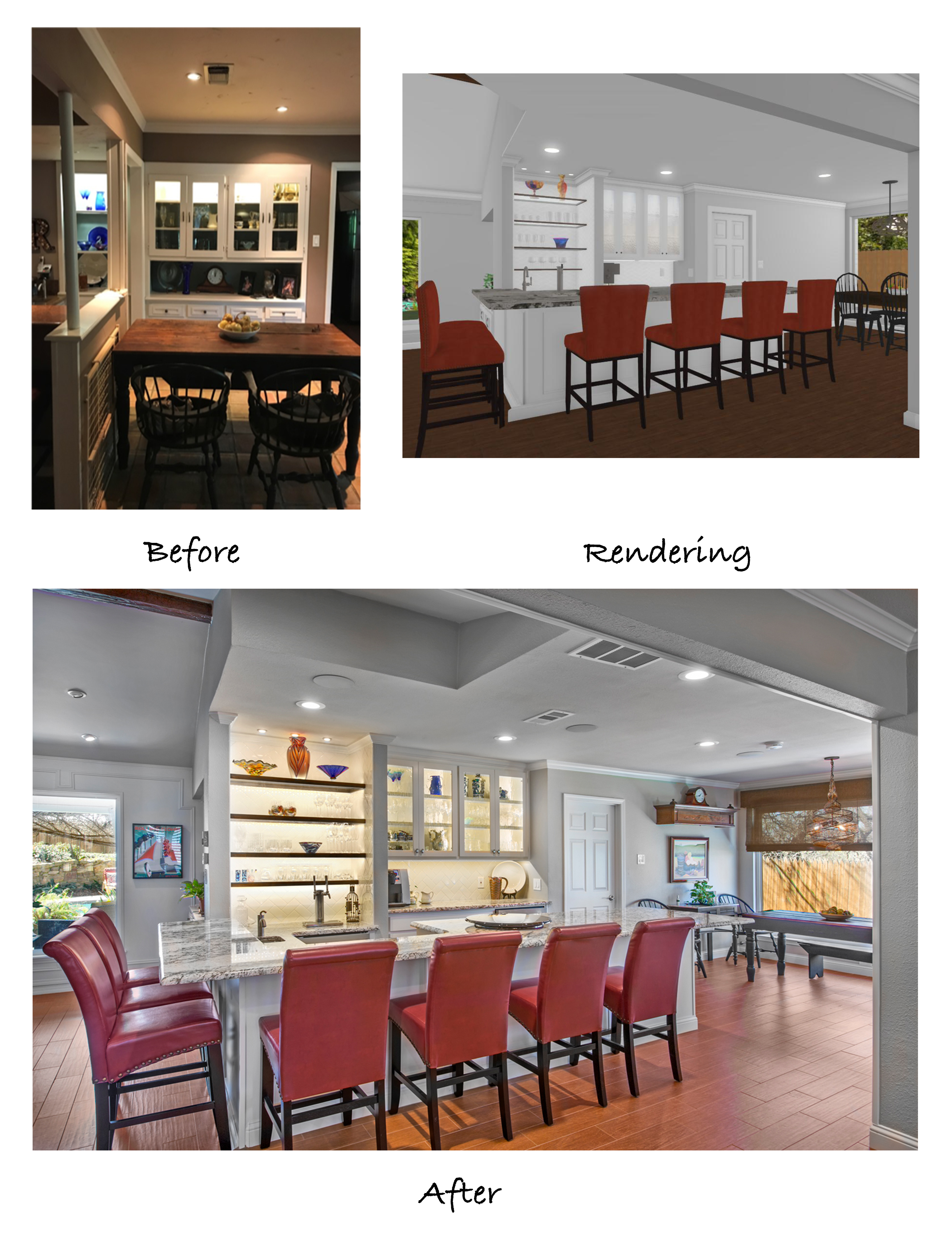
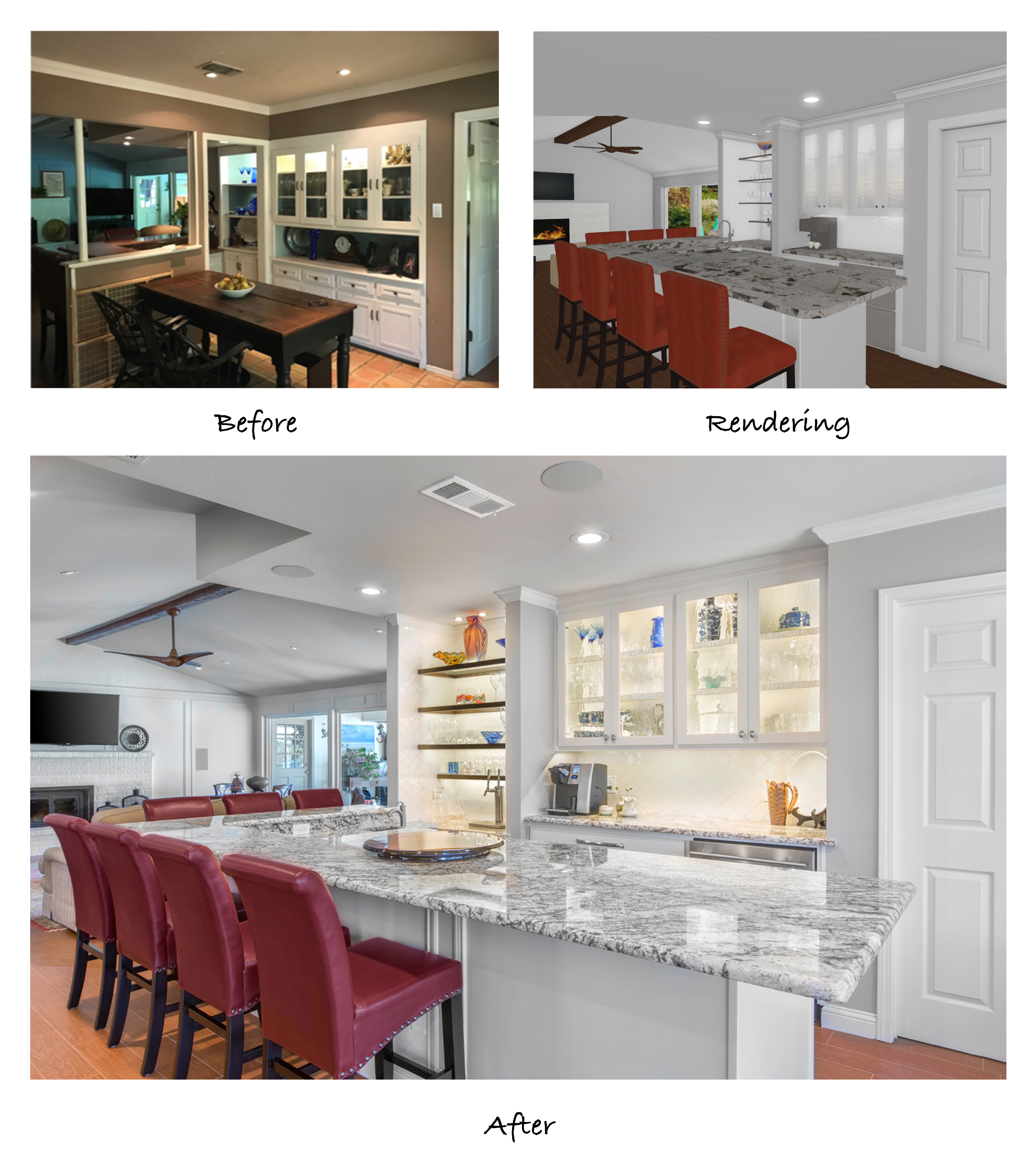
Here you can see the wall and thresholds between the dining room and kitchen/bar area that were removed. Taking out these two sets of barriers really contributed to a larger, more open floor plan. The brightly backlit shelving and display cabinets behind the bar draw attention to the center of the home and create a stunning showcase.
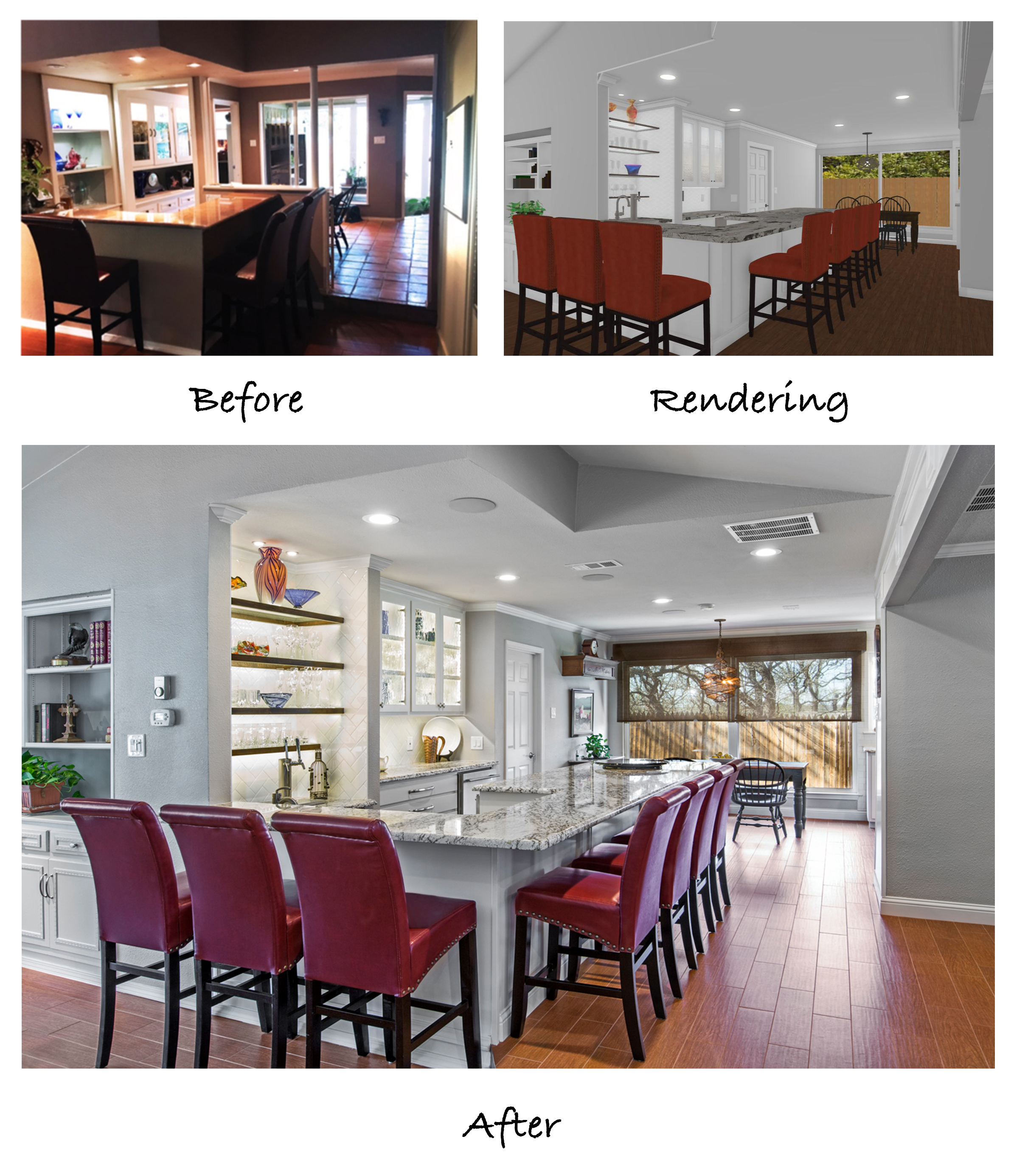
The original bar was designed as a well bar – meaning that the flooring behind the bar stepped down in order to create a cozy feel. The soffits in the ceiling above the bar hung at 7 feet, and because this wall was load bearing, columns reached up from the back edge of the bar to the ceiling. The whole area looked very boxy and bulky. By installing an inverted beam into the attic, we were able to remove the wall and columns completely, as well as the low-hanging soffits. Both the ceiling and the floors were leveled with that of the kitchen to create a flowing, integrated space.

The view from the opposite side of the front door is just as stunning. Guests sitting at the bar have a straight line of sight into the dining room and down to the breakfast area in the kitchen, making the remodeled rooms perfect for entertaining.
The dining table that previously sat at the end of the bar has been relocated to the breakfast area and the new bar has been extended to provide additional seating. It’s amazing how much brighter this space looks with fresh paint, white granite counter tops, strategically placed can lights, backlit display shelves, and the large windows now visible at the end of the breakfast area.
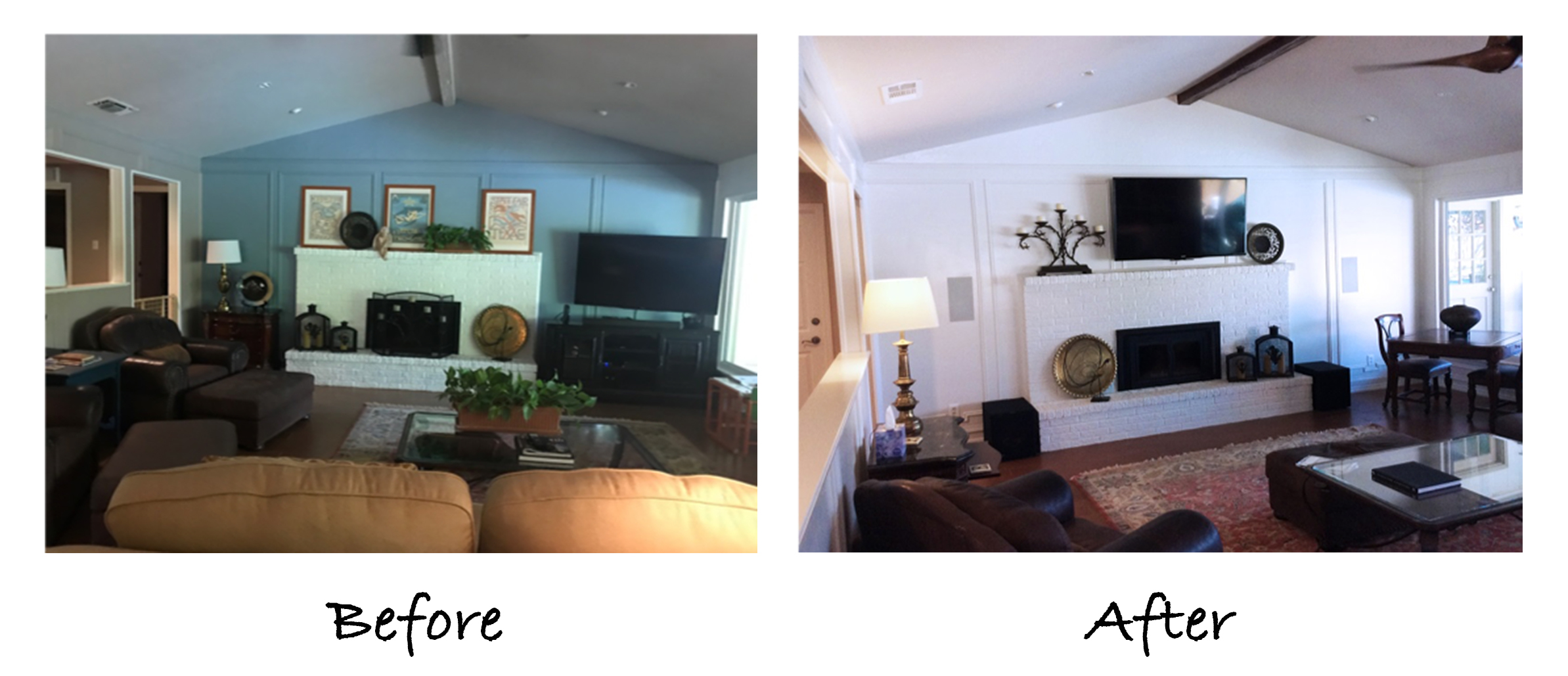
The next point that came up as the updates were being made to the bar area was that the neighboring living room needed some polishing up as well. While we didn’t make any structural changes in this room, we were able to paint the fireplace wall with a coat of crisp white paint. The ceiling beam was refinished with a dark gel stain and a more minimalistic fireplace screen replaced the original for a sleeker look. We also mounted the TV above the mantel, allowing our clients to get rid of the entertainment center previously set up in the corner. The fireplace now serves as a beautiful focal point while the rest of the room has a less cluttered feel.
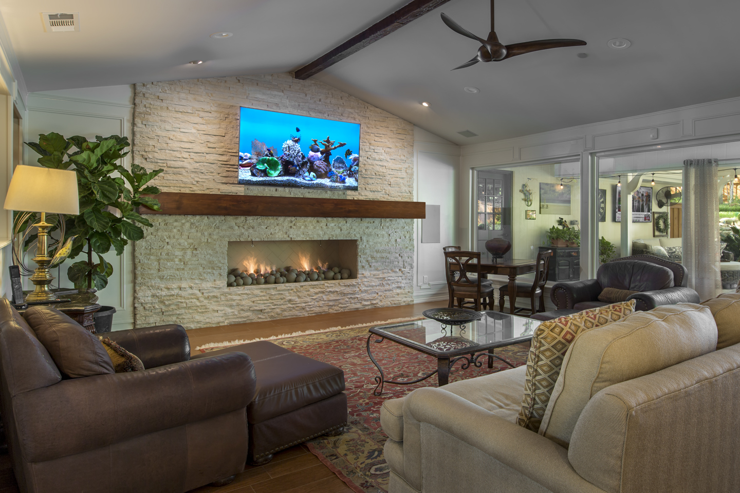
Since then, our team was able to complete a full fireplace remodel for this client — see the blog on this stunning transformation here!
The updated living room now provides a beautiful backdrop for the remodeled bar and can also be seen from the dining room and breakfast area. The fresh white paint and refinished beam continue the style and color palette used throughout rest of the updated rooms. Consistency is an important aspect when designing an open floor plan!
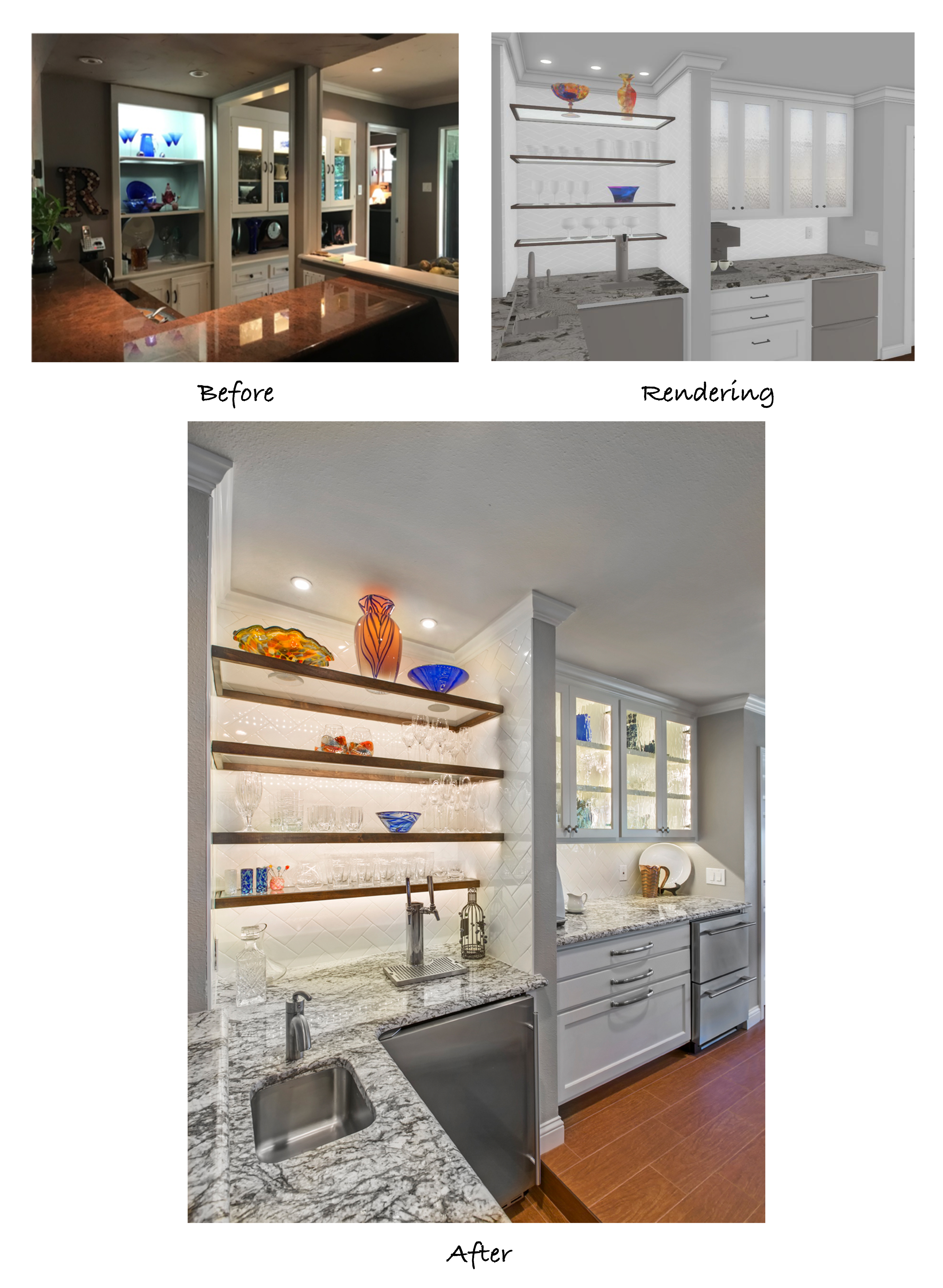
In the buffet area behind the bar, the glass-front display cabinets were extended all the way to the ceiling once the low-hanging soffits were removed. LED backlights were installed in the cabinets as well as in the custom shelf unit we built. What a beautiful display for our client’s glassware collection! These custom display shelves are one of our favorite things to design, as they always turn out great and make such a big impact in any room.
The buffet area also includes two stainless steel refrigerator drawers, deep pan drawers, a double-tap kegerator, a prep sink, and a Keurig hard-piped with its own water line. The countertops, cabinetry, backsplash, and hardware match what was used in the kitchen for a consistent aesthetic.
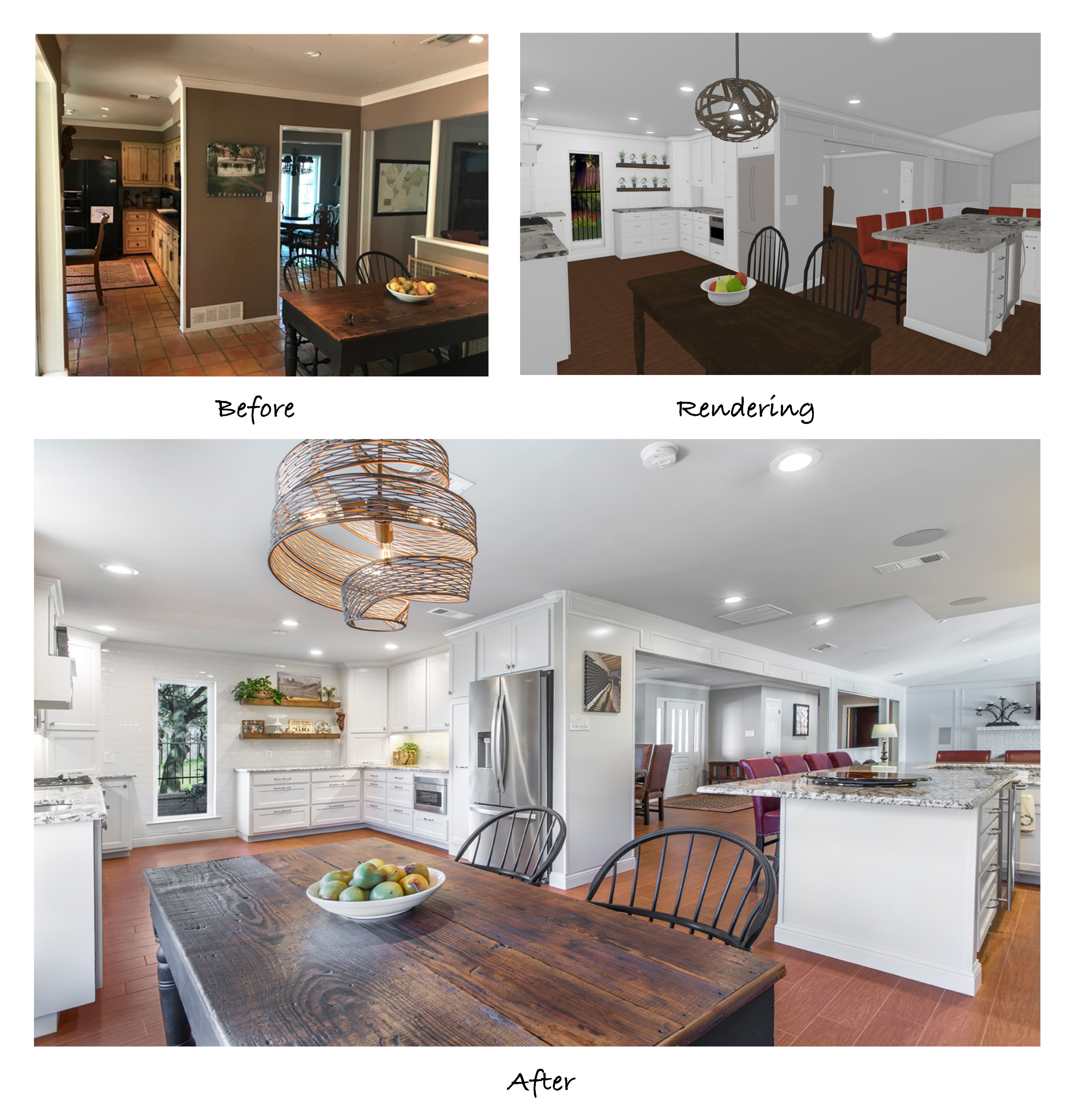
As you can see in this photo, the breakfast area is much larger since the enclosed porch was taken in. Also, notice that you can see the front door from the furthest corner of the breakfast area. Removing the walls from the dining room and the bar area made all the difference in the flow of this house.
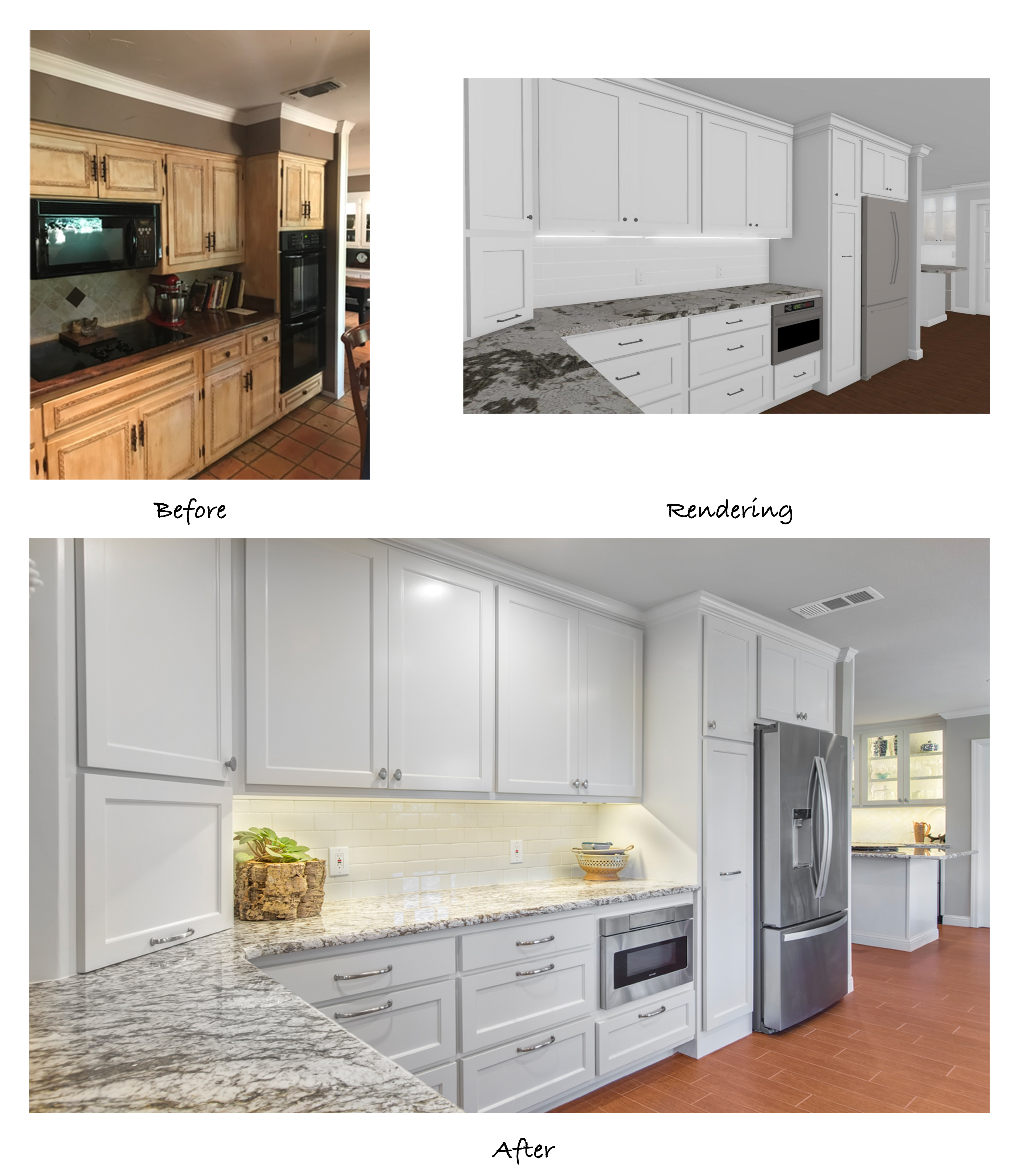
Another common trait we find in homes of this era is that the refrigerator is often located at the back of the kitchen. By anchoring the fridge on the outside edge of the kitchen, the amount of traffic is reduced, making for a better experience for both the cook and the person getting snacks from the fridge.
You’ll also notice that we removed the microwave from the upper cabinets and installed an under-counter microwave drawer. This neat little appliance is becoming a popular alternative to traditional microwaves, as it allows for easier, safer access (who ever thought pulling a hot dish out of a microwave that is above shoulder height was a good idea, anyway?!) Not only is it easier to reach, but it automatically slides out like a drawer instead of opening with a swing door. This design has a lot more space inside than its traditional counterpart. Many models can also be used as a warming drawer to keep dishes warm after they have been prepared. Our clients love the sleek look provided by this appliance and the fact that it contributes to a clean, clutter-free countertop.
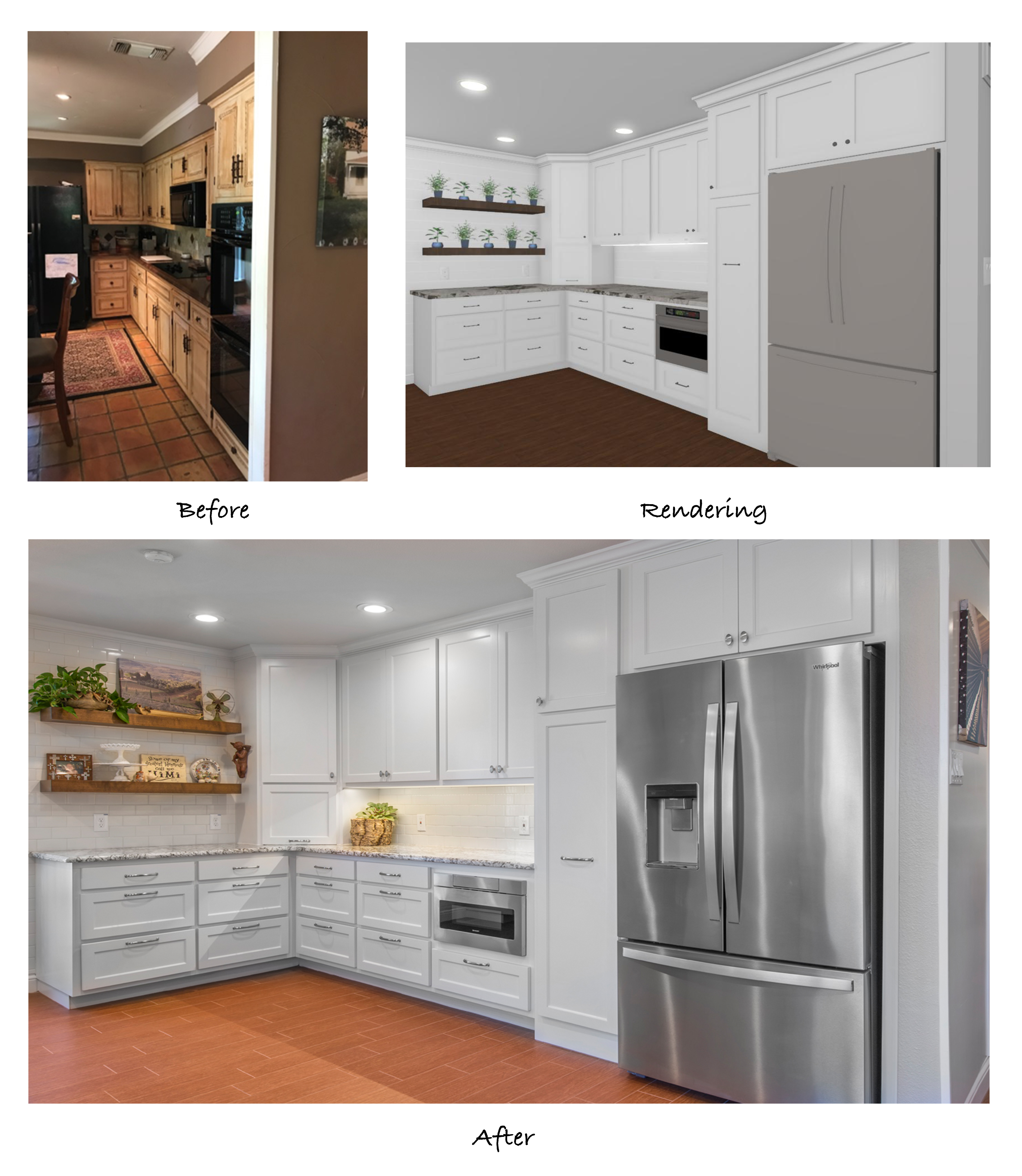
Beside the new counter-depth fridge is a large pull-out pantry that provides a surprising amount of storage space. We install these pantries in just about every kitchen remodel we complete and they have proven to be a favorite feature for many of our clients.
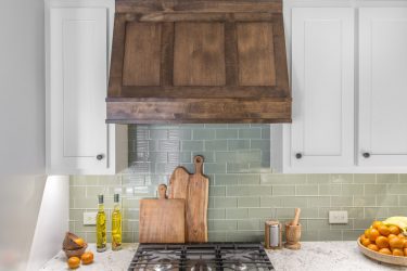
LED under-cabinet lights highlight the beautiful granite counter tops and subway tile backsplash. In both back corners of the kitchen, we installed 45-degree appliance garages to store bulky items. Deep pan drawers line the bottom row of the cabinetry and custom floating shelves were installed for a chic farmhouse look.
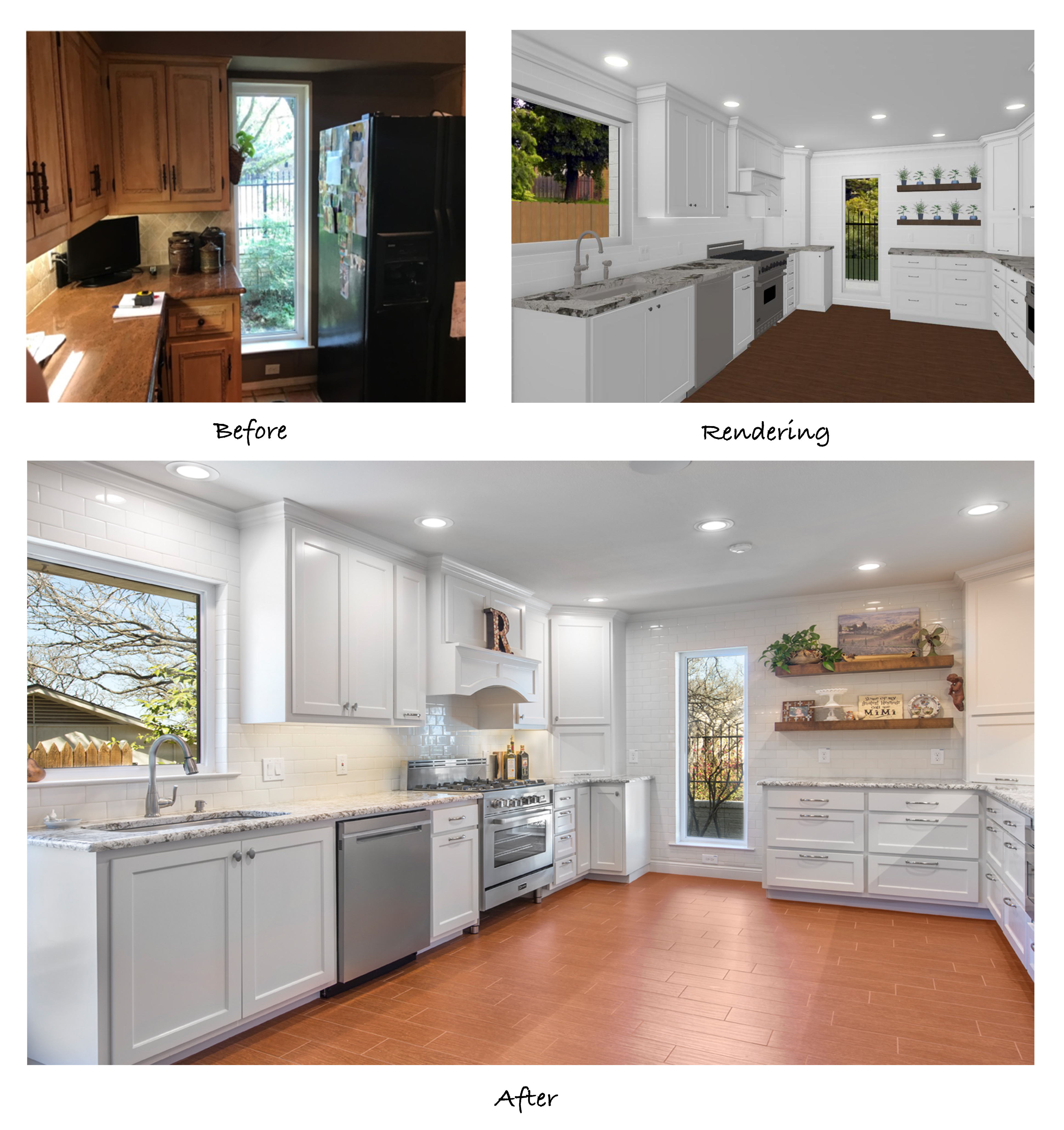
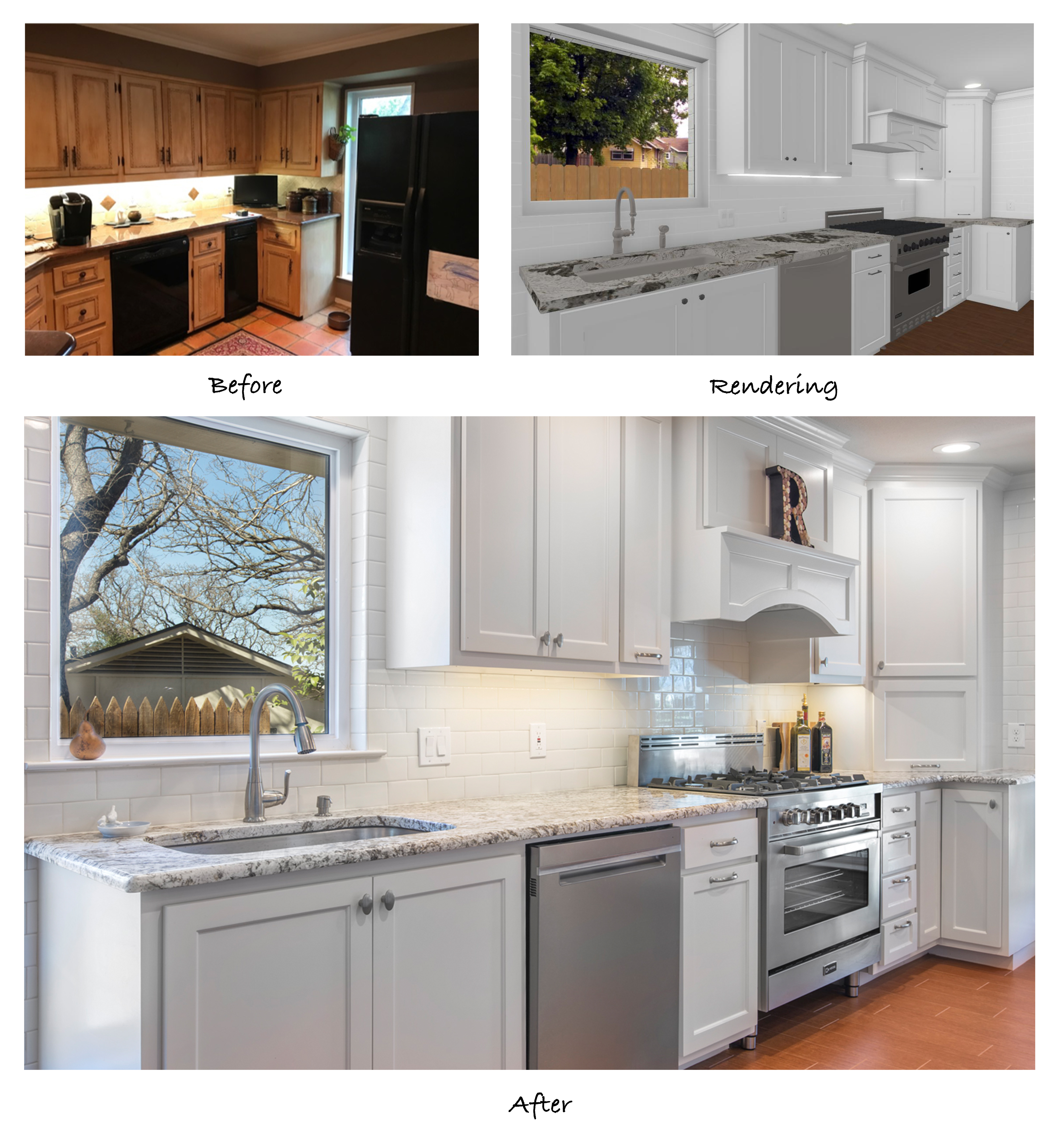
Our clients chose a beautiful 36” stainless steel gas range to match the other appliances throughout the new kitchen. We installed a custom cabinet hood vent and convenient spice rack just above the range and a pull-out trash can and stainless steel dishwasher just to the left. Stacked utensil drawers are at arm’s length just on the right side of the range, and a Lazy Susan sits inside the end cabinet for additional storage. What a convenient place to cook!
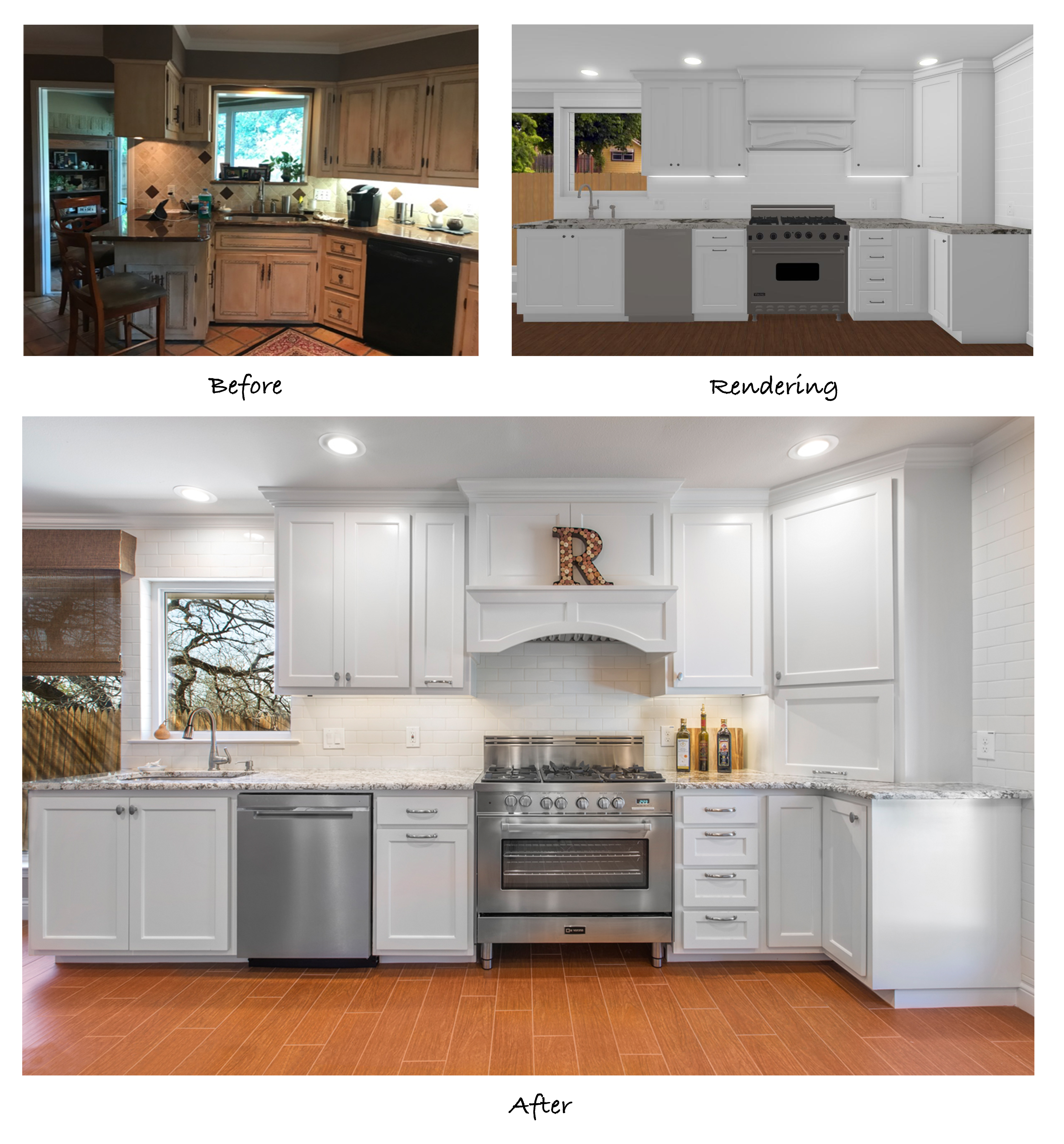
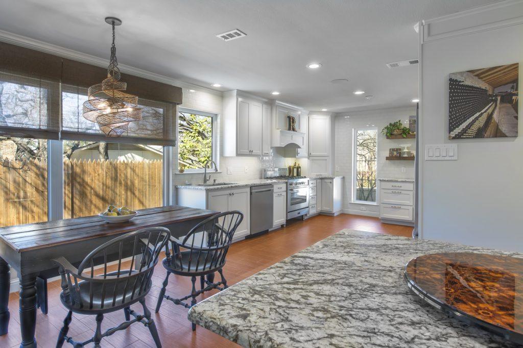
In these before shots, you can see the angled wall with the pass-through over the sink which overlooked the enclosed porch just off the kitchen. The after photos shows where we removed the angled wall, extended the cabinetry down the new wall, and installed a window over the new sink. Not only did the kitchen and breakfast area gain some square footage from the porch, but the extension of the new cabinets reaching all the way to the ceiling makes the walls seem taller. The bright white paint and strategically placed LED can lights add to the bright, polished finish.
You’ll also notice the new flooring: the clients chose a wood-look tile to install throughout the dining room, bar area, breakfast area, and the kitchen. This is a great option for clients that like wood floors but do not want the risk associated with it. Wood floors are easily damaged by water, making them a questionable choice for kitchens and bathrooms. Wood-look tile, on the other hand, is very durable and will not be affected should a spill or flood occur.

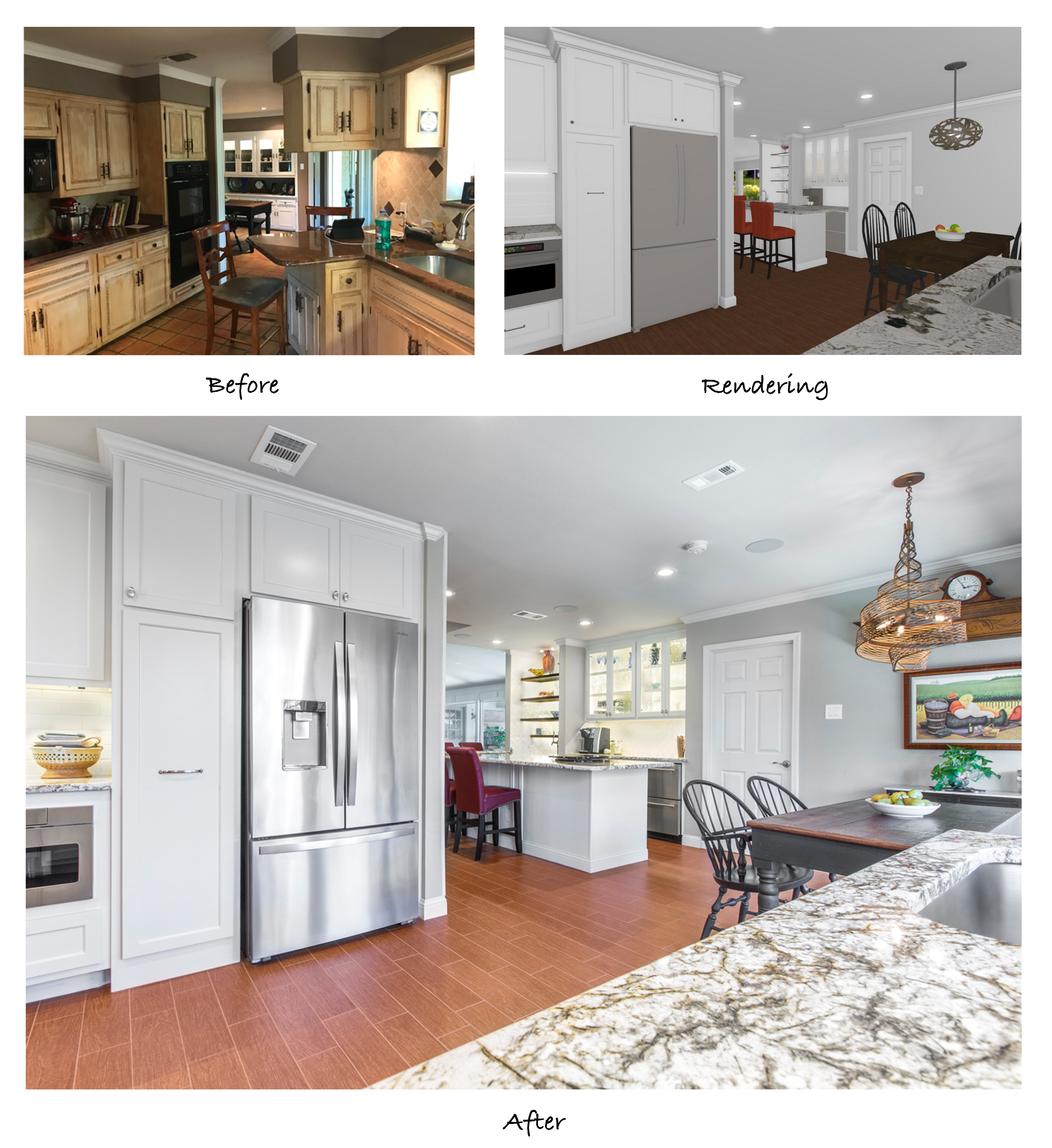
This view from the end of the bar showcases the new view into the kitchen after the structural modifications have been made. Notice how the far window is no longer obstructed by the refrigerator and the large windows in the breakfast area are also unobstructed. This is one of the key factors in creating a bright, open floor plan.
The updated floor plan also allows a clear view of the breakfast and bar area from the cook station. This is perfect for the cook to be engaged with guests while prepping, cooking, and washing dishes at the sink without be secluded by a dividing wall. It’s easy to see that the remodeled space is much more user-friendly, both for the cook and for the guests!
Here is a walk-through video of the completed project:
Altogether, this was a big project that involved a lot of small details. It was truly a proud moment for our team and our clients to see how the finished remodel came together so seamlessly. We would like to give recognition to everyone that worked on this project and contributed to the final outcome:
Structural Design: Mike Medford, Sr.
Aesthetic Design: Stephanie Milford
Drafting and Renderings: Kourtney Davis
Production Management: Michael Medford, Jr.
Project Manager: Dave Broadfield
Carpentry: Dave Broadfield, Neil Norris
Cabinets: Bailey Cabinets
Glass: Clarity Windows, Kindred Glass
Plumbing: Express Plumbing
Electrical: Marc Miller Electric
HVAC: Southern Air
Drywall: Alex Green Drywall
Framing & Trim: Resdoor, Sweeny Lumber
Paint: Phillip Painting Company
Tile & Counters: HRG Granite
Appliances: Texas Appliance
Plumbing Fixtures: Ferguson
Engineering: FWN&A – Ryan Lockhart
Masonry: James Slayton
Flooring: Hilton’s Flooring
Final Photography: Impressia– Todd Ramsey
If you are interested in remodeling your kitchen or another part of your home, we’d be happy to help! Contact us today for more information.
Warm Regards,
The Medford Design-Build Team